(Archive) Advertising District / Fränkisches Abenteuerland
-
 02-May 11
-

 Dotrobot
Offline
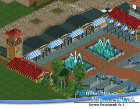
I think the paths are just fine for what it's supposed to be. Ir's a really nice, but not sure of the foliage. I think I can see a pine tree and a palm tree a little distance away from each other :l.
Will all be the entrances be the same as this one or will they all have their own appearance? -

 Cocoa
Offline
that is awesome looking. however I've never actually seen a park using their multiple entrances, they're always too lazy.
 -

 leonidas
Offline
Wow, nice detail!
I actually like the paths this way,
I just can imagine those huge tiles working perfectly in real life.
I dislike the fountains though, if there'd be a strong wind, everyone would get wet.
I like the European compactness of this park, nice cozy theming and facades.
And great atmosphere overall.
-

 Jonny93
Offline
Thanks for your comments!
@dotrobot: yes they have all their own style
I have replaced the concrete path. I used instead of this the full grey path. And i made the fountains bigger but they aren't ready. But i have a picture:
I hope it looks better!
Greets Jonny93 -

 Phatage
Offline
I really like the elevation change going into the entrance, any handicap ramp though?
 -

 Cocoa
Offline
^i agree, everyone else was just stupid. It was so much better before. also, make those fountains 2x2 and it will be more flowing. there's not enough room to walk around with them like that.
 -

 Jonny93
Offline
Thanks for your opinion. I decided to change the path back. And i made the fountains smaller. I also added a ramp for handicap people.
Comments are welcome!
Greets Jonny93 -

 Liampie
Offline
Here's one final suggestion:

That will definately make it even better.
I like these fountains best of all the versions you've shown, but the fences are way overdetailed in my opinion. It distracts from the beautiful entrance!
Lastly, a row of flags on top of the entrance gates might cheer the area up. -

 Fizzix
Offline
I don't think the center entrance building matches the ones on the sides, but maybe that's just me. Really nice little entrance, though.
-

 Fisch
Offline
I know I'm a little late but actually I think full grey path was best easily! It still looks lovely though!
 -

 Jonny93
Offline
Thanks for your comments!
@Liampie: Thanks for this suggestion. I followed this and built flags on the top of the entrance and i changed the path.
Greets Jonny93
 Tags
Tags
- No Tags


