(Archive) Advertising District / Fränkisches Abenteuerland
-
 02-May 11
-

 Jonny93
Offline
Thanks for your comments!
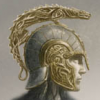
I moved on to another site of the park. I'm working on the theming on the coaster "Dragon Quest". Here is a new picture of my work:
Hope you like it.
Greets Jonny93 -
 Xtreme97
Offline
Aside from the colours of the coaster and the amount of different tree types, that's a really nice screen.
 -

 Fisch
Offline
Very nice, very creative, and very interesting but the support looks weird and it seems that the rocks get a little too close. I'm not sure anyone would survive that.
-

 Cocoa
Offline
you should make the coaster colors so they stick out from the trees and also are more dragon-y. so red, purple, blue, frankly anything other than green
-

 Jonny93
Offline
Thanks for your comments!
I changed the color of the coaster to purple and i worked a bit on the rocks:
Greets Jonny93 -

 Jonny93
Offline
Thanks for your comments!
Which color would you say is better for the supports?
Greets Jonny93 -

 Cena
Offline
Since black is no color and all others are?
Or it could be for the fact that his recent release has every fricking color on a very small map.
I personally would go with light blue (the water color). -

 Jonny93
Offline
Thanks for your answers i will change the color next time but now i want to present something from the new indoor space shot "Mystery Tower". Here is a picture:
Hope you like it!
Greets Jonny93
 Tags
Tags
- No Tags
