(Archive) Advertising District / Insomnia
-
 30-March 11
-

 Steve
Offline
and he can't even finish a design. you're boned, dude!all i know is i'm glad he's on my imaginary h2h team

jokes aside, freak, this looks too good to not get done. that ride looks immaculate. -

 Luigi
Offline
The trackiture works really well here, in my opinion. You definitely need to finish it. Overview looks sick.
 -

 EXeL}ErAT0R
Offline
Cancelled? CANCELLED?..... Nice Supports....
What's That Pink Thing In The Back?
I Don't Think SoIs that a tunnel on the first hill?Doesn`t look that good.
-

 Cocoa
Offline
waahey, that looks pretty cool! I might agree about the tunnel though, it would be cool if you used slanty pieces and turned it into a space shuttle thing.
also ^ what the hell are you trying to say?? -

 posix
Offline
Why is every new member we get and that actually posts such shit? It's frustrating. Suspended his account.
Fr3ak, you can't cancel this. You've come up with a new idea for support and track design. Canceling this will waste it. That's idiotic. -

 Louis!
Offline
^Thankyou, I was just about to do exactly this. It's getting annoying having to 'clean-up' the forum everytime a new member arrives.
 -

 Fr3ak
Offline
Fr3ak, you can't cancel this. You've come up with a new idea for support and track design. Canceling this will waste it. That's idiotic.
Will use the layout Just the theme isn't my kind of thing -

 BelgianGuy
Offline
sigh of relief...
the theme idea was cool but I can understand it's a hard one to get right, I'm glad you'll re-use that layout although I am a little worried about the pacing in the corners after the first camelback... -

 posix
Offline
This kind of coaster is best low-themed anyway, I would say. It is too tall to build theming into the sky and too fast for people to even look at it. I would just make realistic details very accurate, like you have already with the supports. Then add some authentic park surroundings.
 -

 RRP
Offline
Glad to hear your gonna have another go at this.Id try and do more with the layout on the next attempt.The current layout seems to be all about the first drop then just meander back to the station (just like the real intimidator).Maybe there's a more convincing way to do the track as well,especially on corners
e.g
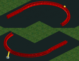
-

 RRP
Offline
2 rows of banked intamin track.1 at 1/2 height and a unbanked junior track between^ merging junior track? genius man.
-

 BelgianGuy
Offline
genius!
and I agree with posix, this type is so massive it doesn't need a special theme to be awesome, this type is imo best with a good flowing landscape and an authentic amusement park atmosphere with a lot of vibrant and colourful details to spice it up a little more.
 Tags
Tags
- No Tags


