(Archive) Advertising District / Cartoon Network Park
-
 18-February 11
-

 Luigi
Offline
I'm not really a fan of the pathing and the foliage. You also need a path leading to the door on the left-side. Great work otherwise!
 -

 tyandor
Offline
Hmmm... I'm in a bit of a twist if I like this park. You have some pretty good concepts and some of them have great execution (Snoopy and Foster's mainly).
However you space out your park in a grid I would expect in a boring office building with nameless cubicles. It feels you constantly have a square ground space you pretty much try to fill within those boundries. It's pretty systematic filling in every 'box' with all CN shows you can think of.
You need to break those systematic constraints and then you can make a park that actually feels real and alive. -

 Chocotopian
Offline
@ rct2isboss: Thanks! Glad you like it.
@ Metropole: Thank you. I must admit, I had my doubts about the colour choices as I was building it, but by the time I had finished I was pleased that they didn’t clash as much as I previously thought.
@ Dotrobot: Hmmmm... they are I suppose. I might try altering the boundaries of the different buildings to spill onto the paths (rather than have the paths spilling as I had previously tried). In this case, a simple extension of the railing fence over the gray path might work. Thanks for pointing this out.
@ Cocoa: Yep, a big backlot would be needed... although I could build most of the ride underground to save space. About the colours, I kinda had to improvise as most of the images of the house show it as a single blue or red – pretty abstract. The strange elements are an attempt to capture the decorative walls the building has (which I often couldn’t do with one layer of wall alone) and the castle bits are taken from the images as well. Personally, I would’ve liked to add some eaves, but I was trying to stay true to the actual design, regardless of how obscure and impractical it was; but then again, it is a cartoon :/
Good call with the chimneys though. I don’t like them that much either now you’ve pointed them out. I might ditch Bloo too as I think he stands out just a tad too much. Thanks for the in-depth crit.
@ Luigi: Yeah, the paving and foliage are still works in progress, but thanks for the pointer. About the path from the door: if I did put something there it would delete the door itself and the thin black pole. I’m not into hacking or stuff like that and I try to build my parks by avoiding them as much as I can. But thank you for the suggestions.
@ tyandor: I completely agree with you, mainly because that’s the way I have been building. However, it is only this rectangular-shaped area of the park that is like this. The other areas are devoted to one show each, with all theming (landscaping, archy, foliage and attractions) designed accordingly. In a way, this first area was designed to feel like a load of misc. cartoons crammed in, overflowing onto the paths and sometimes each other. As I said to Dotrobot, I’m going to work on unsquaring it a bit, but in general this area will be quite straightforward as it is the junction of the park. Thank you for the feedback though, as well as the earlier compliment
-

 Cocoa
Offline
^i'd say add the eaves and shit anyway, you are free to add details while still keeping true to the actual design. also, put the backlots in anyway, they will look better aesthetically and realistically as apposed to just saying "meh, its underground".
 -

FullMetal Offline
I am loving all of these screens so far! The buildings aren't über-realistic, which fits well with what you're trying to accomplish. And I especially love the Flintstone's house. Simple, yet elegantly executed.
-

 Chocotopian
Offline
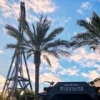
Not much, but just to show that I’m still doing this:
@ Cocoa: Yeah, fair point about the backlot. I’ll probably have a large warehouse type thing, partially themed to match the Courage area that it’s spilling into. I’m still not sure about the awnings though – tried them and they seemed to made the building too “deco” and refined rather than keeping with the Victorian style. I touched up the chimneys though
@ mardy: Thanks very much. And yeah, those paths are just for location atm. They’re going to change position, be broken up and probably change type too.
@ FullMetal: Thanks, glad to hear it! To be honest, I’m just glad you recognised the Flintstone’s house – I wasn’t sure if I’d captured it right. Like you said, it is a very simple building, designed that way for ease of animation I guess, so I tried not to overdo it.
Once again, thanks for the interest and comments guys. It’s all been extremely helpful and constructive. -
 coasterfreak101
Offline
It seems a little large-scale for a building or town from the Pokemon games. If the buildings are bigger in the cartoon (haven't watched it for probably a decade now), ignore this. But the buildings in the games are much smaller!
 -

 chorkiel
Offline
^I still play it
I'm just not sure if that's meant to be a gym, pokémon centre or something else.. -

 deanosrs
Offline
I'm pretty sure guys, that's a new pokecenter from one of the newer games... emerald/sapphire perhaps? I like it I knew it was a pokecenter straight away! (Tell me it is right?!)
 -

 Luigi
Offline
Maybe add some diagonal trims as well to the roof. Other than that I really like the front of the building. Not really sure on the sides though, they seem kinda plain as of now.
 -

 Chocotopian
Offline
@ coasterfreak101: I suppose from the outside it is, but those buildings always became much larger once you walked into them
 And in the cartoons, each town/city is just like a real town/city – large buildings everywhere!
@ NiceyRCT2: I acknowledge your big thumbs up and raise you a big “thank you”
@ CoasterCreator9: Hmmm... perhaps. I looked at a lot of different pictures (and played through all the Pokémon games I have) and although one or two roofs were red, I think the majority of them were more orangey in colour. Plus there’s quite a lot of red in this area as it is.
@ Cocoa: That was one of the pictures I looked at (as I just mentioned to CoasterCreator9^ ) but it was probably the one I liked the least. I didn’t like the sharpness of it, nor the coldness. It just didn’t seem too inviting to me, but rather like a sterile, medical hospital.
@ chorkiel: In the latest games, Black and White, the Pokécentre and Pokémart are combined into one, with the connection centre inside on a kind of mezzanine level. Because of this, from the outside they look like a high ceilinged centre/mart combo with a dome-like section on the roof. I was basically going for this look, with some artistic licence. Some inspiration was also taken from a picture of a gym I found. In game, the building’s going to be a first aid centre.
@ Liampie:
@ deanosrs: You damn right! Yeah, Pokécentre primarily.
@ Luigi: I’ll give those trims a shot. I think there was an issue with those rounded bits being in the way (and I don’t do even the most basic hacking) but I’ll find a way around it. Thanks for the suggestion. I agree with the point about the sides, although I had actually put windows and stuff there originally, then realised that there’s going to be buildings either side of this though, so the details would be lost. -

 ScOtLaNdS_FiNeSt
Offline
Pokemon is fucking amazing lol
 The white/black games where good but the one with lugia where the best silver and gold i think ?. I like the building it does look very much like the pokecenters, What i want to see is the people inside with the bullshit things to say that you all ready no .... "Do you know that you can carry six pokemon at a time" ... "Yes i have being playing since red,blue and yellow stop talking bollocks" lol.
Nice job. Its a simple building but that's the way it is in pokemon
-

 chorkiel
Offline
^^saying it's a pokecentre from black/white. would be enough
I haven't played those yet since I'm waiting for 'grey', or w/e the fusion version is gonna be called. -

 Turtle
Offline
The fact it's instantly recognisable as a Pokecentre means that it does it's job well enough, now move on to the next building and keep going.
I really don't agree with this philosophy of posting a screen of a building, then the next ten comments are "it's good, but add some crown moulding to one side, and some diagonal trim here, and maybe another window...". The constant feedback on details are killing the work ethic and the ability to finish parks in newer members.
 Tags
Tags
- No Tags
