(Archive) Advertising District / Cartoon Network Park
-
 18-February 11
-

 nin
Offline
That path in the bottom left is disgusting, plus it seems as if you have a bit too many path textures as it is.
 -

 Metropole
Offline
This is some great work Choc. Each building has a unique and distinct style. This is great, but just be careful that each area has it's own identity so it doesn't seem like any building could go into any area of the park, if that makes sense. I also echo the sentiments of those disliking the paths. With such busy architecture the paths definately need to be more simple. As I say, each building is unique in itself, it doesn't need a different path type for each one!
 -
 Chocotopian
Offline
Thanks everyone for the feedback.
@ musicman & chorkiel: Cheers guys
@ Liampie & robbie92: Thanks very much. About the paths, I was going for a sort of spill effect, but it doesn’t seem to be giving the right look, so I’ll indeed try something simpler.
@ Pacificoaster: Will do, great suggestion!
@ Cocoa: It is indeed And thanks.
@ RRP: Duly noted. As I was building the shop on the left I realised its size in comparison to the others. However, its structure is based on the Acme Looniversity and is meant to be a megastore, so hopefully the scale can be overlooked in this instance. Thank you for the warning.
@ nin: Do you dislike the grey path completely, or just in combination with the others (which will become more organised)?
@ Metropole: Thanks a lot. The idea here was to create a jumbled look, hence the different styles, but I will most definitely strive to give the other areas distinctive and appropriate theming. Thanks for the advice. -

 birthdaybrian
Offline
You should add Mike Lu & Og to that park, because its a Cartoon Network show.
Nice Park also.
-
 highroll3r
Offline
Really nice architecture here. especially the Snoopy building. Great colours. Id change the Samurai Jack roofing to green though. The pathing is really bad. To many different textures and colours forced. Id use only one or two paths and cut up the middle with planters.
-

 Chocotopian
Offline
@ BrianD: I'll see what space there is left in the central bit after I've put in all the buildings I previously intended. Thanks for the suggestion and comment.
@highroll3r: Thanks very much. I did experiment with a green roof, but on the whole I preferred the red. And I'm in the process of improving the paths, still seeing what works.
Here's a new screen. Hopefully the buildings are clear enough to recognise. Some of them seemed a bit under-detailed to me but, working from the actual cartoons, I couldn't see what more to add.
Thanks to everyone for the support so far
-

 chorkiel
Offline
I say no to that blue building, it's way too undetailled.
All buildings actually miss details but the blue building's the winner. -

 Liampie
Offline
The blue building is the best thing in that screen. I love it. (not sure on the red chimney I'll admit)
Sadly I have no idea what everything is, as I never liked Cartoon Network. One tip I can give you anyway is to be careful with colours. I miss the complete atmospheres in these screens, where you've proven you can do it with Legacy Creek (which I thought was a great little park).
Good luck. -

 zburns999
Offline
This is some really fantastic work. It's great to see some fresh ideas, even if the execution may not be totally there yet. I'll be honest, when I first saw the title of this thread, I had my doubts about how any player could handle this theme. From the screens you've shown, you're on the right track for sure. The Snoopy building alone makes this awesome, and I'm definitely digging the blue building in the most recent screen. Keep it up man.
 -

 Cocoa
Offline
Those are pretty awesome. For the art deco thing (animaniacs?) I would consider adding a lot more art deco and sticky-outy stuff (take a look at the backstage buildings in nin's universal park or in basically any of gjissie's work). I don't know what the cirlce building is, but it looks cool.
I would consider- instead of a series of themed buildings- you have a general hollywood-cartoony-carnival mainstreet, and then rides dedicated to the biggest shows. the flinstones is such a classic to just have an empty, nameless building dedicated to it, it deserves a whole ride. a foster's home dark ride would be epic too.
I sort of like where you're going with the different colored sidewalk, but you need to go further. around the animaniacs building put stalls, cameras, crates, and other wacky hollywood stuff. around the flinstones, put dino, rocks, jungle bushes, broken wheels, etc. you get the idea.
Your mainstreet is really fucking wide too. Put some planters in there. Perhaps even put some solid trees in the middle of it (like that 2x2 one). trees and flowers really make a mainstreet atmosphere.
hope this helps. I really want this park to be the best it can be. -

 Chocotopian
Offline
@ Turbin3 & musicman: Thanks guys
@ chorkiel: Is there anything specifically that you could suggest to add to them?
@ Liampie: I wasn’t sure on the chimney either, but it was as close as I could get it to the actual thing, even with its slight colour variation from the roof. I’ll probably put a list of what the buildings are meant to be later on (maybe in a readme when I finish it), so for now I’m leaving you wondering And thanks for the comment on LC – the unfinishedness here is just so I can get some advice on the buildings, getting them right before I work on the surrounding landscape, decoration and foliage.
@ zburns999: Thank you very much. Encouraging words as always.
@ Cocoa: I’ll definitely give the deco stuff a shot and see if I can add details while keeping it clean. Regarding the theme, what’s in the back of my mind is the mainstreet part of Toon Lagoon in Islands of Adventure, with the jumbled mixture of different characters and shows side by side, so I suppose the “cartoony-carnival” is what I’m going for but just haven’t achieved yet. About the paths and decorations, as I said to Liampie above, I’ve focussed on the buildings for the mo. There are already some crates outside Popeye’s boat and I’m working on a giant anvil elsewhere, so I haven’t forgotten them by any means, and the cameras for Animaniacs bit were in the pipeline too. About the Foster’s Home, you read my mind; I’ve already built a giant Blue for the outside of the building (it seems like I’m just claiming your ideas as my own now!) Thanks very much for all your advice.
Here are some pics of Toon Lagoon to give an example of what I’m ultimately aiming for, even though they don’t do it justice: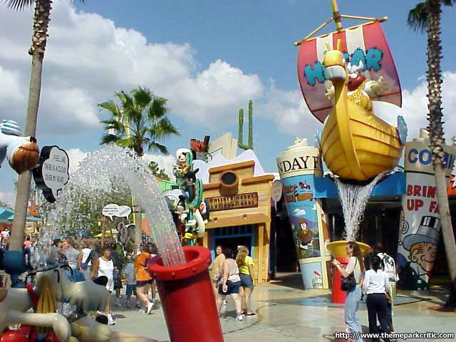


-

 Chocotopian
Offline
Thank you very much, Cole. Slow progress but progress nonetheless.
This is probably the last pic I'm going to show of this area. Just wanted to get the general opinions of people to check I'm on the right lines before going ahead "alone". Thanks for all the support and suggestions so far. They're very much appreciated.
Here's the building for the darkride/ghost train in the Cartoon Central area, with a warehouse type building behind to accommodate the rest of it. Guests enter through the main front doors and exit round the back. About the giant Bloo, it's supposed to be a sort of photo spot where an entertainer dressed as Bloo would occasionally come out of the nearby door to have pics taken, meet guests etc.
Hopefully this was the kinda thing you were talking about, Cocoa
-

 Metropole
Offline
^Indeed.
This is absolutely quality work choc. A very bold choice of colours, but pulled off to perfection. -

 Dotrobot
Offline
But the paths. They look so cubical and sharp. You can see in your own screens of the real life park that the paths aren't so abrupt and sharp.
Great screen otherwise -

 Cocoa
Offline
I'd say get rid of Bloo and that will be perfect. Great atmosphere, although maybe a little more brown for the walls would be nice? idk, I can't really remember what it looks like. however I'd say you're gonna need a big backlot building behind it if this is going to be a dark ride.
as far as architecture goes, you've got some strange elements. for example, in the couple places where the top of the walls are covered in a double layer of fence, or where you've used black castle-bits to mark the transition to roof, you should put some eaves or (god, i can't remember what they're called- those little platformy deco pieces that are flat on the top and sort of curvy underneath). the top of those chimneys could use a little work too.
 Tags
Tags
- No Tags
