(Archive) Advertising District / PineHills AmusementPark Orlando
-
 31-January 11
-

 Metropole
Offline
It's in such a mess, that it's impossible to comment on. I can say I still dislike those paths though.
 -

 Liampie
Offline
The hopper ride is totally out of place. You've got a lot of space but you squeezed that ride in an ugly and not very tactical place.
 -

 SSSammy
Offline
if we don't have rrp anymore, we still have this guy. this... this guy. it's amazing.
 -

 BelgianGuy
Offline
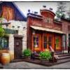
if that screen with the hopper is the actual park entrance I'd say change it, it doesn't look inviting at all, I believe your focussing on being accurate so much it takes away from the livelyness of the park tbh, yes it executed in a correct manner but it lacks live and vividness for me, it has almost no colour, no details that make me smile only details that make me go like, oh nice AC unit and I'll move on looking but there's nothing that holdes my attention in terms of what I look for in a park...
 -

 Luigi
Offline
if that screen with the hopper is the actual park entrance I'd say change it, it doesn't look inviting at all, I believe your focussing on being accurate so much it takes away from the livelyness of the park tbh, yes it executed in a correct manner but it lacks live and vividness for me, it has almost no colour, no details that make me smile only details that make me go like, oh nice AC unit and I'll move on looking but there's nothing that holdes my attention in terms of what I look for in a park...
Amen. -

 Pacificoaster
Offline
I agree with the things said above. Also, the inverts cobra roll is under supported and seems to lack a brake run.
 -

 Roomie
Offline
I actually quite liked this. Understated, sure but its not bad. And if that is the entrance then I cant argue with the positioning of the cobra roll. Like Silver Bullet at Knotts it would be an awesome thing to see when you come through the gate.
 -

 Chillsons
Offline
I don't like the colour of the Supports for the rollercoaster.
everything else seems really good though -

 chorkiel
Offline
This is quite a bit off topic, but Sammy that avatar is orgasmic!
on: It looks messy on the pathways as usual.. It's looking better because it's near completion ! -

 K0NG
Offline
I don't know if it's under supported...but, it sure looks like a leg snapper.Also, the inverts cobra roll is under supported and seems to lack a brake run.
-

 Pacificoaster
Offline
There aren't any supports on either half loop, nor the lead in and lead out. For the record, i liked the black and blue color scheme.
 -

 gijssie1234
Offline
I have place some more supports at the invert coaster, and there are come more and more details to the park.
here you can see a begining of 1 of the kiddie rides in my park, they are real working but not for the guest.
There are also come arcade games to the park!\
 Tags
Tags
- No Tags


