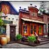
(Archive) Advertising District / PineHills AmusementPark Orlando
-
 31-January 11
-

 SSSammy
Offline
i'm writing a short essay in my own time regarding what i call "the beauty of intention". when you create something to be the thing it is, it is beautiful in the fact that you meant it to be that way.
 -

 BelgianGuy
Offline
yes agreed but if the thing it's intended to be is ugly then guess what it's still ugly, intention or not
 -

 highroll3r
Offline
nice. this is coming together well. i agree that that the scaling is perfect. the glitchy bits on the edge is a bummer but nothing you can do bout tha.
 -

 prodigy
Offline
Do the people stop at the main-entrance inside the park or at the map-edge? If it's the map-edge I could fix it with win-hack (the path would be unconnected with the edge, it would be just one number to change). If it's inside the park I have no idea atm what could cause that problem.
 -

 Fisch
Offline
YOU NEEEEEED to add red flowers with thought here and there. It'd make everything so much more lively. Just the red 1k 1/8 tile flowers maybe.
edit:
sorry I was stuck on the wrong page...^that was regarding the screen with the playground on page 8
-

 robbie92
Offline
It's not just technically, it's that sense of reality, that I have never
seen this intense in RCT2 before, only in Liam's city project.
It might not be the happiest place you've ever seen, but many parks in real life
have ugly parking-lot environments like this. Imperfection and soberness is
what makes this so damn real.
This is FAR from imperfect. It's generic, and I don't mean that in the way that he's intended to make it generic. It feels like a theme park recreation of a motel, rather than any real outlying area to a park. The buildings sit there on their own, surrounded by singular grass and some other foliage. Where are the gritty city elements? Where are sidewalks, seedy bars, scrub? It doesn't look anything like an outlying city since none of the elements come together as a whole. This isn't all that imperfect, is more tepid than sober, and more of an impersonation rather than a representation. I completely agree with the idea of "beauty of intention," or the deliberate creation of ugliness, but this just seems more derived than inspired. I feel like everyone's simply impressed by the deco detailing of the buildings rather than the actual feel of the screens, the atmosphere, or the relationships between the parts.
Sorry Gijssie, but I find this screen, as well as the previous few, pretty lackluster and derivative compared to some of your other screens. It feels like a combination of RRP's, Sey's, and Louis's work without managing to capture the magic or atmosphere of any of the afore-mentioned. I feel like rather than simply recreating specific elements, you should think of how the parts relate to each other and relate to the whole, something I've been trying to figure out in my own work myself. I don't mean disrespect, but I'm just seeing a TON of potential and technical ability without it all coming together to equal something special. -

 leonidas
Offline
I think I agree with you Robbie, but while it might not be completely accurate I still
think it suggests realism, it is realistic in it's first impression, probably because of
all the little details and sort of visual logic, everything 'seems' in place.
But indeed, it's in fact too simple to be real.
I also completely agree with SSSammy. I don't believe in one 'ideal', or academic norm.
I love screens that can effectively communicate a personal feeling or vision and because of that
inspire us to think in a different way. When we look at screens with a preconceived idea of
what's 'good' or 'bad', we only see what we already know. We take satisfaction in seeing
something that matches our preconceived mention of 'beauty', but never learn to notice other aesthetic
principles or ideas.
I think we're kinda ruining Gijssie's topic though (if it's not already destroyed haha). -

 K0NG
Offline
I totally disagree with this. While it might apply to a 'first glance', I think everyone in this community looks much deeper than the superficial. Otherwise, we wouldn't have topics like "The Little Things" sprouting up every now and then. And, as far as 'scale'...there's more than one way to look at scale. Scale in proportion to peeps, in proportion to rides, in proportion to objects and all in proportion to the games height markers. A two brick high, single clearance wall or block goes above a peeps knees. A two block high "stone wall" (basically cinder blocks) or barrel is above eye level to a peep. But, both work almost flawlessly next to a coaster track. I don't think there is a 'perfect' scale in RCT because of the discrepancies in proportion. So, it's all subjective.When we look at screens with a preconceived idea of
what's 'good' or 'bad', we only see what we already know. We take satisfaction in seeing
something that matches our preconceived mention of 'beauty', but never learn to notice other aesthetic
principles or ideas.
I think we're kinda ruining Gijssie's topic though (if it's not already destroyed haha).
I also love when people get their "last word" in before pointing out a thread being hijacked (and hint that everyone else should probably get back on topic). Just sayin'. -

 gijssie1234
Offline
Hi, i now it is almost ready but i'm verry bissy at the moment with making design lamps and other stuff (not for the game , but for sgool, and my intership.) the last time is play it the people doesn't like the coasters and there are most of the time only two peeps on it or no one.... maybe some ideas?
Just wait a bit more
-

 Adix
Offline
Considering I live immediately south of the Pine Hills section of Orlando, I think the name is wonderfully hilarious. It also looks really wonderful.
 -

 CedarPoint6
Offline
^^ That's funny, I was actually thinking that the other day when I crossed Pine Hills road. It made me think of this park, haha.
 Tags
Tags
- No Tags


