(Archive) Advertising District / PineHills AmusementPark Orlando
-
 31-January 11
-

 That Guy
Offline
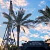
The utility poles are incredible, but it seems highly unlikely that they wouldn't be underground in that area.
 -

 jusmith
Offline
I think what is missing from your foliage are some flowers (bright coloured ones). Other than that, this looks superb!
 -

 coasterfreak101
Offline
The utility poles make sense if it's part of a theme, like an older city or something - that theme just isn't there, at least not yet.
I want to see this finished, because I think when it all comes together it's reeeally going to be something! -

 Dimi
Offline
Beautiful. The triangular roofs above the queue would look better if they weren't white so there would be more contrast, but other than that I don't think there's too much white in this screen. It's probably too late by now, but I also think regular concrete path would look better than these grey base blocks. Anyways, I can't wait to see this released.
 -

 leonidas
Offline
I don't see how white would kill atmosphere, it brings a clean, rational vibe,plz use less white, it kills any atmosphere there could be...
classic also. I actually like it in this screen.
Looks great, Gijs! -

 Louis!
Offline
here is a overview from the whole park !

Looking back through this topic, I've just realised that the Vekoma layout in the back, is my layout lol. -

 gijssie1234
Offline
hi everyone, i understand your comments about the collours, i will see what i can do.
I've been working at the whole park and there have change a lot , paths are cleaner here and there, not that much curves and stuff.
Sorry Louis your coaster is not in the park anymore
I will not showing anything anymore before the release!!
i'm allready love the atmosfere at the park
the only thing that have to be done are some surrounding buildings/houses, wood/plants, etc. -

 FredD
Offline
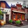
This is almost finished? Oh yeah, can't wait for this. One of the most detailed parks I've seen.
 Tags
Tags
- No Tags


