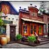
(Archive) Advertising District / PineHills AmusementPark Orlando
-
 31-January 11
-

 Louis!
Offline
Well considering you've just gone ahead and taken over the whole disney project by yourself.
 -

 Cena
Offline
You haven't been online for months untill a few days ago we had a little chat ... You are still free to help/make it into a duo. Just talk to me but don't ignore me.
 -

 gijssie1234
Offline
After reading this, I too a bit of time:
To make this:
Do you think you can use this Gijs?
If so, let me know and you get the object
heey can you send me the object, than i send my park to you so than you can change the parkdat.
or maybe you can say how to do it
-

 leonidas
Offline
I often notice this way of communication on this site..Your pathing-border just sucks, it's so ugly.
It's completely useless. I could tell how your face looks ugly, but it won't help anyone.
Why don't you take the time to say how it can be improved?
The principle behind the pathing is great, very dynamic and flowing.
But you might want to reduce all the little corners and diagonals, it makes it messy.
Try capture the same sort of shape with less kinks in the borders.
I love the compactness of the area, it's cozy, yet not chaotic.
The level of detail is amazing, you leave no spot untouched.
This is quite revolutionary if you'd ask me..
A completely new way of building. -

 chorkiel
Offline
^^that way of communication happens on every forum.
I agree with what you say though. -

 Pacificoaster
Offline
Turbin is a bit harsh by saying it's "so ugly", however you are using two different textures for the curbs. The diagonal is darker than the square block creating an awkward look.
 Tags
Tags
- No Tags


