(Archive) Advertising District / PineHills AmusementPark Orlando
-
 31-January 11
-
 gijssie1234
Offline
Hi everyone!!,
PineHills AmusementPark is a new park located next to Orlando,
It's a small park with a few verry exiting rides, Next to the park there is a nice campsite, and a nice Hotel.
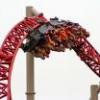
At the pictures you can see some of the rides.


-

 Wanted
Offline
What's the point of the MCBR on the invert? Sorry not really feeling the layout of the woodie or the invert.
 -

 Louis!
Offline
I like the woodie layout. It's cute.
I agree on the invert though, the second half needs to be extended, or the MCBR needs to go. -

 chorkiel
Offline
don't tell me I'm the only one who thinks the slides layout is completely boring and doesn't seem fun ?
I actually don't hate the invert layout and the woodie looks pretty cool but the invert is a little short though I think. -

 SSSammy
Offline
got to say, i fucking love you, dude. i love everything apart from the pointless mcbr on the invert.
 -

 Goliath123
Offline
Really sam? Hes done next to know work and already you love it.
It seems ok i guess -

tdub96 Offline
^im wiht goliath. I think these shoulda been posted in the dump as there's barely anything finished here.
So to me, its just ok. -

 gijssie1234
Offline
heey thanks for the reactions, only i have to say that the park is going verry fast.
(what did you mean with mcbr

The builders didn't have a lot of place, and that's why there are so many rides next to eachother, the theming around will be famous

see you at the next update!! -

 JDP
Offline
Mid Course Brake Run (MCBR).
I would love to know what's the point of yours on that invert though. I hate it when people use mcbr's and they exceed no purpose. A corkscrew or two might justify it though depending on how you do it.
-JDP -

 Dark_Horse
Offline
I'd like to see some architecture, but your ride layouts are ok. The slide layout seems boring and pointless. Try to find a way to add more excitement, like adding a splash pool. Your invert looks fine to me, mini-Raptor (colors and all). I'm not really feeling the woodie layout, and your footers seem way too big for that small of a coaster.
 -

 prodigy
Offline
I like it a lot!
I think for a small park it's just realistic that there are some boring rides like the slide, and so I really like the slide, too. I think it's good to do a small project, that can be finished quickly.
The only thing I would change is, to add 2 corkscrews to the inverter.
I would do it like this (corkscrews=red):
-

 gijssie1234
Offline
heey, the water ride has been removed, i takes to much space for such a little ride.
So "see here the new!!"

-

 Pacificoaster
Offline
Your footers could use some work. Besides that, it looks fairly nice. Keep it up.
 -
 Corey
Offline
Is there supposed to be absolutely no themeing, trees, or scenery of any sort whatsoever?
 Tags
Tags
- No Tags
