(Archive) Advertising District / Colossos
-
 21-January 11
-
 Evil WME
Offline
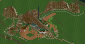
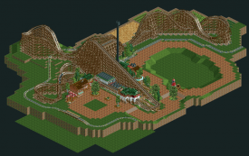
I don't think it looks bad, but it would look better without the tree!
I also think that the columns would look better all white. Not bad though! -

 Goliath123
Offline
I like the tree, and everything else too, the queue especially looks really good.
 -

 Dimi
Offline
First I didn't like this park very much, but now I think it's great. I love everything except for the dark orange colour of the flowers, and I agree with Evil WME about the columns.
 -
 Luketh
Offline
Tree: good.
White awning: Not so good.
Just try a different color for the awning and it'll be perfect execution of a really cool idea. I love this so far, though.
-

 musicman
Offline
^ I agree that the awning doesn't look good, but I think the problem is one of texture and not color. I think it would look better with all tile roofs instead of the weird mix you have right now.
 -
 highroll3r
Offline
the tree is diferent, but i dont really like it. i think the structure would look better with a bit more cover, its logical. i mean if its cover from the rain when peeps are queuing, it should cover the peeps when its raining. the footers on the coaster are fantastic though.
 -

 JDP
Offline
you work reminds me a lot of fisch's.. not a bad thing. oh and leave the tree, its original at least
-JDP -

 posix
Offline
That's what I think, too. It's a cool idea. You shouldn't remove it. Just the white is a big strange. Maybe try light blue.Tree: good.
White awning: Not so good.
Just try a different color for the awning and it'll be perfect execution of a really cool idea. I love this so far, though.
I think the work on the station, how it overlaps with the path over the stairs and everything, is very nicely done. Also the way the screen is composed with the nice queue line looks stunning. Good luck on finishing and don't make it too small again. Give it some surroundings, give it some weight. -

 Austin55
Offline
I like the tree aswell, but like luketh pointed out its a problem of texture. And I also reallly strongly agree with what louis! said about watching out on colours of building and such.
 -

 Evil WME
Offline
Mmm.. if you see it as an idea..
maybe put in some of those bushes that are colored roughly the same as the tree, and make the tree a bit more elaborate?
It's funny how everyone has something different to say about this screen .
.
-

 Liampie
Offline
Maybe use my custom tree? I think could work here, because the architecture and coaster is relatively large scaled too.
 -

 Louis!
Offline
Yeah when I said the tree, I meant the tree, not the idea. Just change the tree type and it would look good. Maybe I should have been clearer in the first place
-

 That Guy
Offline
This is REALLY looking awesome, I just think you're showing way too much...leave something for us to look at in the release.
 -

 pierrot
Offline
yeah...I just think you're showing way too much...leave something for us to look at in the release.
-

 posix
Offline
I get the impression you have very little idea what to fill the rest of the map with. Brainstorm into content before you continue!
 Tags
Tags
- No Tags
