(Archive) Advertising District / Colossos
-
 21-January 11
-

 tdub96
Offline
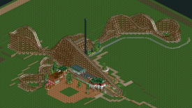
I'm really beginning to anticipate one hell of a design here. The layout is just beautiful, flows perfectly. Definetly a wooden coaster of the year award canidate at next year's awards. The architecture is great too. Really good stuff here turbin3.
 -

 J K
Offline
I love the look of everything. It seems like you've really fell into a grove with your architecture and rides. Now concentrate on giving us some thrill rides or perhaps a water ride to make this map have another star attraction. Also be careful to not clutter the park with archy and path, the more small things you add to your work, the greater the depth and viewing time for people on the forums. Really great work though buddy!
 -

 JDP
Offline
im not one hundred percent sure, but it seems that your trains are longer then then transfer track itself. unless you are only using 4 cars per train which will ruin all chances of this being a great intamin woodie
-JDP -

 turbin3
Offline
Alright, I just added a fifth train, thanks for the tipp, JDP.
Also thanks to JK and anyone else who posted.
New screen will come in a few hours, it's progessing really good.
-

 Louis!
Offline
this is much better than the building that's got the roof sliced in half (you need to fix that up, it looks shit)
this is great though. its nice to see you improving so much. -

 pierrot
Offline
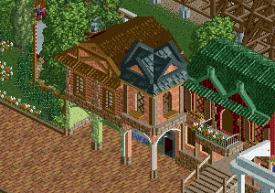
I hate the texture of building, kinda confusing, also so many colors in there, but I can't find harmony...
sorry, just everything looks odd for me. -

 BelgianGuy
Offline
The colours are too repetitive for my tastes the shape is good on the other hand.
 -

 tdub96
Offline
My thoughts, well first I wish I was that good at RCT architecture. I actually really like the colors. There hasnt been an update of this that I didnt enjoy.
 -

 Louis!
Offline
The tree in the middle of the white awning is awful. Ruins the screen.
Also you need to be careful that you arent building the same building over again. The red wood wall and green wood roof combo is being used again.
 Tags
Tags
- No Tags


