(Archive) Advertising District / Colossos
-
 21-January 11
-

 Splitvision
Offline
I like the top-right most portion of it, the diagonal out-and back section. The rest seems a little haphazard and not really like belonging together, and the lifthill feels awkwardly placed. But I hope this'll be a project which you finish.
 -

 Austin55
Offline
Damn, I really liked the first edition, but this is great looking to. Good luck man.
 -

 Louis!
Offline
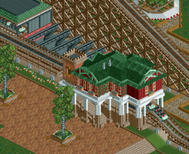
As I said, a much better improvement. Looking great. I think you could still half open or 1/4 open one of the other sheds too, stop it looking so 'perfect'.
Also your clearancing on the path going under the woodie needs to be higher. -

 Fizzix
Offline
Very nice station, and that layout is spot-on. But you know you're missing the upper part of the footer on the first piece of track that comes out of the station? Really great otherwise, and I'll be looking forward to this.
-
tdub96 Offline
Love the station, love the transfer area, love the layout, love just about everything, but I hate the footers. -

 Turtle
Offline
Why is the station a cottage? For a coaster named Collosus, surely you'd want something iconic? It's a nice building, but there is no theme! No atmosphere. Nothing.
 -

tdub96 Offline
I'm really liking this. I love the details on the buidling's second floor, looks great. Also, the outdoor patio with the closed umbrellas is a nice touch too. -
 Levis
Offline
looks a little bit empty inside.
but the building looks quite nice dude ., maybe do something with the top of the roof cause now you can't really see where the roof is at the peek. maybe put a little trim over it.
-

 Goliath123
Offline
Absolutely love it, the layout especially. Besides from what turtle mentioned some of my favourite screens for 2011, great job.
 -

 Louis!
Offline
Well done on making your buildings more open. Much better
Also nice textures and colour combos. The roof seems a bit odd to me, but apart from that the screen looks lovely.
 Tags
Tags
- No Tags

