(Archive) Advertising District / Elitch Gardens
-
 15-January 11
-

 Insanity
Offline
Fantastically real, especially on the first and fourth screens
Btw, will this have peeps? -

 leonidas
Offline
I like how you picked a normal (not so huge and epic) park for your recreation.
The pool-borders are quite creative, and so is the breakdance.
It really lives for me. Some peeps would really make it live though.. -

 RamSam12
Offline
This park will have peeps, but I'm not far enough along to let them in yet.
Anyways, at the end of last season, Elitch's owner CNL kicked out PARC Management from operating because they had no game. Herschend Family Entertainment will now operate the park beginning this year. Here is the press release for those who haven't heard.
http://www.hfecorp.c...ement012511.pdf -

 RamSam12
Offline

Half Pipe is the first of its kind built in North America.


Elitch's main street is one of my favorite entrance areas in a park. Exciting changes for this area are rumored for this season.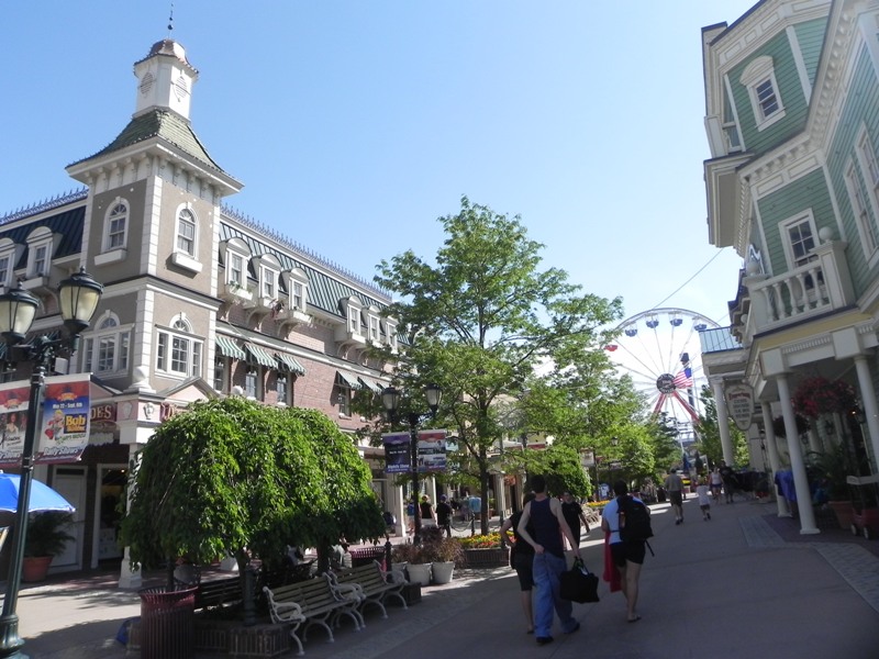
-

tdub96 Offline
Wow, just perfect sam. That archy is great and the half pipe coaster couldn't be done better. -

 Pacificoaster
Offline
I'm sure you're using bingmaps, but this is the perspective i see:
http://www.bing.com/...y=u&FORM=LMLTCC
Maybe try this for the Half Pipe station:
Also, perhaps you could use the same cantilever technique for the queue, maybe using four towers rather than three. -

 nin
Offline
yeah, that station is a bit more accurate than yours, Sam. I would even go so far as to try a roof made of track to get the curve right. Otherwise, that "coaster" rocks. Seriously, as I want to make one myself now!
Moving on, the Tower of Doom queue cover seems a bit out of proportion. I understand why you can't/won't change this, but if there's anyway to, do it. I would also use Kumba's corrugated roof objects as they fit the style of the roof more. Maybe go ask him to make a diagonal piece as well? That'd be a huge help here among everyone's parks.
I feel as if the main street isn't quite as detailed and intricate as the real deal. Seems rather simple and it's simply bringing the area down. The park seems as if it may be your break from your old, bland style to a more detailed style that we know your capable of. This area will really show that transition if you get it right. So far, you haven't. -
 gijssie1234
Offline
the roof from the drop tower is really to big , the idea from the skate rollercoaster is verry funny
 -

 Louis!
Offline
Halfpipe is brilliant. Very well executed. But the station could be done better, definately take Pacificoaster's advice.
Agreed on the Tower of Doom too, the building is just too large. -

 RamSam12
Offline
To address a few issues. I am aware of Half Pipe having 3 towers for the roof instead of 2 like I have. The reason is, I have the station built over 2 full tiles and 2 half tiles in each direction giving it the length of 3 tiles. Because of this, I would be unable to use the giga track unless I rebuilt the ride and station differently. This seemed like the best compromise to have get the overall ride shape looking good. I will for sure re-do the roof somehow before I'm done.
As for the Tower of Doom roof, I've inquired about the possibility of those diagonal roofs. They would help more than just this ride in the park. The reason the roof is large is because of the queue underneath, which in real life wraps back and forth about 3 times under the structure. I might shorten this by 1/2 tile inwards for aesthetic purposes.
Architecture has never been a strength of mine, so I figured this would be a good way to get better at good looking realistic archy. Here is another one of the main street buildings.
Which of those windows on the bottom corner of the building would look better?
Let me know what you think about this and keep the rest of the comments coming. -

 geewhzz
Offline
i think the archy looks fine. this is looking great. i thought i'd just come on here and drop a note that i watched 3 Ninjas High Noon at Mega Mountain today on the movie channels ( http://www.imdb.com/title/tt0118539/ ) this movie takes place at this park, maybe you should check it out for some inspiration, although it's an awful movie.
 -

 cuda
Offline
The Halfpipe station looks almost realist give the fact that it crated on a rct gird system. If someone were to visit the real Elitch Garden after look at this park then, they could relate to is Recreation. keep up the great work.
 -

 cuda
Offline
The station is a very compact station, all three operators have about 3 feet in their operating booths. also the Spaceing between all of the ride are almost dead on and halfpipe is lined up with boom.i think the scale is off. just seems longer then it is
-JDP
 Tags
Tags
- No Tags

