(Archive) Advertising District / * * * Spaceport Omega * * *
-
 20-December 10
-

 Splitvision
Offline
Cool stuff, if someone were to recreate the hugest mountain in our solar system it'd certainly be you with your landscaping skills. Cleverly done too with the grid. I hope you'll vary the land surrounding the mountain a bit more, I''m sure you will though. One question: how enourmous is this map? looks pretty large from these long-range screens, I'm just asking because I really want there to be a chance for you to actually finish this.
EDIT: nvm the question, scrolled up and saw the overview. It's huge though, I mantain a worry that you'll have a hard time completing it, and a hope you'll prove me wrong
-

 J K
Offline
I think you're up there for one of the best landscapers of the game, as you take the time and effort to craft something like this. Keep going dude.
 -

 Splitvision
Offline
^I'd say the main point was to show us how he did it, not the final result. The grid is a very good idea, and it shows that he went the extra distance to get it about as similar as possible in-game. My 5 cents.
 -

 J K
Offline
I like the process of him building it, it shows depth and something many builders don't do.
 -
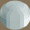
 Timothy Cross
Offline
Cool stuff, if someone were to recreate the hugest mountain in our solar system it'd certainly be you with your landscaping skills. Cleverly done too with the grid. I hope you'll vary the land surrounding the mountain a bit more, I''m sure you will though. One question: how enourmous is this map? looks pretty large from these long-range screens, I'm just asking because I really want there to be a chance for you to actually finish this.
EDIT: nvm the question, scrolled up and saw the overview. It's huge though, I mantain a worry that you'll have a hard time completing it, and a hope you'll prove me wrong
Thanks, and relax, the surrounding land will be dealt with. As for the map size, I believe it's 245x245, however I've planned the park out to help ensure it's finish-able (no overabundance of detail, and half the map is to be 'filler' (also done so for a more pleasing overhead view.)) Though I hope my plan works...I think you're up there for one of the best landscapers of the game, as you take the time and effort to craft something like this. Keep going dude.
Thanks, bud. And I'm glad you decided to post in here.
stop showing so much
Well all screens I'm showing in this topic are to be incomplete (as mentioned), so I don't think I'm giving too much away other than providing a slight idea of what the park is to consist of....It's a big hill. yay?
It's a recreation of Olympus Mons, and an entire resort is to surround it. Also, see below...^I'd say the main point was to show us how he did it, not the final result. The grid is a very good idea, and it shows that he went the extra distance to get it about as similar as possible in-game. My 5 cents.
Exactly.
I like the process of him building it, it shows depth and something many builders don't do.
Yeah, and I do enjoy creating work with great depth. Not just in theming, but in every avenue of it's composure.
Happy New Year everyone. Let's make 2011 an even better year for NE than 2010.
-

 Timothy Cross
Offline
Quite possibly the final overhead shot I'll show prior to release, I give you a preview of 2011 plans for Spaceport Omega. Names are not final, and everything seen is subject to change. However, consider this a good preview on what's to come... enjoy.

-

 Splitvision
Offline
I just love this concept and I've been thinking for a long time to do something like this... I love space, technology and rct and those three elements combine nicely here! I'll be looking forward to some close-ups of the various areas, especially the planets.
 -

 Midnight Aurora
Offline
I get that you did it in a somewhat novel way, Tim, but it's still just a big fuck-off hill. I'd imagine you would have gotten similar results if you just half-assed it. But hey, if you enjoy it, then you do you. I'm just not impressed.
 -

 K0NG
Offline
I think the whole thing is rather impressive. I hope you stick to it and actually finish this (like I'm one to talk). Only issue I have is...wouldn't the "Ocean Planet" be better situated on the side that has....ocean?
 -

 Timothy Cross
Offline
I just love this concept and I've been thinking for a long time to do something like this... I love space, technology and rct and those three elements combine nicely here! I'll be looking forward to some close-ups of the various areas, especially the planets.
Thanks, Split. Glad you're enjoying it. Our brains seem to be similar as it pertains to RCT. Up-close shots of the planets coming soon. Right now, I'm working of the LHC ride to be located at 'Cosmovations' East. So next pics may include this. I think it'll be an interesting attraction to say the least.Why is it so stretched out and symmetrical?
Interesting concept though, I agree.
Glad you like the concept. And the spaceport is purposely symmetrical while the planets are not. I consider it kinda an 'artsy' move to distinguish a difference between the Earth-located spaceport and the more fantasy areas (the planets). As far as it being stretched out, it's just the shape I choose in developing the SP into it's actual purpose (themepark-wise) of it being a museum. The elevated walkways lead to the various expo-areas. Also, it's given it's shape to ensure the desert-landscape can be more apart of the overall look.I get that you did it in a somewhat novel way, Tim, but it's still just a big fuck-off hill. I'd imagine you would have gotten similar results if you just half-assed it. But hey, if you enjoy it, then you do you. I'm just not impressed.
Well, the mountain is not finished yet, and the resort is to heavily interact with it. Maybe when you see the finished product you'll change your mind. Just know Olympus Mons is to play a large role in the resort. Also, I don't believe the shape could have been as accurate without the grid and way I went about it's construction.I think the whole thing is rather impressive. I hope you stick to it and actually finish this (like I'm one to talk). Only issue I have is...wouldn't the "Ocean Planet" be better situated on the side that has....ocean?
Thanks, bud. Good to hear you find it impressive. The "Ocean Planet" (remember, names are not final), just works as a theme land with an 'ocean' theme (possibly a sea-base or 'mysterious island' inspired area) and when guests explore the area, they'll be immersed in the planet without seeing outside it, thus is not in need of any interaction with the actual ocean. (Hope all that made sense).
Also, the "City Planet" needs to be near the ocean side as it will interact with the road system.
Thanks everyone for the comments. Greatly appreciated.
-

 Timothy Cross
Offline
Little work has been done in the past two weeks, but I wanted to prove this is still alive.
Shown here, more detail work on the entrance, beginnings of 'Cosmovations East' to the right, and ticket booths towards the bottom of the screen. Please excuse it being so unfinished ('Cosmovations West' (left) will be dealt with to somewhat mirror 'Cosmovations East' (Different interiors)).
NOTE: This park is totally an 'in-game' thing, imo. -

 K0NG
Offline
Yeah, the Omega sign looks great, but I'm not so sure about the stairway/seats in front of it. What's the purpose of walking up in front of the sign and sitting? IMO, it would be better if you just used the 'ramps' as part of the architecture instead of having a relatively useless walkway with seats.
 -

 Timothy Cross
Offline
Love that screen, the "Omega"-sign and and the ticket booths are amazing!
Thanks, bud.
Yeah, the Omega sign looks great, but I'm not so sure about the stairway/seats in front of it. What's the purpose of walking up in front of the sign and sitting? IMO, it would be better if you just used the 'ramps' as part of the architecture instead of having a relatively useless walkway with seats.
You're exactly right. Though I was thinking of adding a photo-spot so peeps could take their picture in front of the sign and the ship. What do you think? -

 Splitvision
Offline
Really nice screen, I love the little window with the ship and planets inside... Is it supposed to be a flat image? in that case you should try to make the background all black, try using the borderless glass wall in black with black walls as background. If not then nevermind
 I like the sign too, but have you tried it in another colour? It kinda blends with the window behind it ATM. Oh and one more suggestion: some protective, slanted "rooves" lining the inside of the openings down to the road. Those fences doesn't really look secure enough. All in all it's really nice though and I'm glad to see you're making progress
-

 Timothy Cross
Offline
Yeah Split, it's like a movie welcoming guests to the park (you can "hear" it by reading the yellow text coming out of the speakers.) I think I tried the black border-less glass and I believe it was too dark. Considering it's not instantly convincing enough as to what it is, I'll play around with it some and see if I can make it look more as it's purpose being a 'short film'.
I'll play with the sign colors. I like the aqua color, so it may stay, but nothing wrong with a little experimenting.
The fences above the roads are actually themed as electric/ laser fences (not seen so well due to the screen quality). I suppose I agree that some guests would be stupid enough to fall right over them and get ran over by a car . Don't know about the slanted roofs, there's already deco trim lining the inside and I don't want much more of the opening closed off to where barely anything below is seen. I'll play with the fences though. See what I can do. Thanks, Split, great tips.
-

 Splitvision
Offline
Aha so that's what the floating signs were doing, I saw them but forgot to ask about them... If I were to view it in-game I think it'd be obvious as to what their purpose was, so I think it's a great idea. As for the rooves, I also figured they would obscure the view a bit so just fences will be just fine. I'm not sure about the electrical thing though
 Some glass fences would perhaps look better.
 Tags
Tags
- No Tags

