(Archive) Advertising District / Chicago Forest Park
-
 11-December 10
-

 Dotrobot
Offline
Yeah Ferris wheel cars is nicer now. Gives it a fuller look.
Please remove that sickly colored grass and flowers. They're like.. Neon green. Maybe spice up the walls with slanted deco art pieces for intersecting beams?
And vary the use of your windows. I've seen you use that type of window over and over again. I used to use that a lot too. But quarter block windows are nicer looking. I only use the square windows if i have some details like shutter and flower boxes to go with it.
It's nice overall. Agree generally with all advice given above. -
 Jaguar
Offline
I'm back...
Jaguar
Offline
I'm back...I like that except for the shit around the queue. Nice ferris wheel cars, too.
Curious to see the entire flying turns layout. Love the classic feeling though.
Completely agree with Liampe, however. The "realistic" approach to surrounding the queue with random fencing isn't translating well in RCT for you. Noble attempt, but in this configuration, it's not working.
Good work!
Thank you guys, if I get the chance, I'll remove the canopy, it didn't turn out as nice as I wanted it to.Cool coaster. Maybe do something to spice op the walls of the station a bit. And change the queue. You're really improving!
Well, I actually wanted to keep the station bare, but will spice it up soon. Thanks.Yeah Ferris wheel cars is nicer now. Gives it a fuller look.
Please remove that sickly colored grass and flowers. They're like.. Neon green. Maybe spice up the walls with slanted deco art pieces for intersecting beams?
And vary the use of your windows. I've seen you use that type of window over and over again. I used to use that a lot too. But quarter block windows are nicer looking. I only use the square windows if i have some details like shutter and flower boxes to go with it.
It's nice overall. Agree generally with all advice given above.
Well, this bench lacks quarter block windows, and the station does seem a little too bare. Thanks for the comment.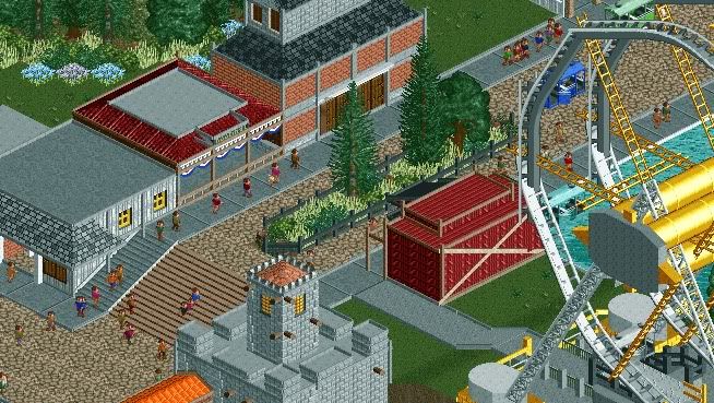
-

 That Guy
Offline
You're getting a lot better. Unless that part is unfinished, add foliage or mow the blank grass space at the ferris wheel exit or whatever it is.
One thing I seem to notice in almost all of your screens is the same path combination. Maybe it's just me but I've never really though the tiled cement and crazy path went well together...I think you'd be better off with solid cement or all crazy path. -
tdub96 Offline
Only complaint is the light green grass. I'd make it more of a natural green. Looks good. -

 F0ndue
Offline
One thing I dislike is the Ferris Wheel.I`m not sure in what time your park plays but I think it would be kinda cool to add a ferris wheel like that one in Belmont Shores by geewhzz and KONG.
 -

 Jaguar
Offline
You're getting a lot better. Unless that part is unfinished, add foliage or mow the blank grass space at the ferris wheel exit or whatever it is.
One thing I seem to notice in almost all of your screens is the same path combination. Maybe it's just me but I've never really though the tiled cement and crazy path went well together...I think you'd be better off with solid cement or all crazy path.
It is unfinished, another thing, I will have new path soon enough. Thanks for the comment.Great improvement. Your architecture is starting to look great!
Thank you, that seemed to be my biggest flaw.keep at it buddy!
Will do.Only complaint is the light green grass. I'd make it more of a natural green. Looks good.
I will try.Yeah I`d say get the Long Grass by K-Dog.
I'll look at itDon't make the park too large, remember that SFGAM is right around the corner

But Great America, let alone the Six Flags title doesn't exist yet.
That's pretty nice.
Thank youOne thing I dislike is the Ferris Wheel.I`m not sure in what time your park plays but I think it would be kinda cool to add a ferris wheel like that one in Belmont Shores by geewhzz and KONG.
Well, it takes place in the late 50's. I actually never liked that ferris wheel though. Thanks for the comment.Great. I love that white-fence building.
Glad you do.
Thanks for the comments everyone. Just wondering, which would be better, a Scenic Railway or Flume?
Another thing? Is this quality accolade worthy? -

 J K
Offline
I think this will be a solid Bronze, silver if you can push your architecture into greater themes that look good. It's all about aesthetics my friend. Also Scenic Railway ftw.
 -

 F0ndue
Offline
Oh yeah make a scenic railway,haven`t seen one of those in a while,but I`d say remove the ferris wheel or replace it with a prettier one,I just can`t stand for it.Hmm,actually I planned to build a scenic railway too.Nevermind.
 -

 posix
Offline
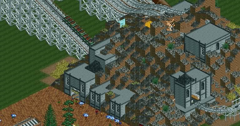
Jag, can you tell me what it gives you when you clutter all these little rock objects? I don't want to sound disrespectful, but I just don't see why one would do it. It doesn't look good to me at all. You use them so inflationary. It's like a nasty skin disease your park has, and it covers it everywhere.
It looks to me as if you have way too little concept for rides and what their features are to even get ideas of how to design them. And while it works for some players to create something nice by just building randomly and following certain rules of harmony subconsciously, I'm sorry to mention that I don't think it at all works for you.
Apart from the rocks, I want to mention that the line you have created with path at the end of the rocks looks razor sharp and just hurts. I suggest you give it a softer transition by connecting only the ride entrance with path, allowing for some more space in between, or adding overhangs to hide the line. -

 That Guy
Offline
While it's great that you're using a theme, it doesn't really seem to go with the ride...what seems like a family wooden coaster has a very dark theme, I would imagine a dark colored steel coaster being in place of the current ride.
 -

 F0ndue
Offline
Yeah,remove the mountain and make a nice station building.BTW is that the so called scenic railway?Oh and could you show some more pics of the woodie?I really liked the custom supports.
 -

 Splitvision
Offline
I dunno. You still mix the wierdest ideas with each other. A woodie housed in an odd fortress built into a square-based volcano-like mould of rock (what is that yellow stuff meant to be BTW?) and all this with that brick path in front of it? It's good to have ideas, but I still get the feeling that you don't think twice about stuff. I mean, why not put the Statue of Liberty on top of that volcano, colour one part of the fortress pink and have an UFO crash-landed in the middle of the street? I'm sorry but that's just the level of randomness I feel this to be at. And I have to agree with J K - while I'm really one to appreciate extreme landscaping, if done well, these superficial, unflowing collections of jagged rocks just don't work in my eyes. As said, it's good that you have unique ideas going on but you need to develop a feeling for the right time to use the right ideas.
 Tags
Tags
- No Tags

