(Archive) Advertising District / Chicago Forest Park
-
 11-December 10
-
 Jaguar
Offline
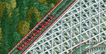
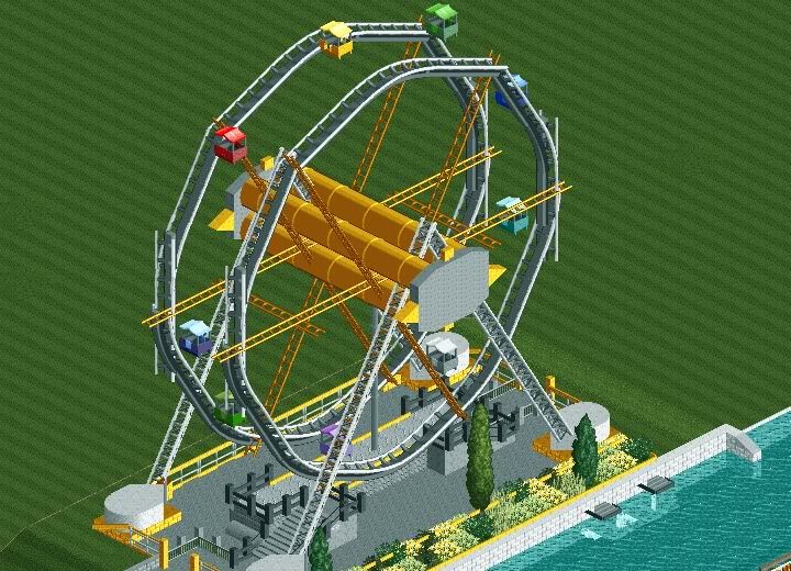
In 1910, a carousel was built on a small plot of land, which would later become a forgotten amusement park. Bought in the 1920's by a young entrepreneur, the park build a scenic railway and a beautiful ferris wheel. The park suffered financial problems in the great depression and closed down in 1937. After the war, it reopened and ran until 1979, where it met it's demise. The park fell into disrepair and in 1993, the rotting remains of a once great park were sadly torn down and scrapped.
-

 BelgianGuy
Offline
OK wow you've imporved in a very good and aesthetic way jag congrats on that one
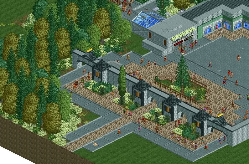
Only thing I don't like is the colours of the foliage, the lightgreen you're using looks pretty dead to me if I might say so, try to use a more "lively" green and also some nice fences wouldn't hurt you either.
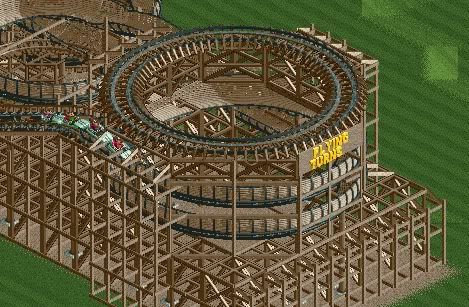
I like the flying turns concept thingy but makes sure you get rid of the old supports underneath the custom ones, Also footers come to mind
in the third screen, try to make your architecture more intersting by adding more levels and depth to your buildings because now it are basically coloured boxes that have an extremely flat facade, it tends to look boring so try to give them more shape and details.
Anyway I think you've improved a lot and I hope the advice I gave actually helped you.
-BelgianGuy- -

 Dotrobot
Offline
I'm sorry. but that ferris wheel is just not very.. realistic. A giant wheel with so little cars, and it's very glitchy. If it was less glitchy it'd be okay.
 -
 F0ndue
Offline
I really like it,except the feriss wheel.The scenic railway looks nice from what I can see!Keep it up and good luck!
 -

 robbie92
Offline
Try suspended monorail cars for the ferris wheel. They'll fill the gap well and are pretty close to the original ferris wheel's gondolas.
That being said, this is looking quite nice! In the foliage, maybe change the pale green to the green that more closely approximates grass, and maybe add an overhang or two. Flying Turns looks great! -

 Kumba
Offline
The landscaping is awful with all the green, but the rest is great. Love the ferris wheel and the flying turns.
 -

 Austin55
Offline
^I agree with Kumba, the first 3 screens are all great, really improved, but your architecture and foliage still seem a little off to me.
That Flying Turns type ride is hawt though. -

 Turtle
Offline
Agreed, really nice flying turns screen. Just keep going man, makings of a nice park.
 -
tdub96 Offline
Yea this is much better jag. Just change the long grass color to a darker, more natural green -

 Faas
Offline
About the entrance again. It should be inviting for guests to enter the park. That isn't the case right now.
 -

 Jaguar
Offline
@BelgianGuy
Thank you for the encouraging comment.
@Dotrobot
Well, some wheels have a small amount of cars, and this wheel is maybe average size (125 ft), considering there are wheels over 400 feet tall.
@Live on earths ass
Thank you, and that woodie is just a regular woodie, not a scenic railway. Look forward to something in the future though.
@robbie92
Thank you, I have changed the wheel and it looks better.
@Kumba Austin55
I agree with both of you, my foliage needs work, but I am glad you like Flying Turns.
@pierrot Fr3ak Turtle
Thank you all for the comments.
@Fizzix tdub96
Thank you, glad I have improved.
@Faas
I agree, thanks for the comment, I am bad at entrances.
@Louis!
Thank you, the wheel wasn't the easiest thing to make. -

 Jaguar
Offline
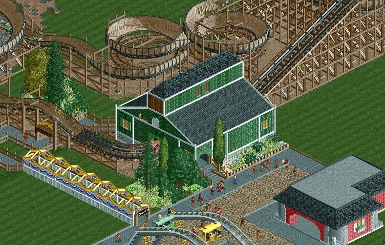
Thanks for the comments everyone. Glad you like these screens. Anyways, here's another screen of the Flying Turns.
-

 rctfreak2000
Offline
Curious to see the entire flying turns layout. Love the classic feeling though.
Completely agree with Liampe, however. The "realistic" approach to surrounding the queue with random fencing isn't translating well in RCT for you. Noble attempt, but in this configuration, it's not working.
Good work! -

 Faas
Offline
Cool coaster. Maybe do something to spice op the walls of the station a bit. And change the queue. You're really improving!
 Tags
Tags
- No Tags


