(Archive) Advertising District / Six Flags
-
 11-December 10
-

 Turtle
Offline
I'd have expected it to be much darker and more sinister to be honest... it's nice, but doesn't capture the feel I get from the cartoons at all.
 -

 Luigi
Offline
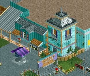
I like the first screen. In the second screen I do not like the roof. I like the facade, due to its shape and color, very much.
 -

 jusmith
Offline
Based on the screen That Guy posted I think you need to look at how to use foliage to create a better atmosphere. Your screen lacks any big looming trees, or even some overgrowth that I think would give a more spooky vibe. Also, the queue doesn't really look apart of the building, I think there must be a different way you can do it so it looks more integrated and still look like a haunted mansion. Little details like souvenirs, seating, and lighting would help too.
 -

 Turtle
Offline
Ah ok, I have no knowledge of real life parks, generally speaking... sorry.
Having said that, I still stand by my comments, i'd personally do it differently to make the theme more interesting. -

 nin
Offline
Yes, this seems like a more detail = more interest. The real life counterpart does have mroe detail than yours, even if it's a rather simple building.
 -

 Austin55
Offline
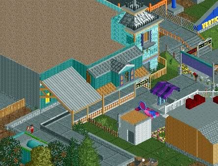
Thanks for the feedback. However, I should mention that it was not based of the St. Louis version, but rather the San Antonio one. I did this to keep from copying CP6, mostly.
It's kind of meant to have that "shoved in a corner" feel to it, as if you were looking at the real one from the troika ride from above ^.
Maybe this helps, plus gives you some more views of the area. All I really added were bushes and trim, but Im kind of at a loss for anything else. Also some unfinishedness around the edges.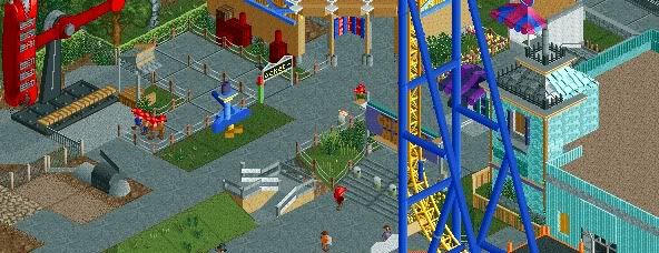
-

 Luigi
Offline
Yeah indeed, the roof texture is ugly as hell. I do like the facade of the building and it's colors.
First screen is likable as well, just needs some foliage, but thats probably the part you still need to do. -

 Dimi
Offline
The roof is ugly, the architecture is nice. I dislike the concrete paths, the minimalistic foliage and the colour clashes in the first screen. It would be so much better if it weren't that messy, it all really lacks cohesion.
 -

 Dotrobot
Offline
^^^^what the hell are you talking about?
what roof dude? There's like 5.
please end it with the 1~5 word posts.
edit:sorry dimi. post wasn't directed towards you :l. -

 Austin55
Offline
Lol, I bet everyone is talking about a different roof.
I dont know either, the tan tiles, the grey tiles, the black pirate roof, the metal roof, or the flat roof? -

 Dimi
Offline
The flat brown roof. The brown doens't fit and some details would be nice. But I don't really like the flat grey roof with the smooth texture either.
 Tags
Tags
- No Tags
