(Archive) Advertising District / Six Flags
-
 11-December 10
-

 Austin55
Offline
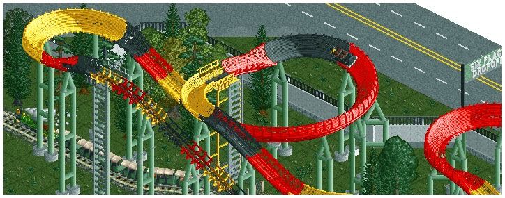
When The Park's original owners installed a unique intamin bobsled (perhaps purchased from an overseas park) they themed it to a northwestern bobsled runs. When Six Flags Purchased the park they dumped a few cans of paint on it and stole the theme from the same type of ride at Six Flags Over Texas called La Vibora. This made more sense, being a bobsled in a mexican themed area confused the guests some. Both La Vibora's are very similar, with the same name, layout, paint scheme, and both are at the front edge of the park with a train running underneath them.
-

 Louis!
Offline
Very nice. I dislike the colours, but then that's because La Vibora's colours are skanky. But yeah, a very nice screen, shows how much you have improved.
 -

 JDP
Offline
you should go with light red, tan, and black... it would look more like the ride itself rather then a bunch of bright random colors that came with the six flags one.
and i dont see the great improvement in this. supporting is wrong for one, the land has no texture to it (all grass), theres no bushes and everything looks incomplete like most of your screens.
-JDP -
 highroll3r
Offline
it looks ok but i hate those ladders people build. they just look to big for peeps and ugly. other than that the screen is ok. the supports are diferent but i think you could do with putting another one, perhaps diagonal just on the first turn after the pre drop.
 -

 djbrcace1234
Offline
and I dont see the great improvement in this. supporting is wrong for one, the land has no texture to it (all grass), theres no bushes and everything looks incomplete like most of your screens.
-JDP
I couldn't agree any more.
I want to like it, but it seems so rushed.
For one, your foliage just lacks identity in my eyes, for it seems crammed in and forced. Not to mention it is all grass, but even in real life, patches of grass are missing. These little subtle details can make or break a screen.
I could care less about the supports, because these do the job.
Keep at it, though. -

 Austin55
Offline
Thanks everybody, Ive taken your suggestions in and changed some things up.
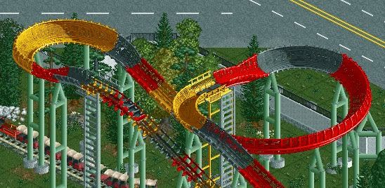
better? need more work? worse?
If somebody could maybe post an example of foliage if it still isnt working that'd be great, Im tottaly lost on that. -

 JDP
Offline
here bud. this is how cp6 told me to do foliage wayy back (mainly clumping the bushes with the trees). so just try and perfect it yourself and use these colors for La Vibora (tan, light red, black)... they look smoother imo
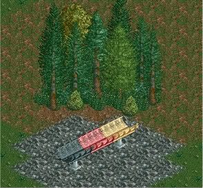
-JDP -

 Dotrobot
Offline
instead of zc'ing those bushes. try putting dark hedge fences around all the trees ALL THE TREES not just the border. personal preference though. I like this method because I hate alt tabbing out to my trainer.
 -

 Austin55
Offline
Alright I'll try that out. Im not a fan of the colo(u)rs of Vibora though, there a bit to dull for my taste.
 -

 K0NG
Offline
Laziness will get you nowhere...fast. Plus, once you start doing it often enough, it becomes second nature and you won't even notice that you're doing itI like this method because I hate alt tabbing out to my trainer.

-

 highroll3r
Offline
nice popcorn cart. i dont like the orange fence in the background. the gap between the two balcony fences is horrid. i like tomoawk.
 -
 Splitvision
Offline
A "trick" I often use when doing foliage is using this bush object:
It can be placed wherever you want without ZC, and it's great for making generic areas of foliage. It's like the dirt/grass land type, a good backdrop to all kinds of foliage. -
 jusmith
Offline
hahaha SSSammy so true! I agree with Splitvision. I also use the half flower object, which also is ZC. Colouring it green, I find it gives a nice contrast with the more generic bush types.
 Tags
Tags
- No Tags


