(Archive) Advertising District / Workroom
-
 03-December 10
-

 pierrot
Offline
'
pierrot
Offline
'[font="tahoma"]Ekirra
Experience in the Forsaken Ruins[/font]
slightly unfinished
LLLL -

 Chrixz
Offline
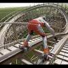
Stunning work love the landscaping and that spinning wildmouse cart which is meant for pushing the rapids forwards. Very nice detail, also love the drowning funky monkey
-

 Cocoa
Offline
pretty cool. just make sure that you fill that green space with foliage and scenery, as it looks horribly bare right now (especially for a jungle). Don't be afraid to use some actual trees as well.
 -
 RCT2day
Offline
Anyone notice the usage of the volcano object to make a cleaner transition from grass to the tree or to the rock wall? That's brilliant.
 -

 Liampie
Offline
Good work on the rocks, the spinning coaster car, the vines, the drowning ape and the customized flowers. What I like most in this screen, however, is the brilliant subtle mix of plants you used for the trees. There's more to the trees than just the usual jungle bush stacks.
I can't say I like the station... -

Airtime Offline
The spinning coaster car above the whirl pool is a great idea but I feel like that looks more like one of those large turbines that brings the water to the top of the lift and not so much like something that creates waves or whatever.
I also really like the gorillas walking the vines, another good idea. -

 pierrot
Offline
just make sure that you fill that green space with foliage and scenery, as it looks horribly bare right now (especially for a jungle). Don't be afraid to use some actual trees as well.
thanks guys, that's a good point. I'm still struggle with fucking trees, it's really hard to pull off overgrown feeling but also keep clean.however, is the brilliant subtle mix of plants you used for the trees. There's more to the trees than just the usual jungle bush stacks.
thanks posix, I quickly lost all interest in the RCT2..Love to see your LL spirits are up again pierrot.

FINALLY! SOMEONE NOTICED IT! LOLI also really like the gorillas walking the vines, another good idea.
-
 Corkscrewy
Offline
Holy shit... That volcano object to smooth out the rock face is fucking brilliant..
 -

 Midnight Aurora
Offline
Eh, you've done better. I see the thought process behind all of it, and it's amazing as always... It's just not pretty, and that's enough for me to dislike it.
And I'm glad that somebody is finally making use of my ideas, even if it is 6 years later. Moment of realization: I'm old.
EDIT: It's the land tiles I don't like. I'm not sure what you could do to make it better, but I'm having trouble seeing contrast of the extreme height elevation, which is the greatest strength of the screen. The plant overgrowth, I would say, is my favourite part. There's just nothing that shows me that it's high above everything else. One suggestion is to use a plant like the bullrush only at ground level so you can clearly see one type of foliage is at ground level and one in the trees. The other problem I have with the screen is that there's no color. The benefit of having a very plain area like this is that any small bit of color is going to naturally jump out at you. You're not taking advantage of that, -

 pierrot
Offline
'
pierrot
Offline
'[font="tahoma"]Concrete Jungle
with 'proper' progress![/font]
Astronaut : Huss Jump II
LLLL -

 pierrot
Offline
^^ ah, thanks for the criticism MA! I'm quite surprised it was rarely used btw.
* this will be the last screen from CJ -

 Louis!
Offline
YOU WERE MEANT TO USE THAT HUSS JUMP ON THAT COLLABO
Really nice, possibly too much on all the grey texture though. -

Airtime Offline
Pierrot. That is by far the best screen you've ever posted I think. Absolutely love it.
I do have to wonder though, it does seem like there's no vines around ripping up the place?
And what's with the floor of the Huss Jump? Surely it should all be the same floor, unless it's been ripped up a little? -

 nin
Offline
It's great to see a big, fully-realized screen like that. I love the paths and everything, but I don't like that chain link fence used everywhere.
 Tags
Tags
- No Tags

