(Archive) Advertising District / Workroom
-
 03-December 10
-

 Liampie
Offline
No, I think the parking lot is going under the coaster...
Pierrot, I'm not sure about the rapids part. I like the idea, but next to a parking lot just seems like the wrong location to me! The rest is great of course.
-

 pierrot
Offline
rly?just to let you know, the clock objects are animated. over excessive use of the object may cause lag on your computer


yeah it will be weird, but don't worry, rapids part is location at 'lost there funtion' zoneNo, I think the parking lot is going under the coaster...
Pierrot, I'm not sure about the rapids part. I like the idea, but next to a parking lot just seems like the wrong location to me! The rest is great of course.


-

 djbrcace1234
Offline
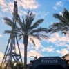
I really don't like that such a beautiful flyer is built over a parking lot. I for one don't want to be riding a flying coaster staring down at cement, yet alone it makes the park look tacky and cheap. Just me, though.
 -

 That Guy
Offline
^Agreed. Unless you're making a SF park, ditch the parking lot theme. You can do way better.
 -

 JDP
Offline
yeah and the hundreds of thousands that rode s:uf at sfgadv agree...I really don't like that such a beautiful flyer is built over a parking lot. I for one don't want to be riding a flying coaster staring down at cement, yet alone it makes the park look tacky and cheap. Just me, though.
...fail.
oh and that guy, you probably never ever heard of this coaster but it has awesome themeing...

-JDP -

 That Guy
Offline
oh and that guy, you probably never ever heard of this coaster but it has awesome themeing
I'm just saying it would be a whole lot more interesting for him to make a good theme, since his skills and innovation are obviously good enough. -

 coasterfreak101
Offline
^^Superman has grass underneath it - that picture looks to be taken in either winter or very early April when the park opened, so a lot of it looks pretty dead. The only time you really pay attention to the parking lot next door is when you're going up the lift - and that'll be solved with the addition of Chang.
Scream, on the other hand, is terribly tacky and just plain ugly. And, with this being a flyer over just a parking lot, I don't think that guests would be too thrilled with the view. Just a grass plot would be better, honestly.
However, the supports and the lift look fantastic! I love this entire topic, pierrot, you've got to be one of the most creative minds playing this game! -

 Wanted
Offline
Hey JDP, we are a COASTER COMMUNITY...using these real life examples of the GP enjoying shitty theming for a parking lot coaster is pathetic. Ditch the parking lot theme. You can do better than that.
 -

 coasterfreak101
Offline
Isn't the point of advertising here to get feedback? He doesn't have to agree, or to take it at all. Pierrot, if you're happy with your product, stick to it!
 Tags
Tags
- No Tags


