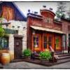
(Archive) Advertising District / Universal studios Sidney
-
 27-November 10
-

 gijssie1234
Offline
heey guys ! , the park is making some progress.
i'm building pease by pease, so here you see how new york will look like!
-

 chorkiel
Offline
I like those buildings but maybe new york isn't the best name since new york is rather famous for it's incredibly high buildings rather than those small buildings you made.
 -

 Midnight Aurora
Offline
Ridiculously good, man.
(If you're only going to talk about how the screen isn't finished, we heard you say it already. fuck off.) -

 Dotrobot
Offline
That's what new york architecture looks like.
classy corner houses and compact townhome/apartments. -

 leonidas
Offline
Your lay-outs are just as dynamic as the method of building.
The architecture is on the spot, I thought of NYC right away.
It's detailed yet not dramatic.
I worry about your attitude though, you don't seem involved in the comments of others, so why post your work? There's a whole discussion going on here, but you don't seem to care, Nor do I see any change in presentation or building, some admire that kind of stubbornness, but I don't, unless you tell us what principles you're holding onto.
Sorry for being this harsh, and it might all be just a
language thing. If that's the case, ignore all I've said.
This is looking insanely good though!
PS: Your way of building, with it's realism, detail and flow
could really flourish within RCT3, think about it. -

 gijssie1234
Offline
Hi ,
-- i'm not allways responding to comment's because most of them say it's not finished and i'm nevver gonna get it done, But i do, it only will take a time.
And i'm really glad with the people who like it.
I don't have always the time to play this game, i've got a live ouside the game like.
Work , school, friends , shopping and that stuff, i'm doing a study for home styling, so i have to make verry much projects and stuff.
now lat's go back to the game.
what did you guys think about this xD

-

 leonidas
Offline
That is genius!
Some risky colors, but they make it fresh and exciting.
I'm not sure whether the New York theme will work next to a lake
for some reason.
Those boat-dock-thingies look extremely good. -

 coasterfreak101
Offline
^^I mean, New York City and the surrounding area is kind of built on the water...
This looks absolutely fantastic. I'll never get over how great you are at this game. -

 Cocoa
Offline
those buildings are looking a bit little... although very nice, they need some more space for bare walls so the windows don't seem too cluttered.
 Tags
Tags
- No Tags


