(Archive) Advertising District / Universal studios Sidney
-
 27-November 10
-

 h3r3stheKrak3n.
Offline
 Other way round here. Like the coaster, but I'm not a big fan of the castle colours. But it looks kinda impressive, so I'll give my final thought when it's finished.
-

 disneylandian192
Offline
The castle is looking fantastic, my only thought is that the ride my be too close to the structure to make sense, then again clearly you have a plan which I trust will turn out much better than this unfinished screen. I like the layout, very flowy. Not sure how I feel about the head-chopper directly under the start of the lift, but I could grow to like it. Is the map size a secret until the release? (Fingers crossed that there is a finished release)
 -

 chorkiel
Offline
Since RCTHolland doesn't work anymore at all and my hopes are fading.
I'll comment here what I wanted to post on RCTholland (translated ofc ):
):
OMFH THAT IS AMAZING ! c:
I love the castle though I want to know how the screens will work out when finished and how they'll connect to each other. -

 CoolCody
Offline
I hope you don't hit your max object limit
this is a very awesome well themed park you got going on here, can't wait for more updates -

 wildroller
Offline
This whole park just looks incredible, even with the unfinished screens. Seeing the screens come together like this is quite inspiring! Don't listen to the guys wanting finished screens, keep doing what you are doing! Also, to be about the 50th person, watch that object limit!
 -
 gijssie1234
Offline
uhm so how will i begin...?
i've been verry bussy with sgool the past time , so now i'v got some time i will get rct2 back!!.
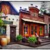
Here the final design of "Battle Star Galectica" duelling coaster.
sorry it's not done yet but iv'e got verry much inspiration at the moment and there will come many cool details at the park !!
enjoy!

-

 Louis!
Offline
I still think you are one of the more talented members at this site. I love your work.
 -

 Turtle
Offline
I just don't like the coaster colours, but I understand they may need to be that way. Everything else looks so clean, it's fantastic.
 -

 posix
Offline
As much as I enjoy the screens, I just can't suppress the concern that you won't ever finish this. So the whole feeling of anticipating the park that I will get to open sometime in the future is not as real as I wish it would be.
 -

 Pacificoaster
Offline
You seem to have a grasp with much of the custom scenery, however I haven't even seen one finished screen from you.
 -

 Steve
Offline
I agree with posix and Pacificoaster. You are amazing at building technical buildings and other things like those docks there, but at the same time I get the feeling posix has about worrying you won't finish. I just hope your way of building doesn't affect your motivation. Still, great work so far!
 -

 Cena
Offline
What am I looking at? A boathouse-storage thing near a lake, with a big block of concrete in it, with a red and blue coaster on it that are dualing?
It depends on the path blocks that are gonna use between the boat house and the red facade, but if you don't choose the correct ones, it will color clash horrible, I think.
Still waiting on a finished screen btw... -

 Chocotopian
Offline
I’m always impressed by your screens. Regardless of the content (which is almost always intriguing), the way that you continue to post in this fashion, despite comments requesting complete screens, is admirable. You have got your own building style and your own posting style, neither of which I think you should give up on. I am sure that once you do complete something it will look fantastic, and the incompleteness of these screens keeps my anticipation up.
About the latest post, I really like the openings on the roofs of the... boat-shed? Nice use of that green too. -
 Timothy Cross
Offline
^ Disagree completely. He may have his own building and posting style, but what it shows to me is a lack of patience. It's good not to build things one at a time, but in his case it seems he simply gets bored of something and moves on rather than having a proper building order and criteria.
 -

 Chocotopian
Offline
Hmmm... perhaps. I see your point, FantastiCo, but I imagine this style to come from having certain ideas in his head that he has to get down in the RCT world, i.e. he imagines something that he wants to build (whether this be an actual structure, a coater layout or even just a certain type of deco on a shop front) and builds it there and then before the thought’s gone. I think the patience will be a virtue when it comes to filling in the very large gaps.
 -

 Timothy Cross
Offline
Not so sure, maybe planning is an issue here. His building seems random. Getting an idea out of your head doesn't necessarily mean having to put it on the map (though this works in some situations). He could do other things to preserve his ideas before building. Though, with the way he's going, it doesn't look like anything is going to be finished here, and certainly not a full map. He would have to have, for lack of a better term, the patience of a saint to go back and finish all his abandoned construction.
I just think he needs a better understanding of grasping a full picture. Looks like he's starting massive projects. Think he needs a complete mini-park under his belt.
 Tags
Tags
- No Tags


