(Archive) Advertising District / Universal studios Sidney
-
 27-November 10
-

 K0NG
Offline
As much as I enjoy following the progress of this, I'm disturbed by the fact that it seems as though the finished product will feature empty walkways and riderless coasters......which would be a shame.
 -
 gijssie1234
Offline
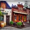
heey everyone, here just a little update, the New York part of the park just start.

but what color is better suited to the corner house ??? please help
(on the back ground you see the biginning of the Spiderman ride).
From a other site>
And some extra's of the entree.

-

 J K
Offline
It's all incredible and starting to come together very well. You also seem to be working fast for such detail. Keep this up.
 -

 Splitvision
Offline
I'm impressed by your building discipline, making the buildings first and the roads later. I always kinda do everything at the same time. It all looks quite promising, it shall be interesting to see where this is heading.
 -

 Louis!
Offline
It really is amazing at how you can build like this. It's so inspiring.
Oh and the first colour for the building. -

 posix
Offline
I tried to build like this before and had like 30% of a solo done, but in the end it didn't work out. But it seems to work much better for you. Good luck!
 -
tdub96 Offline
I just don't see how amazing this is. I like that he's showing each stage of building, but I dont understand all the awe in this. It is really good, dont get me wrong, but i dont see the spectacular-ness of it. Like i said, really good, but I must be missing what makes this exceptional. To me, its good architecture and solid coasters without anything finished. Ah, well, I'd love to see this develope, though. Its a great start, keep it up. -

 Louis!
Offline
^It's because it is a really incredible way of building, it shows that he can clearly see what he wants to build and can invision the whole park/area and just build. Not many people can do what is happening here.
 -

 Cocoa
Offline
I prefer the orange the best.
I agree, what you are doing is incredible. I just get lost if I plan so much... and your architecture is phenomenal. -

 gijssie1234
Offline
i will give you some hinds,searh for the Scooby Doo car close to the mummy at universal studios..... and there is a King Kong sign. [google maps/ google earth] good luck
-

 RCTFAN
Offline
The screens just get better and better, I too wish that I could build in this way.
Is this going to be peepable? -

 Cena
Offline
Gijs, in alle eerlijkheid, kan ik deze screens zeker weten waarderen, maar ik zou graag, ook al is het maar een kleinere verknipte screen, graag een screen willen zien waar je meerdere gebouwen op hebt staan, met wat peeps erbij als dat kan, gewoon om te zien hoe je de atmosfeer aanpakt, dat is graag waar ik benieuwd naar ben ... Hoop dat je dit kan meenemen in 1 van de komende updates. Voor de rest ziet het er zeer geinig uit, maar begin ik me toch echt af te vragen hoe het eindresultaat eruit ziet. Succes met je park
-

 Dark_Horse
Offline
This is looking really nice, gijs. It will be on my parks to watch in 2011. I really wish you Dutch boys would post an English translation for those of us who don't know Dutch.
 Tags
Tags
- No Tags
