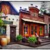
(Archive) Advertising District / Universal studios Sidney
-
 27-November 10
-

 RCTNW
Offline
This has a great feel to it already. Not too many parks can show this much of an incomplete screen and still have quality that shows so much. Going to be fun to watch this. Keep it up!
James -

 In:Cities
Offline
i love it, but i feel that it is a little small.
thats just personal taste though.
nice work! i'm looking forward to seeing this completed. -

 gijssie1234
Offline
heey every, i'm just start whit building the Canopy flyer ride from universal studios Singapore whit my own touch.
i hope you like it

Extra >>>>>
-

 pierrot
Offline
block around the tree is seems to
blocky and use too many diagonal
I think it need to make more fluid
-

 RCTFAN
Offline
Most promisng park in the Ad District. The planning and execution is very exciting to see!
 -

 Steve
Offline
It does look great and I love seein' this progress, but the JP building looks waaaaaay too small. The actual building in real life houses 3(?) floors, a food court with tons of seating, and museum pieces of fossils, etc. I think it could be worked on, but the quality is undoubtedly still there.
 -

 Cocoa
Offline
if this is a full size park you better watch out for the data limit! but nice work still...
 -

 gijssie1234
Offline
just a little time ago they start to build the entrance.
You can see the ticket shops and info centres.
I hope you like it.


-

 nin
Offline
It's crazy how similar our styles are, but I can't be amazed by a few half-finished buildings and some footers for an archway.
 -

 robbie92
Offline
^I agree 100%. I honestly could see you and nin making something together and we wouldn't be able to figure out who built what until you get to the foliage. It's cool to see your process with this, but some finished screens eventually would be nice, even those with as much content as the paramount park you posted a topic for a while back.
 -

 gijssie1234
Offline
i understand, i and nin are both building on a Universal studio, And even i think how similar our styles are.
But when it finish you will see more differences
And the next time you will send some more finished sections. -

 Steve
Offline
He could send this into the site unfinished and I'd still vote it for a gold. Its looking great!I cannot WAIT to see a finished screen. Those pillars look really cool so far.
-

 disneylandian192
Offline
heey every, i'm just start whit building the Canopy flyer ride from universal studios Singapore whit my own touch.
i hope you like it

Extra >>>>>
This is looking great! I'm so intrigued by your method of building, it makes these unfinished screens work. One question however, did you offset the two domes on the Jurassic Park building on purpose? One is 1/4 tile closer to the edge than the other one. Other than that, I can't wait to see some finished screens.
 Tags
Tags
- No Tags


