(Archive) Advertising District / Universal studios Sidney
-
 27-November 10
-

 Fizzix
Offline
What you've built is just incredible. However, I would suggest adding some depth to the bay, it looks a little off all the same depth.
 -

 chorkiel
Offline
With this level of detail, I'm gonna have to nitpick on one thing.
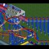
I don't like how those brown things (to the right, near all the blue fences) don't fit each other, they aren't going smooth just block-block-turn-block. If you get what I mean.
Other than that it's superb. -

 coasterfreak101
Offline
I really do hope that these more finished screen really show up some of these people who keep complaining. Because this is absolutely stunning.
 -

 Xophe
Offline
SOOOO much better with paths! This looks amazing now. I have to agree with chorkiel though about the messy brown trim.
 -

 wheres_walto
Offline
I don't like that the vast majority of the roof textures are the same as the street, but I think it'd be excusable with HVAC and whatnot on the rooves. And also, I'm not a big fan of those dead trees, but that's personal preference.
Ultimately, this is very high quality work, unrivaled in detail, and I'm really reaching for any critiques to provide. -

 gijssie1234
Offline
i understand your opinion
 but still i will keep the roof textures en the brown block at the water site, (and not all the roof's will have the same textures.
Look at this new restaurant at the cityWalk Area!
I'm thinking to build something with Fast of the furious or the Simpsons in this area.
And in front of the cityWalk there will come the entering area.
-

 leonidas
Offline
RCT2 has always been something on itself, but this is so close to reality,
I can almost see it being real. The level of detail is extraordinary.
You have a huge sense of realism. This is amazing.
Keep it coming, I love it all. -

 prodigy
Offline
Please finish this gijssie and you will be my absolutely favourite parkmaker, infront of CP6, RRP, 5dave, Steve, gee and Robbie!!!
 -

 Liampie
Offline
Just noticed that the paths have the same texture as the flat roofs... I suggest using a darker texture for the roofs. It'll make the paths stand out in a good way.
-

 Cena
Offline
Well, let me get this straight first. Gijs his technical level is very high, and because of that, I judge it like that. But while I find this a complete mess is because It seems to be missing objects (deco objects at ground level being the prime example), then the awnings that dont cover the entire facade, because he choose to use 1/16 tower colums, (you can still fit the awnings that are half the size next to it). I think Gijs knows this himself too, and therefore added those ugly flowers at ground level to cover it. (which only looks good from this angle, not from a different). Another thing that irritates me, is the glitch with the crown mouldings (I believe I even made those objects), just under the roof top.
All by all, just go for a different solution with the colums that go from base floor to first floor. You cant make them perfect unless you want to make new objects for it. Because you can put the half awning pieces (from Kumba) in there, but then you create new glitches with the colums itself. You can fix it with a combined objects, that is made of both, but I dont think Gijs would be willing to give up an object slot for that.
Here is my explanation Nin.
My advice would be, reconsider the colums and fix the glitches.
 Tags
Tags
- No Tags


