(Archive) Advertising District / Thrill Point Worlds of Adventure
-
 01-November 10
-

 Louis!
Offline
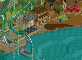
What I don't get is that the station's roof and the trackitecture roof essentially both simulate the same thing, a curved roof. Yet one is made with track and the other with objects. Why?
The one made with objects looks great, so I don't understand why you would make the other one trackitecture other than to use trackitecture. But why bother when you can clearly make the same thing look just as good (if not better) with objects, which you've proved with the coaster station. -

 BelgianGuy
Offline
to explain part of the messyness, the theme requires it in a sense where I want to make it look like parts where made over time and added over time, patchwork on walls and such so hence the textureclashes and such, also the roof is a part of the idea of the messyness
 -

 AvanineCommuter
Offline
I love the color of the roof and the curve of the roof, and I agree that you should stick to either trackitecture for both or just custom for both. Unique buildings, love the shape! The building on the bottom right doesn't look as nice.
 -

 tyandor
Offline
Most of the screen does nothing to me, but damn the upper right part is damned nice. It oozes with atmosphere.
One small note though is the big wooden wall that seems a bit disrupting with it's surface. -

 Steve
Offline
Not the biggest fan of that last one. Obviously it shows skill but there's three different path textures, the tunnel for the coaster looks kind of thrown together, the diagonal wooden fences are horribly made (sorry K0NG(?))... I dunno. The forms in the architecture are nice but then again I'm not a big fan of the textures.
I do like that patch of foliage with the grey bricks around it; thats something that really brings some atmosphere across. -

 AvanineCommuter
Offline
There's a lot to like about that screen, great atmosphere in the upper right corner, red umbrellas pop great, the patch of brown ground bothers me as it doesn't really make sense for me why that's there; The tunnel for the Immelman is fine imo, but there needs to be some fencing around the area surrounded by pathing. Also, the white fence on the very left is out of place and too bright compared to the deeper colored fencing around the sides, and doesn't fit well with the graveyard fence underneath imo. Bringing some of the atmosphere from the right side to the left side of the screen will help the area be more cohesive.
 -

 nin
Offline
It's not just you 'Cities, but me as well. I know it's meant to be messy, but it's not messy in a good way. Not an intentional messiness, despite you wanting to convey that. When people throw things together [in the case of this theme], I don't expect they're intentionally making it appear in a messy way, but simply in a way to support the structure they are building.
For example, people do not build favelas or ghettos to look like favelas or ghettos, but to provide a sense of security and shelter, all while using whatever materials they can get their hands on. -

 Cocoa
Offline
that middle building is gorgeous. but the left side could do with some interesting stuff too. maybe make a cool ruined building around the vert. drop's tunnel entrance like on sheikra?
 -

 BelgianGuy
Offline
some new stuff I whipped up today, rerouted a few paths in asia wich made that section smaller and less monotobne for the entire park...
good news I had new room for an entire mini theme!
got 2weeks of off work so expect this to move faster in the coming weeks, maybe even finished... -

 Nitrous Oxide
Offline
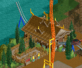
The only thing I really don't like is the supporting. I know Intamin added the extra supporting on their Impulse Coasters in the past few years, but to me it looks a bit odd in RCT. The last connected support seems a bit close to the track. Possibly just the execution is off and could look better.
I really like the station there though. Queue seems a bit boring though. -

 Liampie
Offline
That looks quite good, except for the colours, which are awful in my opinion. And I'm not even refering to the impulse coaster. Track --> blue, supports --> brown (any shade). Trust me.
 Red would look good as well but that would look shit with the impulse coaster, from this angle.
-

 Fizzix
Offline
I am a fan of this station, I think it's rather nice. That is, if I could see it past the Impulse track. If this were me I would probably do something about that.
 -

 Louis!
Offline
The station for that ride seems way too big. It is nice however. But yeh, usually rides of this type don't really even have a station, normally just the platform and controllers box, with an entry and exit path.
But the station is nice.
 Tags
Tags
- No Tags

