(Archive) Advertising District / A little something..
-
 31-October 10
-

 J K
Offline
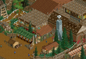
I really really like the screen. You've used those ruined flat roofs well here and I like the change in elevation to make it look simple but detailed at the same time (very hard to do in RCT). What I'm missing here is just some of the defining shapes (small wooden elevation change on the building with the Victorian railing and the curved arch on the front of the awesome wall texture) to the right of the screen that you've so clearly crafted, as all being coloured in the dull brown disguises them. The arch colour isn't the biggest issue but I think it needs something more in front of it but I think you should change that small section with the Victorian rail on top of it to a different colour to stand out a bit more.
Nitpicking right? Agreed! That’s because mostly everything else is perfect. I like the flash of grey in there so it doesn't make the screen look too dull and it gives you something else to process. I also like the foliage and the small turtle touches that elevate your work into legendary status. -

 JoeZia
Offline
Beautiful, though I find it to be more fit for the dump place until you get more screens.
 -
 Valp
Offline
Something about this screen reminds me of why I used to love playing and spending hours looking through others' parks. You were always one of my favorite parkmakers.
 -

 Comet
Offline
This makes me so happy, not particularly this screen
just the fact that you're doing a solo
Well, the screen makes me pretty happy too I guess -

 Faas
Offline
I don't really like it, maybe a bit too messy for my likings. I'm excited for more though.
 -

 dr dirt
Offline
Not feeling the rusty roof & orange-brown wood roof combo. Black roofs would look so much nicer instead of the orange-brown ones.
 -

 Cocoa
Offline
Disney, right? Maybe I picked a bad time to start my one...
but seriously though, excellent, but I feel that more red and brighter colors would improve it. -

 Turtle
Offline
Only thing I dislike is the queue line,please select another kind of path.
I've tried literally ever path type I have, I think this is the one I like best.. I know what you mean though, it is very brown..What I'm missing here is just some of the defining shapes (small wooden elevation change on the building with the Victorian railing and the curved arch on the front of the awesome wall texture) to the right of the screen that you've so clearly crafted, as all being coloured in the dull brown disguises them. The arch colour isn't the biggest issue but I think it needs something more in front of it but I think you should change that small section with the Victorian rail on top of it to a different colour to stand out a bit more.
Good shout man, i'll have a play around with it. I know this is a very brown theme, so it's quite difficult not to just make everything that colour.. i'm sure you're right though.Beautiful, though I find it to be more fit for the dump place until you get more screens.
You don't know how much i've done! Plus, I prefer the Ad. Life before the Dump Place was sweet.HOW little is it? xDBtw: <3
Not sure I fully understand you man? The map is just over 2 million square feet, afraid I can't remember how many tiles that is..Not feeling the rusty roof & orange-brown wood roof combo. Black roofs would look so much nicer instead of the orange-brown ones.
i tried black roofing; the problem is that those rooves aren't colourable (I have colourable versions of them in the bench, but they look shitty in black..), and the other rooves I do have don't have the texture I want. I see your point, but I quite like the colour of these.Disney, right? Maybe I picked a bad time to start my one...but seriously though, excellent, but I feel that more red and brighter colors would improve it.
Right! I have never done Disney, and seeing as i've been to Paris quite a few times now, I thought the time was ripe to make some of my favourite rides.
Just to let you guys know, although this park is loosely based on Disneyland Paris, I will be allowing myself a large amount of creative license when it comes to layouts, themes and suchlike.. This is not a recreation. Think of it as Jem does Disney. -

 RCTNW
Offline
Think of it as Jem does Disney.
That statment alone is enough to add this to my "Parks I must follow" list as this is going to be fun to watch.
The park looks to be off to a great start. Keep up the good work.
James
 Tags
Tags
- No Tags


