(Archive) Advertising District / Horsetooth
-
 16-October 10
-

 RamSam12
Offline
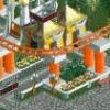
Over the past few months I have been trying to get back into RCT and complete another park. I restarted this as a smaller park, but I have no idea how long it will be until finishing.
Zamperla Rotoshake. I'll post one of the new coasters soon. -
 MikaRCT2
Offline
Looks good, but I think there are a bit too much Ruin Blocks. Maybe change some of them to landblocks?
 -

 AvanineCommuter
Offline
LOVE it. Detailed yet clean with beautiful composition. Colors work well here too! Keep this up!
 -

 Liampie
Offline
Very good. Love the path in front of the ride, the awkward texture on the shack behind, the spiral stairs (brilliant placing) and the overall realistic feel. You succeeded in making the most boring parkmaking style around not boring.
 -

 robbie92
Offline
That's amazing, Sam. I would say, out of personal preference, I don't know how I feel about the gold brick underneath the ride. I do love all the green, though!
 -

 Pacificoaster
Offline
The rock work could be better IMO. You only used three (1/4, 1/8, and small corner piece). The other two are really nice to use as well. Overall though, this screen is pretty solid. Keep it up.
 -

 gir
Offline
I really like the last two updates--it's parks like this that make me wish I had a copy of RCT2.
 -

 nin
Offline
Whatever you do, dont mix the ruins with the quarter-tile landscaping. It will
Never get your vision across as well as this. -
 disneylandian192
Offline
These last two screens are fantastic! Once your foliage improved every screen has as well!
 -

 RamSam12
Offline
Wow I didn't expect to get this much feedback from what is just another one of my flat ride screens. My days of using 1/4 tile land blocks for rock formations are over since the ruins look much better. Pacificoaster, I'm holding off on using any other ruin objects for now in order to save SS slots for future use since this is probably going to be the only big rock formation in the park.
 -
 Corey
Offline
Love it, love it.
Thought for sure though this park would be a tribute to one Baba Booey.
 Tags
Tags
- No Tags
