(Archive) Advertising District / Two screens today
-
 08-October 10
-

 Liampie
Offline
I think the blue is perfect for this purpose. I still hate the colour scheme though, but that's just my disgust of American patriotism.
The second screen is very nice. I suggest using another texture for the big roof, it blends with the paths a little. How about black? (No big deal) -
 Andrew
Offline
Now that I'm looking at these as screenshots and not as an actual park (and not being absorbed in actually building these things) I don't like the look of that roof at all and it will probably get an overhaul before release.
 -

 Brent
Offline
Your transfer track on the wooden coaster doesn't work... You need to delete half of it if you want it to at least look real without adding anything around it. Sorry, just my major pet peeve. Love the layout though.
 -

 nin
Offline
Why make so many topics for the same things? Regardless, it's all pretty well made, I really like it.
I just feel that the coasters could use more 'spiffy' entrances, like maybe making the Captain's resemble his shield or something, and the Hulk's being more, well, Hulk-ish. More oriented to the actual characters than just simple boxes or archways. -

 Jaguar
Offline
I didn't really get your question.
edit: I mean your previous question. 'Why?'
I don't get why you hate American patriotism. I feel I should be proud of having a good constitution, first men on the moon, and considering the millions of men (well, boys would be a better term, considering many were under 21) died fighting for this country, sacrificing their lives on the beaches of Normandy or reuniting the Union. -

 K0NG
Offline
^Dude, all non-Americans hate "American patriotism". They don't get it so...they hate.
Deal with it. It's natural to hate what you can't comprehend. -
 Andrew
Offline
People from any given country are often bothered by other countries' national pride, patriotism, or nationalism, just like fans of any sports team find the opposing fanbase foolish. The United States has a lot to be proud of, as does Europe, and neither would be what they are today without the other. The successfulness and righteousness of either are not mutually exclusive.
The American patriotism shown in that area of the park is line line with the character of Captain America. However, I tend to agree with Liampie that that color scheme/theme/attitude can be rather gaudy, so it isn't an extensive area. You simply cant have a Marvel lineup without including the Cap.
That being said, let's try to steer away from the obvious trolling. I don't want this thread to turn into a Youtube comment section. -

 RRP
Offline
I like the coaster in the first screen. As pointed out the transfer system doesn't work so id change that. Im also no keen on the fact that most of the ride is over water. I think it'd be better if you reduce the size of the water to a smaller lake,maybe having just one section passing over it as opposed to it just being under the majority of it.
The thing i dislike most about the first screen is that the whole landscape is brown dirt. Dont be afraid to use grass, I think if you removed the whole body of water and replaced it with grass maybe with a small 3x3 grass mound in there it would make the whole screen more natural rather than dull and dirty.
As for screen 2.Looks great to start.I really like the interest you've created with the path layout (big interesting building to look at along with smaller supporting buildings).You obviously have custom scenery on your bench.Why not import the custom support scenery for the b&m?
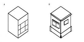
Overall id say you need to avoid using the pre 2004 LL tricks, they look silly now that people have thought about how things should really look (paint all the ground brown,path as a roof etc etc) and import some more custom scenery so you can add more dimension to you buildings

A) The buildings you have now B) with more depth -

 posix
Offline
First class feedback there rrp.
I quite enjoy the screens. The oldschool vibe never fails to excite me. -
 Andrew
Offline
Yes thanks indeed rrp.
I am slowly and gradually learning all the possibilities offers. I am still in many ways an LL parkmaker, but I am excited about the opportunities rct2 offers for theming. As I discover them and figure out new tricks, I keep going back over older areas in the park and redoing them. It's a slow an gradual process, but I'm hoping that by the time the whole park is finished, it has a unique style that NE isn't used to. Thanks for the tips.
As for the B&M theming, are you talking about the supports? I do have that scenery pack in my park, but I'm still trying to figure out how to use it in a way that fits my aesthetic. I'm working on a design with the sole purpose of learning how to use them in pleasing ways, but until I am satisfied with that, they probably won't appear in screenshots of the park proper.
Again thanks though. -

 Cena
Offline
I really like the screens, the blue could be changed but it is not needed.
Cena
Offline
I really like the screens, the blue could be changed but it is not needed.^Dude, all non-Americans hate "American patriotism". They don't get it so...they hate.
Deal with it. It's natural to hate what you can't comprehend.
Tell me, what is the point of spending billions of dollars on military personell and equipment, while the USA has the biggest debt any country has ever seen ...
And ...
What is the point, of invading other countries under the fake reason of 'terrorism' and to kill innocent people in those counties. The reason why the USA invaded Iraq in 2003 was that there were nuclear weapons. K0NG, they never fricking found one of those there!
So yeah, that is why the rest of the world hates the 'American patriotism', hope you understand it. -

 nin
Offline
What is the point of ridiculing the United States? If you don't like us then leave us alone.
Sorry Andrew, but I do get tired of others thinking they know how to run the place. -
 Andrew
Offline
It's ok, the thread was in danger of becoming relevant again. Most of the time the best way to deal with unabashed trolling is to just ignore it. Is there a function on the forums for just ignoring certain users and not have to see their posts? NE seems way more hostile than it used to be and it seems like some particular users are responsible for a great deal of it.
 -

 Ride6
Offline
Tell me, what is the point of spending billions of dollars on military personell and equipment, while the USA has the biggest debt any country has ever seen ...
And ...
What is the point, of invading other countries under the fake reason of 'terrorism' and to kill innocent people in those counties. The reason why the USA invaded Iraq in 2003 was that there were nuclear weapons. K0NG, they never fricking found one of those there!
So yeah, that is why the rest of the world hates the 'American patriotism', hope you understand it.
Tell me was that has to do with American Patriotism. I'm an American who loves his country that didn't agree with any of those actions, before, during, or now. Don't confuse patriotism with imperialism, militarism, war mongering, or shear stupidity. Despite what they would lead you to believe American 'conservatives' (otherwise known as oil pumping, bible thumping, money grubbing, backwards thinking types)are not in any way more patriotic that any other citizen. Quite the opposite. If an American ever claims to be a "real patriot" or "a good christian" they're usually trying to deceive you for personal gain. There's nothing patriotic or christian about it, but that's the sad truth.
Regardless these screens excite me mostly because the overall composition of how things are laid out shows an understanding that seems to have been lost lately. The way the 2nd screen is composed is incredibly good, and the only real niggle I have with the first is the scale of that lake and no supports in the pond keeping the wood above the waterline... Though that's just a lot of zero-clearencing and experience with custom scenery talking. You clearly have a good thought process about how you're working things out. Building your strengths in layout and then working through and flashing out the details. I'm pretty excited to see what turns out.
Ride6
 Tags
Tags
- No Tags

