(Archive) Advertising District / MCI at work
-
 26-September 10
-

 Welshcraft
Offline
The aqua coloured layout looks better then the grey and orange one, Just use Layout Two.
 -

 Dotrobot
Offline
Option 2 is way better. But from what i see it looks like the finale will be super strong. But i don't know much about coasters.
 -

 Fizzix
Offline
I like the second layout more too. Yeah, I would definelty submit this as a design, you might end up catching one.
 -

 Dotrobot
Offline
I like it. But you made the right choice of making this into a small park because the coaster is built WAY into the corner and would not have much potential at being a design.
And I love the fast paced action the schwarzkopf has! -

 MCI
Offline
@fizzix: I think I have no chance winning anything^^ Your Inferno was ways better and get 56%(?) I hope I get 45% or more^^
@dotrobot: I wanted to build a small park with only one "big" attraktion, not a "big attraktion" in a park^^ So It was my intention to put this one as close to the corner as possible.
________________________
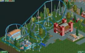
Another Screen today, I just finished the supports! As you can see, I build CSO suppoerts, but the rest will be NCSO (I think I´ll using one sort of cso roof and the pathes (and the lines at the parking slots)(more or less four objects + the supports)
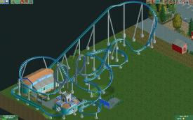
MCI -

 BelgianGuy
Offline
I'm sorry but the person saying this can get a design is wrong, this isn't nearly enough to get a design imo and it lacks a little extra to make it come to life more, add some more details and such to give it that look it has the opportunity to have...
 -

 MCI
Offline
@That Guy and SuicideCarz: ok, good to hear that the station is ok. There will be more nature soon, but I want to place the flatrides first before starting to finish the theming.
@Dotrobot: Would you be so kind to translate the words meh, eh and bleh for me? My english is very not the best and google translator don´t know these words
-

 MCI
Offline
After 5,5 month showing nothing in here, I decided to show you some pics off my newest Coaster.
It´s a GravityGroup Woody inspired by "TheVoyage" (how could it be otherwise^^)
Name: Whiplash
The layout and the supports are finished, the station is finished about 90%:
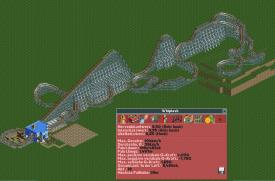
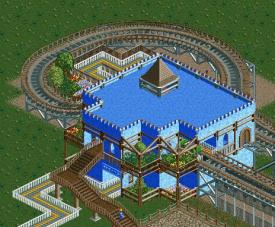
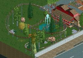
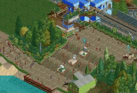
Furthermore I´ll submit a finished NCSO park in a few days. I showed some pics in the dump place, I think?! In case you didn´t noticed that, here´s a small screen:
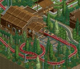
Gruß
MCI -

 Hex
Offline
I absolutely love the last screen. Don't change a thing on the last screen. The second screen is very good for unfinished. Also i rather do enjoy the layout on the GG Woodie there. Excellent work as usual, MCI.
 -

 Luigi
Offline
last screen looks great ineed.
The blue in the first two screens is a bit too bright imo. Your archy is just brilliant here. The lay-out is OK I guess, I only don't like how it goes through the lift-hill, it seems a bit forced to me. -

 MCI
Offline
Thank you!
@luigi: Hm, Does it look forced? Thats bad! I didn´t realize that while building the track. The Way through the Lifthill was not planned at all, It just happened xD
I have a question: I want it to be pepable, but I forgot all the shops, to sell food etc. and the toilets -.- Is there any way to import them belated (hope it´s the right word) into the bench? I dont want to restart the project...
Gruß
MCI
edit: A new picture is aviable:
 Tags
Tags
- No Tags
