(Archive) Advertising District / Montu - Busch Gardens, Tampa
-
 26-July 10
-

 K0NG
Offline
GREAT aerial there Phatage. Having never been within 2,000 miles of Montu I hadn't seen anything (not that I'd actually looked) so far that "explained" the layout like that. Makes me almost want to try my own hand at this impossible dream...
 -

 Midnight Aurora
Offline
Phatage = winner. The only layout I've seen so far that looks exactly like the original and still looks good in RCT.
 -

 Roomie
Offline
This is just as intriguing as the same conversation we had over Kumba
Phatage's does look as close as you can get... BUT strangely only because you had the overhead picture too.
if it had been on its own I would have said it was miles off... but it does seem right and I cant argue with a actual photo.
I've heard it used to have crocodiles under the ride somewhere? If so where were they? I dont remember seeing them when i rode it back in 2002 -

 Austin55
Offline
K0NG-You do realize that's just bing maps right?
Phatage's is a winner layout wise, but he is also the first person in this thread to get the colors right . -

 K0NG
Offline
^Since I'd done all of zero research on this, I'm just saying that it's the best image I've seen presented here. That's what I realize. And, that I've never seen a red x in my sig. Might wanna check your browser settings.
 -

 Louis!
Offline
The only thing I see with that version is the drop out of the zero-g looks awkward and doesnt flow from this angle. But form other angles it probably looks fine, so yeah, that's your winner there.
 -

 Wolfman
Offline
K0NG-You do realize that's just bing maps right?
Phatage's is a winner layout wise, but he is also the first person in this thread to get the colors right .
Not to be argumentative, but I got the colors right. I have since day one. And I like Phantage's version too.
Ok, in another park I created, just for this coaster, I started working out some of the details of the structures and scenery. (Based on Google Earth 360 camera photos.) I used footpath blocks in the center, but forgot to use extended gray tarmack to cover the gaps between the blocks and diagonal footpath.
The large ruin has two different wall treatments. For lack of a decent variety of Egytian Hieroglyphics, I was forced to use various stone, block or brick walls. (the lavender awnings and the rusty roof is the Montu gift shop.)
The back side is all the same size of block, but different colors. I like this version the best. The center larger path through the structure is the main entrance to the Montu Courtyard. The lower path is the exit from the attraction which walks people past the photo booth and the Montu shop. It hides two restrooms to the left, and the shops at the far end are invisible souvenier, clothing, hats, info...
Starting from upper left, Montu On-Ride Photo Stop, "Shifting Sands" children's "archaeological" sand pit area (empty,) Refreshments Stand (invisible food shops,) three midway games, (empty strucures.)
From right to left... King Tut's Tomb (Recreations of the objects found in King Tut's Tomb, (buried Crooked House,) Shops that sell Egyptian knic nacs, Hair braiding, wrappping and beading... (food court.)
-

 Dark_Horse
Offline
You're still going theough the Immelman inversion. You need to move the Immelman back more to let the diagonal pass between the loop and the Immelman. Other than that, your layout has improved a lot. On the first screen, you're missing a column next to the gift shop. Also, put some railings on the roof of the ruins. The roof of the gift shop needs to be much flatter/less angled. Looks like you are also missing a building on the right side of the girft shop. I don't see any resemblance between your King Tut's tomb, and the BGT one.
 -

 Maverick
Offline
And the land near the batwing should be higher than the land by the lift. You can see the elevation lines on the mechanical drawing.
 -

 Dark_Horse
Offline
^Noit only that, but Google Earth shows the elevation of the land under the station at 48 ft, while the batwing area has an elevation of 54 ft. Also, that shallow drop off the barrel roll looks ugly IMO.
 -

 Wolfman
Offline
As it is, I wasn't even sure if I wanted to use the colorable curved 1/4 tile block as I haven't done a detailed search for all the right objects. This was just thrown together from memory of what I saw on Google earth. Just testing the waters, and I found out I needed a lot more space. So far? Worth the while.
I think the columbs are too far away from the shops. That roof over the shops is too wide. I didn't notice that unitl after the post.
The Photo Booth is supposed to be a bit larger/deeper. It looks too small to me. So is the refreshment stand. But I do have to keep in mind that the shuttle driveway to the front gate & parking lot for the handicapped are right on the other side of a fence behind the shops along that side of the park. I plan to put a decent representation of that.
So now you can see that I plan to de the entire Egypt themed area. I'm just looking for a handfull of objects. A colorable school bus, and a landrover style atv, as the serengetti <sp> has SUV tours and those are right close by behind King Tut's Tomb.
Thanks for the tips! I'll start taking more detailed notes and using my Blackberry to snap photos of GE... (Google Earth.) and have a viewer of pics without having to reduce the game. -

 Maverick
Offline
Just a quick note: Should you decide to make "artist interpretations" of the ride, swinging the first loop to the left instead of the right could considerably compact your layout. Yours still feels a bit drawn out. I am liking the entrance area though.
IE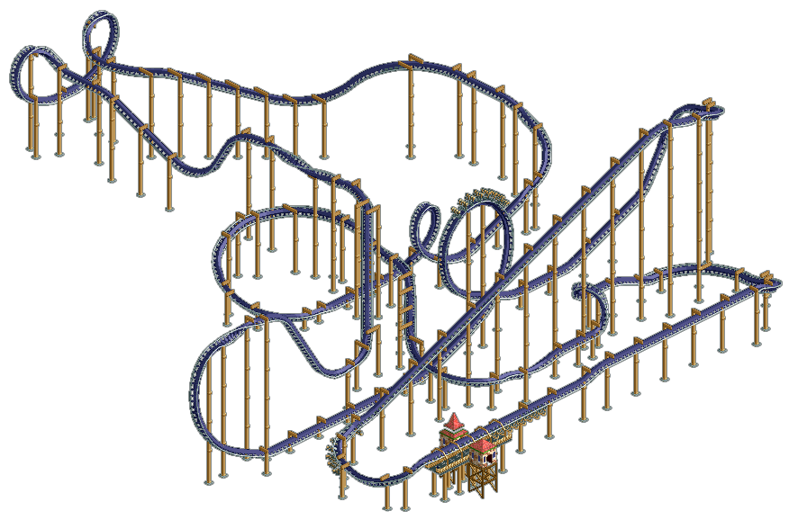
Phantage, nothing against yours, as I usually like what I see from you... but I just feel like the middle section looks better perpendicular instead of parallel. If I were to use your layout, I would almost want the batwing srtaight or 45deg from the zero-g roll. That 90 degree turn is really killing it for me. -

 Wolfman
Offline
It seems that there is a bit of a rub where the Immelman drops and where it drops after the helix. The two HAVE to cross somewhere. And it's right beneath the Immelman in the original blueprint. In the RCT blueprint, it's not altered that drasticly. So that means that the helix has to be brought a bit closer to the second loop so that the drop after the helix can be behind the Immelman. (In reference to the last image I had submitted.)
If there are no other issues, I'm going to make that adjustment. -

 John
Offline
@liam- except if youre kumba

Make no mistake, Kumba is just masking what would otherwise be a subpar layout with excellent theming and foliage. The accuracy of a recreation will always sacrifice looks, it's just that Kumba is doing a great job making up for that with all of the intricate details.
I really like Maverick's latest layout. It wouldn't change substantially if you reverted the first loop to go to the right, would it?
 Tags
Tags
- No Tags


