(Archive) Advertising District / In The Valley: A park by wasoe
-
 26-June 10
-

 wasoe
Offline
Hello all, seeing as I had a considerable amount of time without anything to do over the summer, I decided to begin work on a serious park in RCT2. It is an 80x80 map, so it's not too large, but large enough to contain what I want it to contain. Here is a glimpse of the design process so far:
I started by building the entrance area: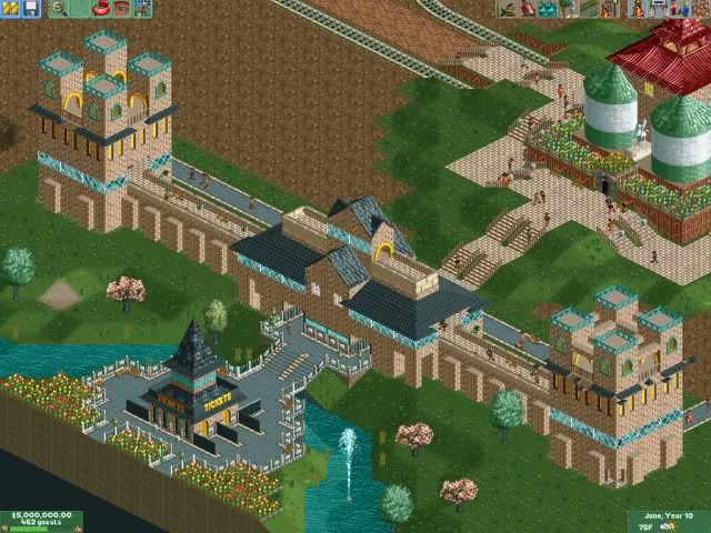
The water in this shot was originally going to be just a couple of ponds that decorated the entrance area, but those ponds have now become one of the ends of a massive river that meanders through the park.
That building with the cylinders around it in the upper right corner of the picture is the merry-go round building. I'm planning to tear that entire area down and rebuild it differently.
We now move to the first coaster built in the park, the Hyper-Twister "Firebird."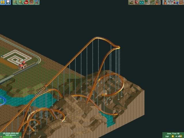
The coaster was built first, and the mountainous terrain sprung up around it. Here is the station I built for it: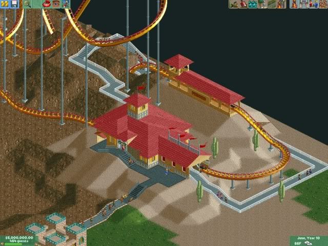
The same station, from the back: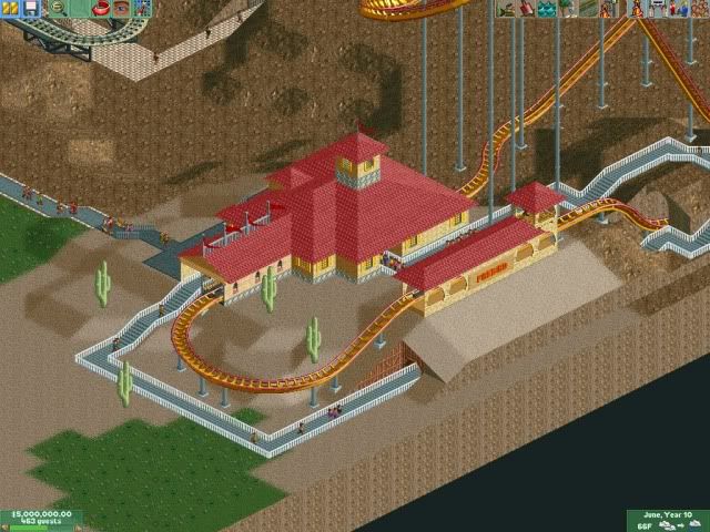
Firebird turned out to be one of my best coaster designs to date. It has 9.3 excitement with about 4.75 nausea. I'll post a screen of that later.
Now, we move to the other corner of the map, the design of which came to me in a dream. The vertical coaster is called "Cliffhanger:"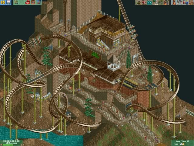
I feel I should note here that I plan to put in the majority of the foliage once all the rides have been placed.
Aerial view of the area: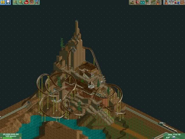
"Cliffhanger" also turned out to be one of my best coaster designs, with 8.6 excitement and relatively low nausea (if I recall correctly.)
The third coaster design is nestled in the center of the park. It is a simple corkscrew coaster tentatively called "Shooting Star." It is pictured here: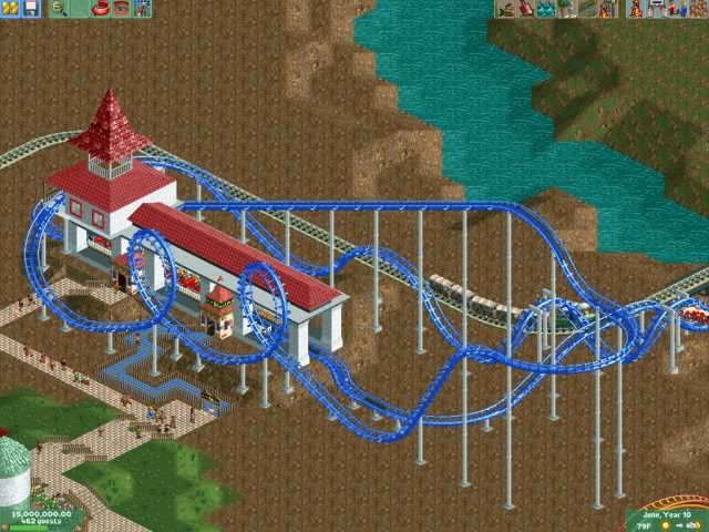
Feedback is largely appreciated. If any of you know how I can own all the land without having the game stop letting guests enter my park, that would be largely appreciated as well.
Also note: None of these areas are even close to being finished, so if you have ideas as to what to put in, please don't hesitate to suggest them. -

 Wanted
Offline
It looks really cool! Just add more "things" around the rides and it will be even better.
 -

 h3r3stheKrak3n.
Offline
I like really much.
The interaction between Rides and guests/buidlings are awesome. It has a realistic touch, although (somebody answer if this word means what I think it does) it's nowhere near a realistic Park. (mountain - vertical coaster.... &....)
Keep it up, it looks interesting! -

 wasoe
Offline
A couple more screens. First, a railway station building:
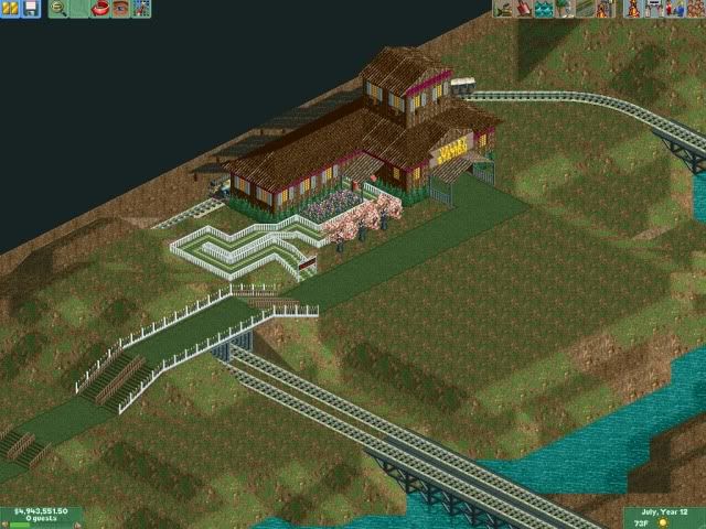
Second, a fountain just inside the entrance. The posts also serve to hide the entrances and exits of two underground train stations: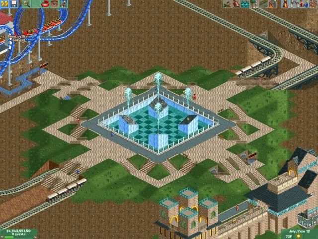
-
 GigaG
Offline
Good job, but that corkscrew coaster has an issue. There is a short steep slope before the large first drop. Fix that.
 -

 magmoormaster
Offline
I think it looks pretty good. Cliffhanger and Firebird look like they would be a lot of fun to ride.
But I have a few issues with it.
The paths for both Cliffhanger and the fountain look really chaotic. It just doesn't seem to flow all that well. For the fountain, I would make it [mostly[ flat. You have it dip around the corners and I just don't like that. An then on Cliffhanger, you have the 2 parallel paths but one's a littler lower than the other. I think it would look better if they were all at the same elevation.
And lastly, I think that Firebird's station building is a little short. Maybe make it taller? -

 wasoe
Offline
Latest additions: Another corkscrew coaster with a winery theme. It's called "Corkscrew:"
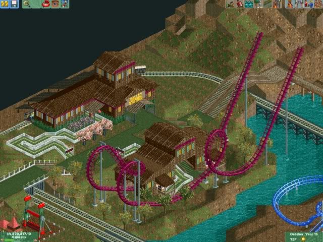
The top spin in the lower left will be enclosed in a building soon.
Here's the winery area from a different angle: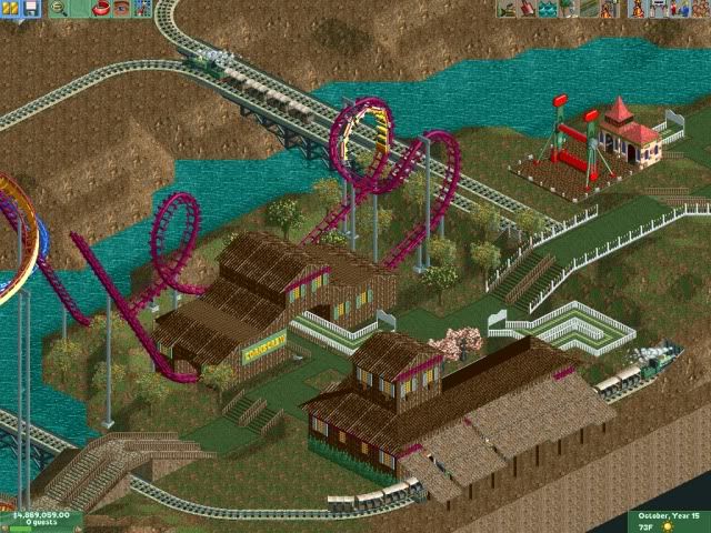
I've made some minor improvements to the cliff section. Cliffhanger's impressive stats are included: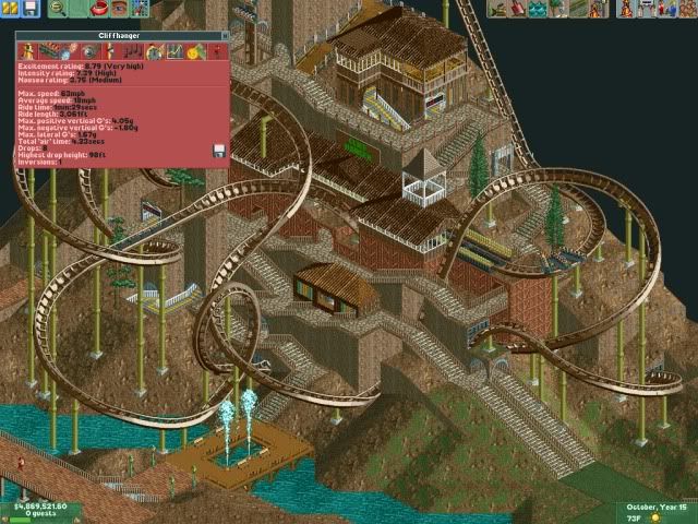
I've begun construction around the fountain: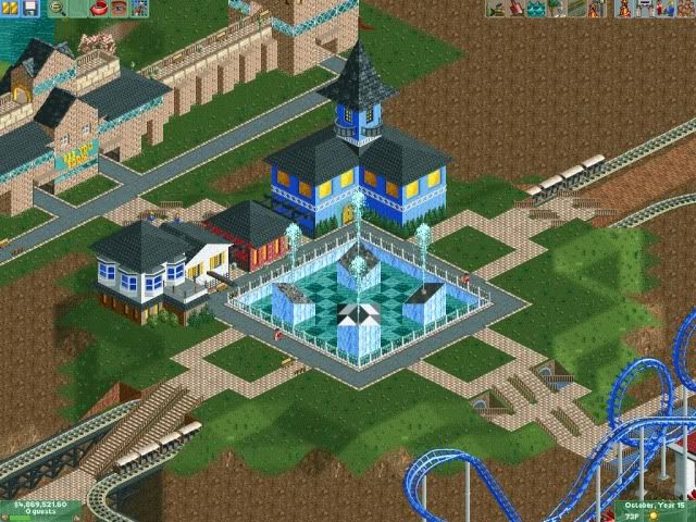
And here is the same installment from a different angle: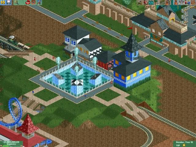
Back to work! I hope to have made significant progress by Monday. -

 wasoe
Offline
And more progress! The fourth coaster, a wood giant named Serpent, has been built. It stands 140 feet tall, and features a sick helix element:
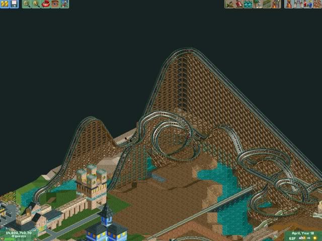
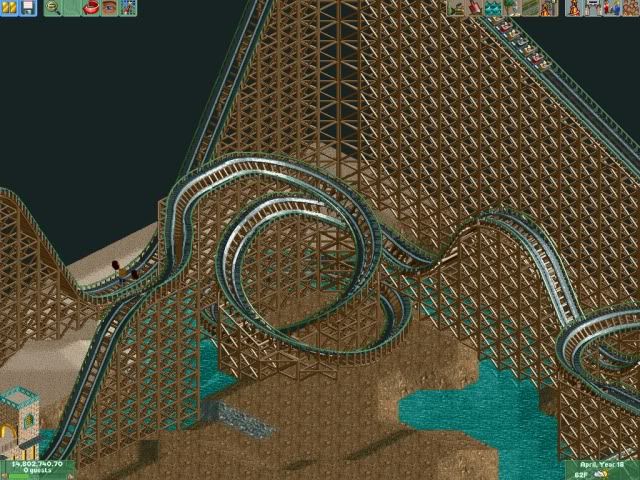
It's currently awaiting design tweaks, and the station is still a work in progress. -

Rhynos Offline
With the bottom of the first drop and the two hills after that, I would smooth out the transition from 60 degrees to 0 degrees with one more piece of 30 degree track in their on both the top and bottom of those hills. Just seems to change angle too abruptly for those kinds of speeds and the aesthetics of it on this scale make it seem too sharp at the tops and bottoms.
Basically, they look like shark teeth and I think it would look better (and run better) if they looked a sine graph. -
 LDW
Offline
Wow, this is a park I'll be checking up on. I especially love your screen with corckscrew and the railway station; it's just got a wonderful atmosphere (even better with peeps!). Are you making theme areas? I think that work work well in this park.
-

 Cocoa
Offline
that is a cool helix but the transition in/out of it could be better flowing and less clunky.
 -

 wasoe
Offline
I redesigned the first hill and helix entry for Serpent:
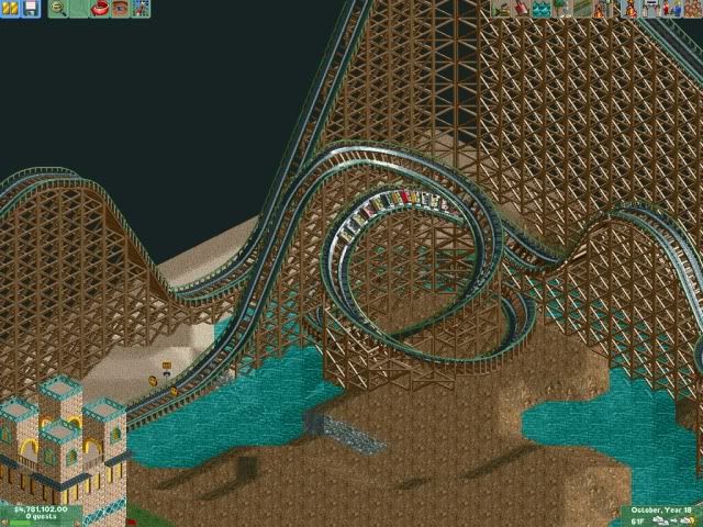
I also added in a loop: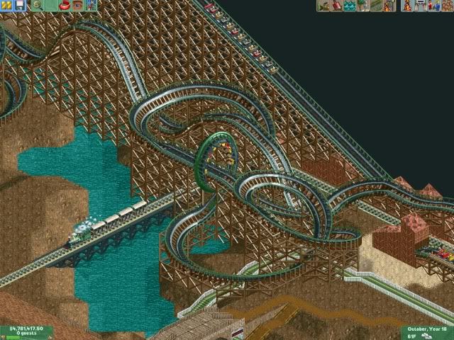
And a barn has been built near the winery: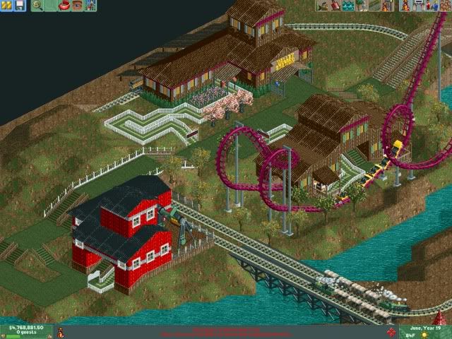
-

 fraroc
Offline
Very good park BUT,
You do know that we call the Hyper-Twister a B&M Hyper
and the Vertical drop coaster is the B&M Dive Machine
And the Corkscrew coaster is the Arrow Development Multi-Looper
And the shuttle corkscrew coaster is known as the Vekoma Boomerang.
Use these coaster terms, they will make this advertising look so much more realsitic. -

 fraroc
Offline
can SOMEONE PLEASE delete the second post? It was a screw up because of the stupid refresh button.
 -

 SSSammy
Offline
those things don't even matter fraroc. you should have kept the funky path at the vert coaster. it gave a nice aesthetic. i think you'll do well in time.
 -
 Maverick
Offline
It looks as though you put the buildings between the entrance and fountains. Would you want to block that line of sight?
 -

 wasoe
Offline
Very good park BUT,
You do know that we call the Hyper-Twister a B&M Hyper
and the Vertical drop coaster is the B&M Dive Machine
And the Corkscrew coaster is the Arrow Development Multi-Looper
And the shuttle corkscrew coaster is known as the Vekoma Boomerang.
Use these coaster terms, they will make this advertising look so much more realsitic.
If I were to do this, there'd be people giving me shit about the coasters not being realistic and not following the footprint of some existing B&M, Vekoma, or Arrow model. I'm approaching this park strictly from an RCT2 design standpoint. I build the rides, and I adjust the land and build scenery around them.
 Tags
Tags
- No Tags

