(Archive) Advertising District / Unofficial Quest for the Best
-
 20-June 10
-

 wheres_walto
Offline
Just submitted mine, a bit rushed at the end but let's just hope for the best..
 -
 MF72
Offline
Maybe it's just me but I reallly HATE that style of LL.
The "track as supports" style. Don't play dumb you know what I'm talking about. I am just saying it isn't exactly "pleasing" to my eyes.
Hmmm.
I must say, though, it does look pretty cool. One thing I notice right away is that shouldn't the supports be on the inside of the track on the turns? -
 Wanted
Offline
Well at first I didn't use it......but then I put the supports on the ride and I liked it better. Fuck me I'm a hypocrite.
As for the supports being on the inside of turns I'm thinking of the ride as an experience, I would personally like to be flying towards the supports and then having a "near-miss" situation. -

 FK+Coastermind
Offline
Like the local for the coaster. well situated, kinda reminds me of Apollo's Chariot.
The trees that are a silver-green color seem to stick out weird. I like the idea of having that color in the forest, but maybe play around with which tree you use, there might be a tree which works better with that color.
the dead trees look out of place as well, but that might be part of your theme....like the coaster though, im a sucker for dark red anything...hehe
FK -

 Ride6
Offline
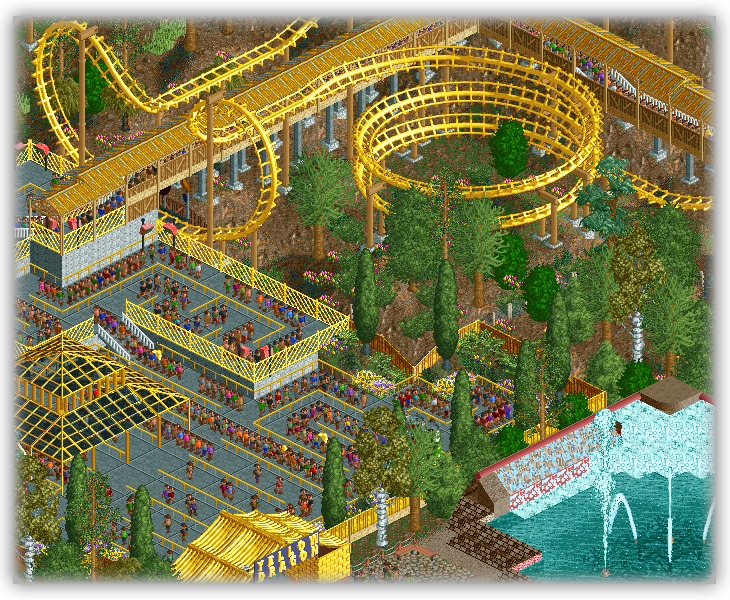
That's one hell of a long helix...
The colors are cool though. I'm surprised how the yellow just seems electrifying rather than annoying here... The black glass and the abundance of dirt rather than grass helps it maybe? I just know that much yellow seems like too much (logically) but works well here.
That fountain seems neat too.
Ride6 -

 Maverick
Offline
Yeah, but I didn't submit the open version, that's the one I let run here at work for a little while... 8cars Trams helped me a bit.
 Line fills right around 1000 (max?) and runs just over 2000 per hour.
-

 Turtle
Offline
THE most ridiculous umbrella i've ever seen. Colours are spot on though, funny; i'd have thought red, orange, yellow, lime green and purple would clash, but it looks great.
 -

 Louis!
Offline
Sammy as I said to you earlier, you really do have one of the best entries this round. You, along with Turtle and several others, hit the nail on the head with the sizing/idea of the contest.
Hopefully when people see how little is actually needed, next round we wont see so much forfeiting. -

 Wanted
Offline
I really hope you are kidding. If you look back at QFTBX SOME of the best rides were HUGE. For example: Corkscrewed's Paleos Bay Mine Ride and JKay's Buccaneer Harbor.
However, small is still good as well.Edited by Wanted, 04 July 2010 - 10:05 AM.
-

 h3r3stheKrak3n.
Offline
As a none-part-taking im just looking forward to see some of the best contest-creations I've seen yet I think...
Some screens were stunning. -

 JDP
Offline
Well sammy... this is a little taste of what I did have going.
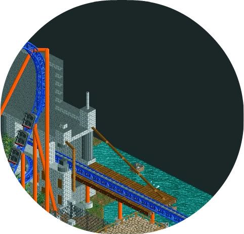
Obviously lots yet to do
-JDP
EDIT: I'm happy I didn't send it in now since you had a lot more completed then I did, and yours would have looked better over all. You had some really nice ideas and some daring moves in your submission that can help win you this competition. I'm sorry I couldn't give you a match but, hopefully this gives you motivation to continue building like you did in you entry. Good stuff
-JDPEdited by JDP, 05 July 2010 - 01:17 AM.
 Tags
Tags
- No Tags

