(Archive) Advertising District / Seaworld: Adventure Bay
-
 08-May 10
-
 K0NG
Offline
K0NG
Offline
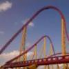
Ya know...a real, live female might eliminate the need for that.Yeah Spout? Maybe try Hydro Pump!!
-
 Austin55
Offline
I was thinking water spout, like the tornado on water, but yea, that name is pretty bad Belgianguy. I do like the way you set the spike over the water, the thing I liked about V2 in SFGAM was how it was placed above the lake like it is.
Austin55
Offline
I was thinking water spout, like the tornado on water, but yea, that name is pretty bad Belgianguy. I do like the way you set the spike over the water, the thing I liked about V2 in SFGAM was how it was placed above the lake like it is.
Either way, I cant wait to see this park released, it is looking seriosly awesome! -
 BelgianGuy
Offline
you're missing the point, its SPOUT!, not spout...
BelgianGuy
Offline
you're missing the point, its SPOUT!, not spout...
No I meant it to be the name of a water jet think "whales" and "water shooting in the air"
oh and the map size is 110x110 to answer your question liampie -
 nin
Offline
Still, it's pretty simple for a SeaWorld/Busch park. The chain has always been known for theyre unique, innovative names and while Cheetah Hunt is no good, Spout is even worse.
nin
Offline
Still, it's pretty simple for a SeaWorld/Busch park. The chain has always been known for theyre unique, innovative names and while Cheetah Hunt is no good, Spout is even worse. -
 FK+Coastermind
Offline
This all looks pretty awesome. I'm really digging the inlaid diagonal arches on some of those buildings, nice use of scenery.
FK+Coastermind
Offline
This all looks pretty awesome. I'm really digging the inlaid diagonal arches on some of those buildings, nice use of scenery.
FK -
 RCTNW
Offline
This is lookiong really good. It will be fun to follow this one. Is it peepable?
RCTNW
Offline
This is lookiong really good. It will be fun to follow this one. Is it peepable?
Keep it up -
 braztaz
Offline
I have to say that I'm looking forward to this release. All the roller coasters look interesting (as I'm expecting they're not copies) and the architecture looks phenomenal. Great work here.
braztaz
Offline
I have to say that I'm looking forward to this release. All the roller coasters look interesting (as I'm expecting they're not copies) and the architecture looks phenomenal. Great work here.
-
BelgianGuy
Offline
everything is peepable, I'm currently rethinking some stuff mostly regarding some additional flats and maybe a simulator like wild arctic so I won't have to do a lot of foliage where it would just be easier to do so, I think adding a few more rides and such will make this more a park in a way so stay posted...
-
 Comet
Offline
This looks great
Comet
Offline
This looks great
A few things though...I think the white on the objects in the woodie screen is a bit overwhelming, maybe add some gray accent to it. And the supports for the awnings on the path of the floorless screen look a bit flimsy -
Ruben
Offline
Can only say I'm looking forward to this release! Most screens have been really small, and I'm curious about how you fitted everything together and what it looks like as a whole. I can only hope it's as good as I expect when seeing the screens in this topic.
-
BelgianGuy
Offline
Don't call this an accolade just yet
I won't go and say it'll surely get that or something I'll just have to wait and see.


Tags
- No Tags