(Archive) Advertising District / Six Flags Santa Fe
-
 24-April 10
-

 RCTCA
Offline
That green somehow seems to work very nicely with everything. GREAT work, Robbie.
~RCTCA -

 Fizzix
Offline
^Yes it does. You're very skilled at choosing colors,and overall making the most basic buildings look great.
 -

 Midnight Aurora
Offline
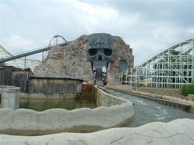
The colours sell it for me. Being that it's the "original" water ride in the park, I assume it's old, and that colour scheme is right out of the 60's/70's.
 -

 K0NG
Offline
but when he returns he returns as an RCT god.....

that's just magical, robbie.
Really, I mean...REALLY?
Make no mistake, I love most of robbie's work. But calling that screen "magical" and proclaiming him as an "RCT god"....maybe I'm missing something. But, all I see is an above-average player at best. Maybe I'm jaded by seeing what I build on a daily basis but, come the fuck on. And no...I don't have a jealous bone in my body...I just call 'em as I see 'em. -

 robbie92
Offline
Please stop K0NG... I don't agree with them either, but just let them have their opinions. People find your work to be "magical" as well when all I see is an above-average player "at best," but I don't question their judgement. It's all about opinions. There's room for more than just yours.
"Maybe I'm jaded by seeing what I build on a daily basis..." Oh, and stop being such a conceited bastard about your own work. We get it, you think you're the shit. Been that way ever since those obnoxious posts you had in the dump place a few years back. Grow up; it's not like you didn't have 50 years to do so already...
Oh, and don't take this too personally, "I just call 'em as I see 'em..." -

 Casimir
Offline
K0ng: I don't really want to bitch 'round anymore, so I'll keep it short.
You're wrong.
robbie: Great screen! Loving the foliage! -

 Dotrobot
Offline
K0ng: There's a million ways to say that politely.. Don't say it like an asshole. I know you're here to stay but please cool down.. O
Edit: O sorry in the midst of all this your screen got lost robbie. -

 J K
Offline
Like always Robbie I like your supports but as others said it's not as exciting as some of your other stuff. Can we stay on topic pleaseeeee.
 -

 RRP
Offline
As far as long flumes go that look nice. Taking the time to do the supports and stuff is commended. Not really much else to see or talk about though
 -

 verti
Offline
Log flume has a nice atmosphere to it, but there's really not a lot going on. You've shown better screens.
 -

 dmaxsba
Offline
It may not be much of a picture but I see a lot going on. All the great supports for the ride itself, the water return under the the drop (a very nice addition), great use of plants, and cool little shack under the ride. What is that building for anyway? A shop or a pump house for the flume?
Anyway, I don't see how anyone can find anything to pick on about this picture. Hell, the damn grass is even mowed. Hats off to your landscaping staff. -

 Wanted
Offline
I'm in between Kong and Sammy. It's nice. There is nothing wrong with the pic but I want to see something MORE! Perhaps quality can meet quantity and you can show an excellent largescale picture
-

 BelgianGuy
Offline
this is minimalism at a certain rate and I like it but I have a hard time loving it, as stated above you've shown better. also the screen looks a little dead if I might say this. Knowing this is a SF park I know there isn't a lot of theme to it but I'd like to see a little more detailed work concering the setting of the ride because it seems you focus too much on accuracy rather than aesthetic value and atmosphere, the screen isn't showing something that looks like a fun ride atm. it may need some more colour perhaps...
 -

 Dark_Horse
Offline
I'm kinda in the middle too. While it's charming, it's not real exciting. There's just nothing in there that makes me go WOW or catches my eye. I think that this being a Six Flags park should have nothing to do with lack of theming. Case in point: Typhoon Sea Coaster at Six Flags America.
-
 coasterfreak101
Offline
^Typhoon Lagoon was added before Wild One even got moved to the park, two owners before Six Flags. That's not really a fair case. Also, I live 20 minutes away from SFA, and that is the only legitimately-themed ride we have. Six Flags has really just recently begun striving to have its themeing match its coasters.
Robbie, I love just about every part of these screens you're posting. I don't show much, and I'm not anywhere near your level, but you're without a doubt one of the most inspiring builders on this site. Keep that up! -

 CedarPoint6
Offline
There's plenty of 'theming.' The surrounding nature in itself constitutes the theming of the ride. Take something like the world's first flume at SFOT or SFOG's flume #2-- both of these are just a flume ride through some trees with maybe a nice wood trestle structural support system in places. The supports on this remind of a classic older Arrow flume, perhaps-- or something along the lines of the Coal Cracker at Hersheypark (which is fantastic). The coloring is perfect for it. The only thing that I'd really consider is even more overgrowth since this ride would be buried in the history of the park. But this is really well done-- lack of any distinct 'theme' included. Keep it up.
 -

 Ride6
Offline
I think I must agree that more overgrowth (as CP6 suggested) would be terribly befitting of this ride, but certainly not entirely necessary. I may not see "an RCT God" but I certainly see well beyond an above-average player at work in these screens. Your taste and sophisticated understanding of how real parks look and 'feel' is certainly well beyond the normal. This is one of the few parks I can look at and really picture what it would look like from a guest's perspective, and more importantly how it would feel to be there. It reminds me more of Six Flags Great America (I've only been to SFA and SFGAm, as far as SF parks go) than any other park I've been at.
This screen, in and of itself, is not incredibly special. But I suppose an area like this at a real park wouldn't be mind-blowing to view either. However, this is very well composed, and I like it.
Ride6
 Tags
Tags
- No Tags


