(Archive) Advertising District / Six Flags Santa Fe
-
 24-April 10
-

 RCTNW
Offline
Classic stuff Robbie! You can really feel that this is indeed a SF park. Keep up the good work
James -

 robbie92
Offline
BREAKING NEWS Due to an unforeseen departure from the park's main designer and the leading members of the design team, Six Flags has sent the lead designer from another park in the chain, Six Flags Carolina, to continue minor construction of the park until the SFSF design team returns to New Mexico to resume regular construction.
 -

 Cena
Offline
Is it a guestspot by Cedarpoint6 or is it a duo now between you (Robbie) and Cedarpoint6?
 -

 Louis!
Offline
^Guestspot. It says until the design team return. (As in when Robbie can build on it again)
 -

 robbie92
Offline

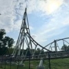
Conquer the Leviathan, only at Six Flags Santa Fe
Image is a copyright of Six Flags, Inc.
-

 Phatage
Offline
I really don't think you've captured it. For one is the actual trackwork, as what you are using right now has been used so many times in RCT to represent an overbanked turn, but this turn is definitely different (for one, its not supposed to be symmetrical). Structurally, I know there are a lot of limitations with the scenery available in order to literally make the ends of the bracing meet each other, but you can be more resourceful using things like mini-suspended coaster track for the diagonal slanted bracing. This will help with making the supports branching off of the center tower look more accurate and structurally sound.
 -

 geewhzz
Offline
^I said the same thing to robbie the other night and pointed out here:
http://rcdb.com/615.htm?p=779
that the entrance to the turnaround is more flat/raised than the exit and it gradually goes into the turn and the exit is like a dive downwards -

 Cena
Offline
^ It's probably not a recreation, because he has the train going threw the wrong direction as well ...
Screen looks awesome Robbie.
 Tags
Tags
- No Tags

