(Archive) Advertising District / Random Snippets...
-
 31-March 10
-

 disneylandian192
Offline
That's very good-looking. that coaster is positively Steveian though.
I'm debating posting an overview shot to show how different the two layouts are. Anybody think this would give away too much? -

 Cena
Offline
It's not the layout;I'm debating posting an overview shot to show how different the two layouts are. Anybody think this would give away too much?
- colors
- foliage
- roof on path
- over all atmosphere -
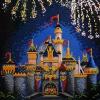
 Pacificoaster
Offline
As Cena said. It's not so much the layout. It's the mimicked techniques from steve. The arches in the awnings over the queue, the brick work, the station, etc. Not hating because Fenrir is one of my personal favorite designs ever posted.
-Pacificoaster -

 disneylandian192
Offline
I've been thinking a lot about the similarities to Fenrir, and have begun by changing the colors of the track. This makes a big difference I feel, not just in the comparison between Fenrir and this project, but dramatically changes the mood and atmosphere of the park itself.

Edited by disneylandian192, 06 May 2010 - 03:56 PM.
-
 Splitvision
Offline
Yeah that immediately took away a major portion of the "fenrir-look-alike" feeling. But the deep red doesn't fit this all very well IMO; maybe a duller colour could work?
 -

 Cocoa
Offline
I'm always a big fan of solid colors. Looks cool, but it maybe makes it show up too much and detract from your scenery.
 -

 nin
Offline
Yeah, the more I look at it, the more I see that you may have to adapt the surrounding colors a bit to blend in with the coaster more, but so far it's looking great.
 -

 BelgianGuy
Offline
I'm sold on the red, keep it but make your surroundings up to par with the intensity of the colours of the coaster
 -

 disneylandian192
Offline
Splitvision: I couldn't agree more! The coaster pops so much more now.
Nin: I will, thanks.
Liampie: I felt the same way for a few hours, but eventually got used to it and now I love it.
Nokia: I won't, thanks.
inVersed: It is, isnt it? I changed the rails to the deep red and it helped the track not look so shiny.
BelgianGuy: I agree. I'm currently working on ways to tweak the surrounding plant life and archy to help even out the colors. It's definitely a work in progress. -

 nin
Offline
I can really tell you're breaking from the Fenrir influence, nice job. I would sort out the tall footer, it's all in the way of the peeps route. The tunnels beneath the path are a nice touch as well.
EDIT: Wow, commented on the wrong screen. Lovely foliage in this one, and like Liampie said below the trick-track has a great placement. -

 J K
Offline
Yeah it takes a strong parkmaker to produce good work influenced by another design and do it justice but It takes an even stronger player to want to change work to prove you have your own style.
Anyway Yoda will pipe down. Nice screens, loving the red.
 Tags
Tags
- No Tags
![][ntamin22%s's Photo](https://www.nedesigns.com/uploads/profile/photo-thumb-221.png?_r=1520300638)


