(Archive) Advertising District / Starpointe
-
 16-February 10
-

 Splitvision
Offline
I love the tipped bucket
Me too. Great execution. But as louis said it could maybe be just a bit thinner. -

 Louis!
Offline
I'd go with B. Overall it's the best execution of the three.
C is just too bulky. A doesnt have as good a shape. So yeah B is much much better. -

 Pacificoaster
Offline
B with a lil more curvature . . .
P.S. If anyone believes they have a better grasp on a tilted bucket, please feel free to post what you have come up with. All help is greatly appreciated. -
 AvanineCommuter
Offline
I really like the water park areas in the recent screens. Great style of park making, it's clean and detailed at the same time. I find myself getting too cluttered all the time but this is just great!
 -
 djbrcace1234
Offline
It's nice to see that you used the impulse track rather than the giga track, because the arrow looks very, very nice!
 -
 highroll3r
Offline
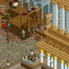
While Intimidator looks plain and boring, Gyre looks fantastic. The first screen seems too bare and theres no colour. Too much grey i would colour the supports differently or use a different path. The second screen is great. I love the Arrow supports and path interaction. The planter shape in the middle of the path looks awsome too. It does look too bare on either side of the path though. More trees or elevation changes are needed here. Looks great apart from what i mentioned above.
 -

 BelgianGuy
Offline
I like it but the screen of the arrow would be SOOOO much better with some land elevation in the part where the foliage is
 Tags
Tags
- No Tags

