(Archive) Advertising District / Starpointe
-
 16-February 10
-

 imawesome1124
Offline
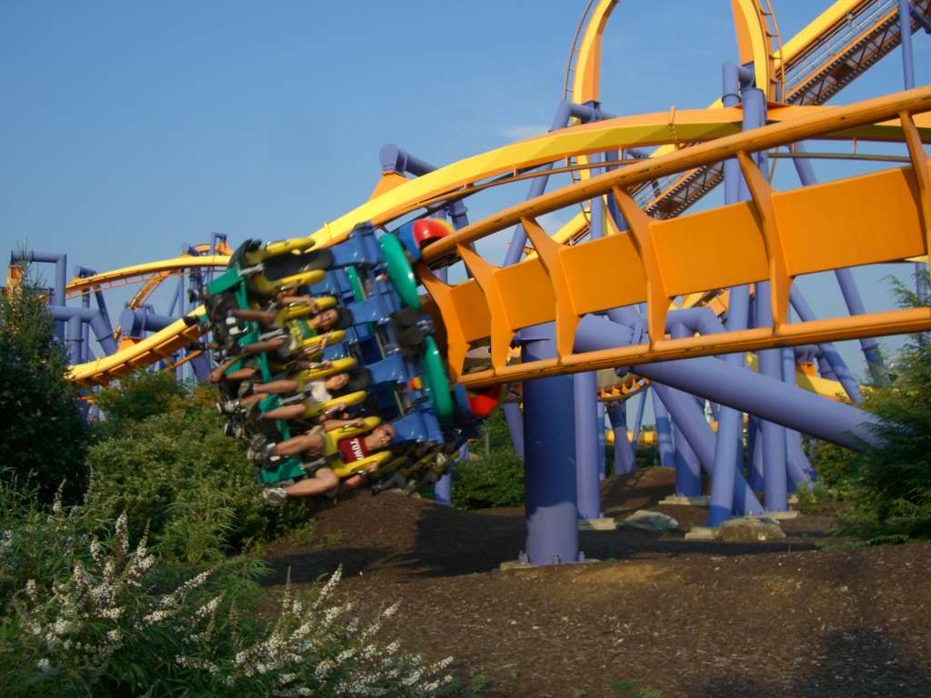
Simple and almost perfect. I echo the comments about changing the dirt to grass and removing the oak tree.
 -

 Steve
Offline
The brown dirt is really refreshing, I think. Also didn't even notice the large oak tree until someone mentioned it so to me, that means it should probably stay. I'm glad you're still plugging away at this dude. I know its hard after working on DAW, but at least you have some room to get a little crazy like with the architecture in the bottom right. Keep it up and get this done before the school year starts back up again!
 -

 6000000flags
Offline
If this is a new coaster (last 1-2 years) the dirt is entirely justified. Rides don't become overgrown in a few years.
 -

 Maverix
Offline
Then maybe the red dirt? If that's what you're going for (with the dark mulch) I think that could look better as the mud looks like mud in game.
 -

 imawesome1124
Offline
If you're going for that Talon look then you should add some more bushes and shrubs around the outer edge of the fence.
 -
 ScOtLaNdS_FiNeSt
Offline
So shit. a certain buckeye would wipe the floor with you.
Start improving seriously....
Serious note: I really like it, If your going to stick with the dirt then you should go with some small
foliage. Get rid of that oak tree.
Nice little element you have there and i can peice together parts of the coaster(corkscrew)screen a while ago, Just after this brakerun.
As everybody else im looking forward to this. -

 Fizzix
Offline
I love it, although I'm in favor of adding small foliage either with or without the Oak.
 -

 dr dirt
Offline
I think more foliage framing the coaster would make the screen look nicer.. but then again its hard to say without seeing the entire area.
 -

 RCTNW
Online
This is looking exceptional Justin! At this point, since the feed back is about even on the foiliage, just go with how you feel it should be.
Keep up the good work!
James -

 Turtle
Offline
Colours are perfect, composition is perfect. The bare grass could possibly do with something slightly more interesting, even if it's just grass foliage? Looks like a really elegant and smooth ride, too. Can't wait to see more of this.
 -
 highroll3r
Offline
nice screen man. i know you can do better but its still nice. as for the mud i think you should put more foilage around it. again theres no levitation and those supports need to come in on the inside. nevertheless this is an epic park. will be one to remember.
-

 Insanity
Offline
Seriously. you went from "not bad" to "HOLY SHIT"
I haven't been this excited for a park since SFC and SFSF -

 BelgianGuy
Offline
I think your greatestasset in skills is making something ordinary like path look damn good!
 -

 Xeccah
Offline
You've touched an area that I believed would not get it, but holy holy shit dude. The atmosphere is goddamn amazing .
 Tags
Tags
- No Tags

