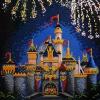
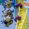
(Archive) Advertising District / Starpointe
-
 16-February 10
-

 Dimi
Offline
Such an improvement, I really like like how you show the old and new screens along with each other! The colours are beautiful indeed. The second screen is perfectly balanced.
 -
 rct2isboss
Offline
The first screen is decent but I think some details to the building could be added. I love the second screen though.
 -

 Liampie
Offline
The first screen is decent but I think some details to the building could be added. I love the second screen though.
Quoting this for the sake of quoting. -
 ScOtLaNdS_FiNeSt
Offline
The 2nd screen is a new and improved version of the first screen rct2isboss
 Brilliant work man what an improvement
-

 JJ
Offline
Vast improvement, the former was dull boring and lifeless, I really enjoy the updated version
-

 Steve
Offline
I'm so glad you redid that building. It looks stunning. I don't even think it needs flashing lights, it's lively enough on its own. Well done, dude!
 -

 posix
Offline
Yeah. Grey is the most lively colour of all, right?The colors are beautiful!
I think it's decent, but it's also pretty boring really. Where are your own ideas in this? It all looks like maximum replication. -

 SSSammy
Offline
with all the grey, it needs either a difference in height, or a different path type to break the monotony.
 -
 highroll3r
Offline
itll have to be path type and elevation change by the inversion. dig out under the path around by there.
 -

 Steve
Offline
posix and Sam, maybe I'm reading your posts incorrectly, but this is a before and after thing. Pretty sure the second screenshot is a revised version of the first.
 Tags
Tags
- No Tags

