(Archive) Advertising District / Six Flags Fiesta Mexico
-
 12-February 10
-

 coasterfreak101
Offline
Anything that's dirt is incomplete. Anything that isn't dirt is 'complete,' unless revision is necessary. Which it probably is.
Constructive criticism is very much appreciated! I'm not looking to be perfect, but I'm looking to have fun and to get a little better every step of the way.
--------------------------------------------------------------------------------------
Six Flags Fiesta Mexico
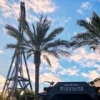
The walkway to the park between the lots on either side. These lots will most likely be expanded later on.
The entrance to the park. In front are ticket booths, and behind is the actual entrance.
The small town that greets guests after the entrance and leads to the larger town circle.
The higher-class town circle, which serves to anchor the entrance area.
--------------------------------------------------------------------------------------
Prospective Areas:
-Entrance/Town Circle - a higher-class town overlooking the river.
-"Old Town" - an older Mexican town, i.e. robbie92's SFSF entrance area.
-"Southwest Territory" - a western area, as seen in a number of SF parks.
-"Gotham City" - pretty self-explanatory, and very necessary.
I think that one more area would round the park out, and so look for another to be added to the list. Any ideas, throw 'em out there. Also, if anyone knows of any older Mexican towns, please do give me a name. I'd much rather give "Old Town" a real name, as that's really only a placeholder.
Hopefully this turns out to be a nice park. It's my first real attempt at a full one, so we'll see how that goes! -

RMM Offline
blahhh... every building looks exactly the same. make each one more unique, more than just a different color. needs variety.Edited by RMM, 12 February 2010 - 01:25 PM.
-
![][ntamin22%s's Photo](https://www.nedesigns.com/uploads/profile/photo-thumb-221.png?_r=1520300638)
 ][ntamin22
Offline
I love how colorful and cheerful it is. it does seem a bit empty, but that should go away as you continue building.
suggestions:
- make the tunnel to the park a bit more obvious to guests. There isn't even a sign over the tunnel entrance to direct them.
- the "river" doesn't seem to come from anywhere. you've got waterfalls coming down from a pond with no source.
- I'd leave the "old town" named the way it is. large theme parks tend to stick to broader, more stereotypical themes so it is easier to let the guests imagine whatever they want. Better a well-done, unidentifiable "old town" with aspects of several mexican towns than a poorly done recreation of a particular city.
- If you plan on adding another area you should really consider a kids/looney toons area, since almost all sixflags have them.
if you look in J K's dreamport thread there's some good links to mexican locales, including an abandoned mining town. Again though, if this is a park in mexico then consider making areas that aren't mexico-related. Maybe the park guests want to get away
-

 nin
Offline
It looks like a non-operational SF park.. add some signs and park "stuff". (banners, map racks, etc.)
nin
Offline
It looks like a non-operational SF park.. add some signs and park "stuff". (banners, map racks, etc.)Edited by nin, 12 February 2010 - 07:07 PM.
-

 Jaguar
Offline
I think it looks good, will you be adding a goliath batman clone in the park?
700th post -

 ericmichaellucas
Offline
I like the fountain. Although I'm not sure if it's too big for the area it's in. I'm not too sure about the yellow on it either. Maybe, the same fountain in a bigger area with a different colour less brighter than the yellow could help. But that's my two cents.
-

 coasterfreak101
Offline
School's back in session tomorrow (after twelve days off, thanks to all this snow) and so updates are probably going to be pretty slow-coming as we try to catch back up to where we would be had we not gotten hit with three feet of snow. They'll fluctuate with my workload: homework + real work = no update, easy day + day off = update (at least in the works)! But for now, replies!
I understand where you're coming from. I'm somewhere between feeling the same way and really being content with what I have. I know that I'm going to go back and fix up the area before the circle, but I think I'm going to keep that area pretty much as is. I've never been good with knowing what works together, but I'll be trying to work on that as I go.blahhh... every building looks exactly the same. make each one more unique, more than just a different color. needs variety.
I knew when I made my original post I was forgetting something, and now I know what it is! I was throwing around ideas for the kids' area before I posted, and I think I finally settled on a Thomas Town. It's just my favorite of all the Six Flags kids' areas! Oh, and thanks very much for the tip to check out the links in the Dreamport thread, they're very helpful!I love how colorful and cheerful it is. it does seem a bit empty, but that should go away as you continue building.
suggestions:
- make the tunnel to the park a bit more obvious to guests. There isn't even a sign over the tunnel entrance to direct them.
- the "river" doesn't seem to come from anywhere. you've got waterfalls coming down from a pond with no source.
- I'd leave the "old town" named the way it is. large theme parks tend to stick to broader, more stereotypical themes so it is easier to let the guests imagine whatever they want. Better a well-done, unidentifiable "old town" with aspects of several mexican towns than a poorly done recreation of a particular city.
- If you plan on adding another area you should really consider a kids/looney toons area, since almost all sixflags have them.
if you look in J K's dreamport thread there's some good links to mexican locales, including an abandoned mining town. Again though, if this is a park in mexico then consider making areas that aren't mexico-related. Maybe the park guests want to get away tounge.gif
Muchos gracias! I aim to please.I actually really like that entrance circle for some reason.
Got it. I always feel like those banners that the game has are tacky and they don't really fit in. Are there better ways to go about that?It looks like a non-operational SF park.. add some signs and park "stuff". (banners, map racks, etc.)
Nosiree. I guess you could consider it the '--Fiesta Texas' counterpart to '--Over Texas.' Similar name, totally different place.I assume this is not a recreation of the real SF Mexico?
I'm trying to fill this with much more original ideas. I don't plan on using any clones, just rides based off of their real-life counterparts. But things can change!I think it looks good, will you be adding a goliath batman clone in the park?
700th post
The fountain is probably what I messed with most while doing what I've completed so far. As everything came together, I started to feel more and more like it fits where it is. But I'll keep playing around with the colors and such, and try to find something that might look a tad better.I like the fountain. Although I'm not sure if it's too big for the area it's in. I'm not too sure about the yellow on it either. Maybe, the same fountain in a bigger area with a different colour less brighter than the yellow could help. But that's my two cents. idea.gif
Edited by coasterfreak101, 16 February 2010 - 09:10 PM.
 Tags
Tags
- No Tags

