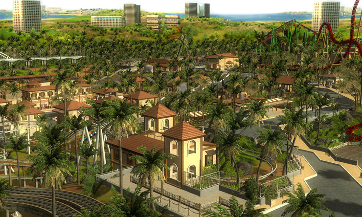
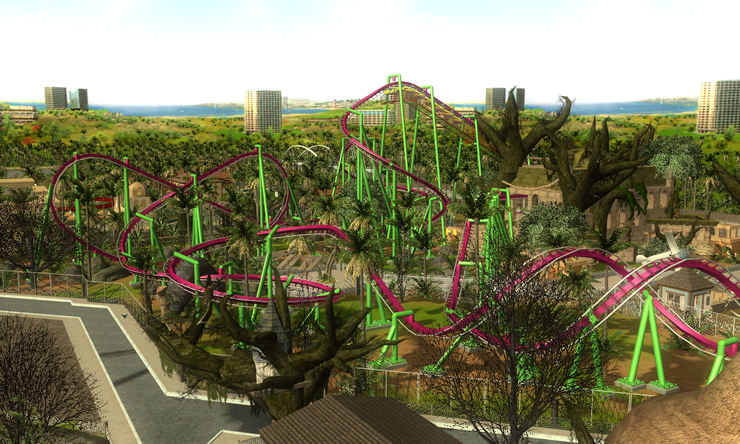
Related Games / Burj Oasis : Miracle in the Desert - Download Available
-
 17-January 10
-

 Dotrobot
Offline
^^uh with these kind of skills i think ANYBODY on these forums would be very glad to help you.
 -

 NGT Amusements
Offline
Luigi - Thanks! but there aren't many choices of tropical trees atm. I tried hard to put some different variations.
Dotrobot - haha but the problem is that I have no patient to learn such skills..
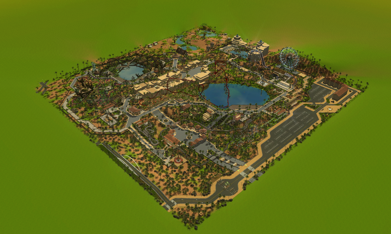
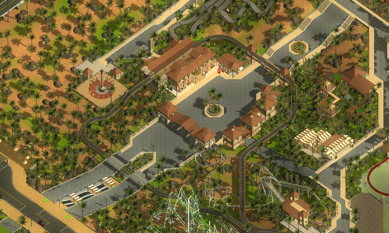
I want to share a park map with you guys before the Grand Opening!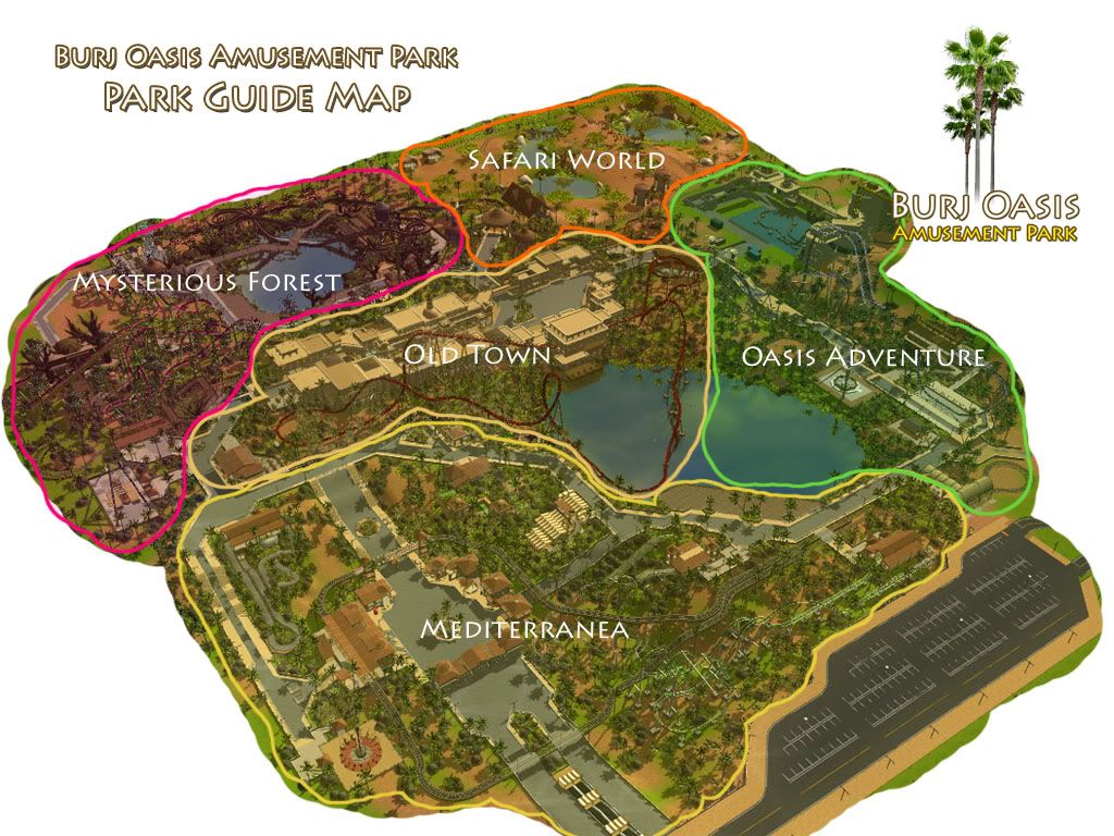
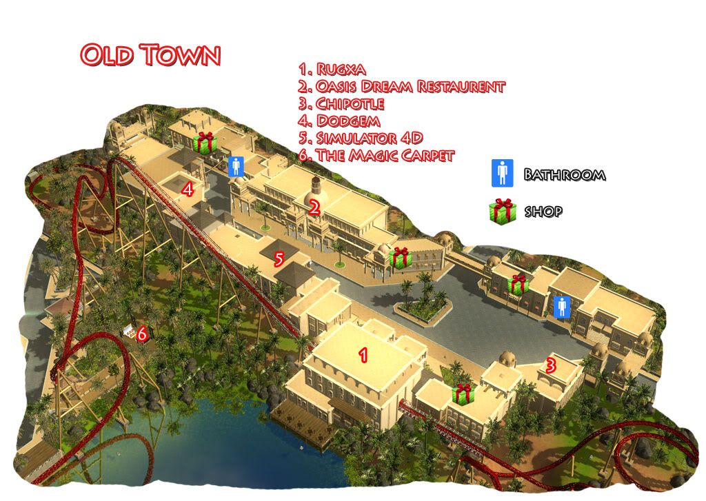
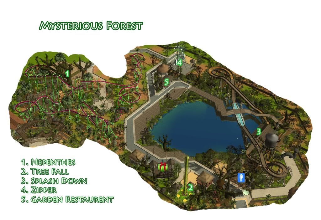
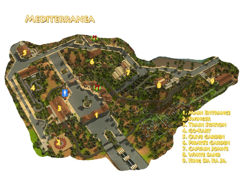
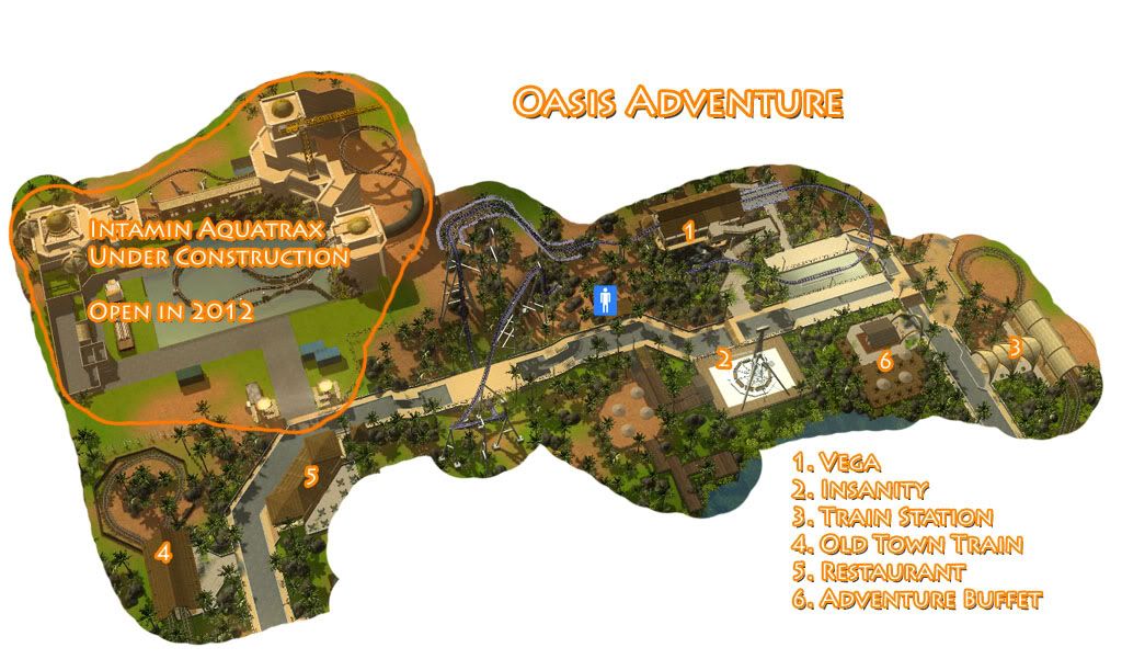
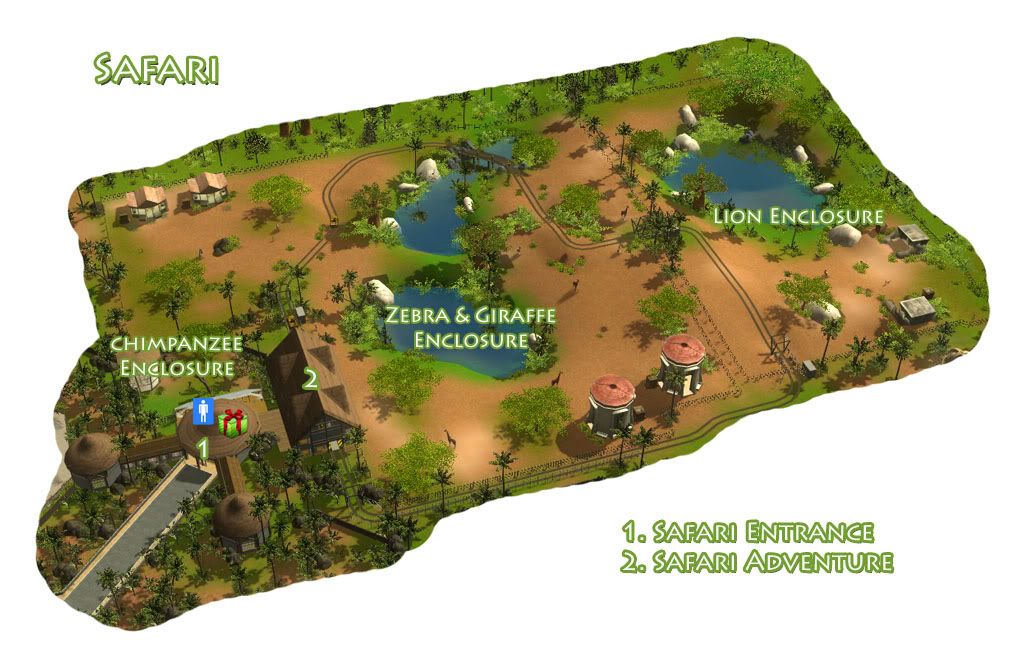
Thanks for watching! -

 leonidas
Offline
These area's look great! Fantastic lay-out as-well.
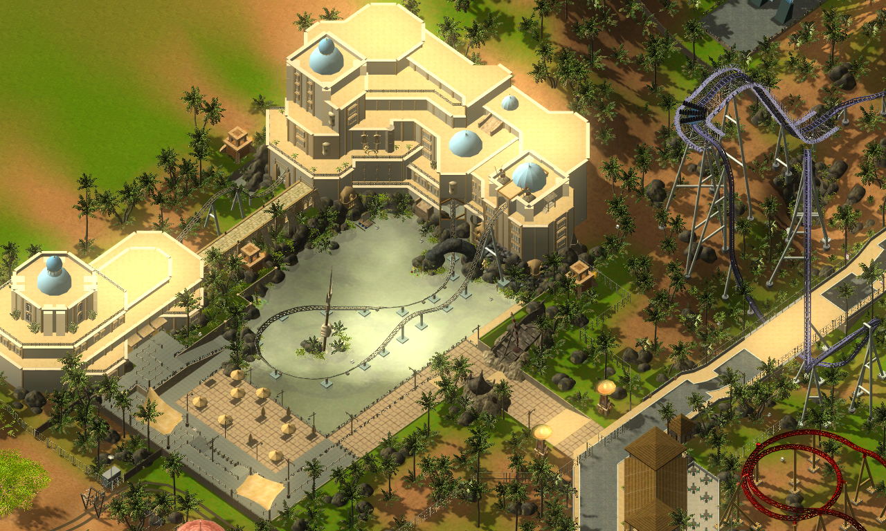
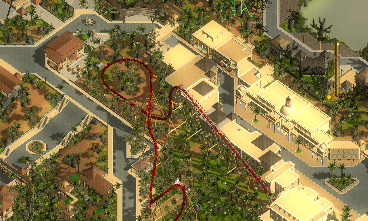
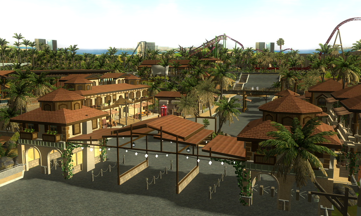
Old-town reminds me of the rare old parts of Dubai, amazing detail overall,
but as some mentioned before, it could use some colour, I know you're going for the sandy
kind of architecture, but still.
I'm still not sure whether I find the mysterious forrest area fitting to this park.
Somehow such a winter-ish theme doesn't seem to belong there. I might just have to get
used to it though xD.
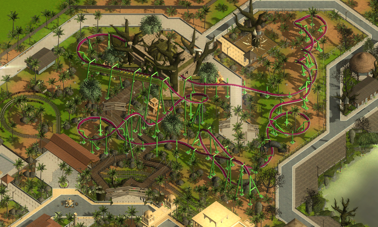
I love the safari area, it fits in perfectly. It is a bit squared though, you might
want to create a more flowing lay-out.
We should seriously consider doing a RCT2 collab, lol! -

 BelgianGuy
Offline
dude this is sooooo awesome
it would actually be cool to try to recreate this park in RCT2 -

 Roomie
Offline
Dude it looks awesome. I do have one criticism though. The Log Flume in Mysterious forest looks good but it looks to me like there is no run out from the 2nd drop and that it just drops into a corner. could just be the angle though
 -
tdub96 Offline
The only thing I dont like is the name "King Da Ka Jr." Surely you can name it something else Otherwise, you and CD5 are the two best at RCT3 hands down, and I, too, would like to see this translated to RCT2.
-

 Luigi
Offline
So, who is gonna recreate this in RCT2?
Congrats on (almost) finishing this. Good job. -
 F0ndue
Offline
Also,get rid of the high voltage signs on the fences,its a bit unlogic,but aside its really great
 -

 Dotrobot
Offline
Also,get rid of the high voltage signs on the fences,its a bit unlogic,but aside its really great
Actually it's very common that theme parks do that. But looking amazing NGT, Your level of productivity is one of the things that also amazes me.
By the way, i haven't visited korean rct forums in a long time. Are they still active, well is freerider still active? -

 NGT Amusements
Offline
Thanks everyone for comments!
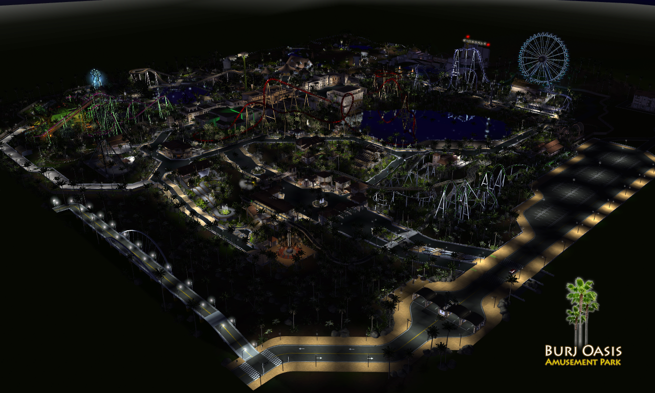
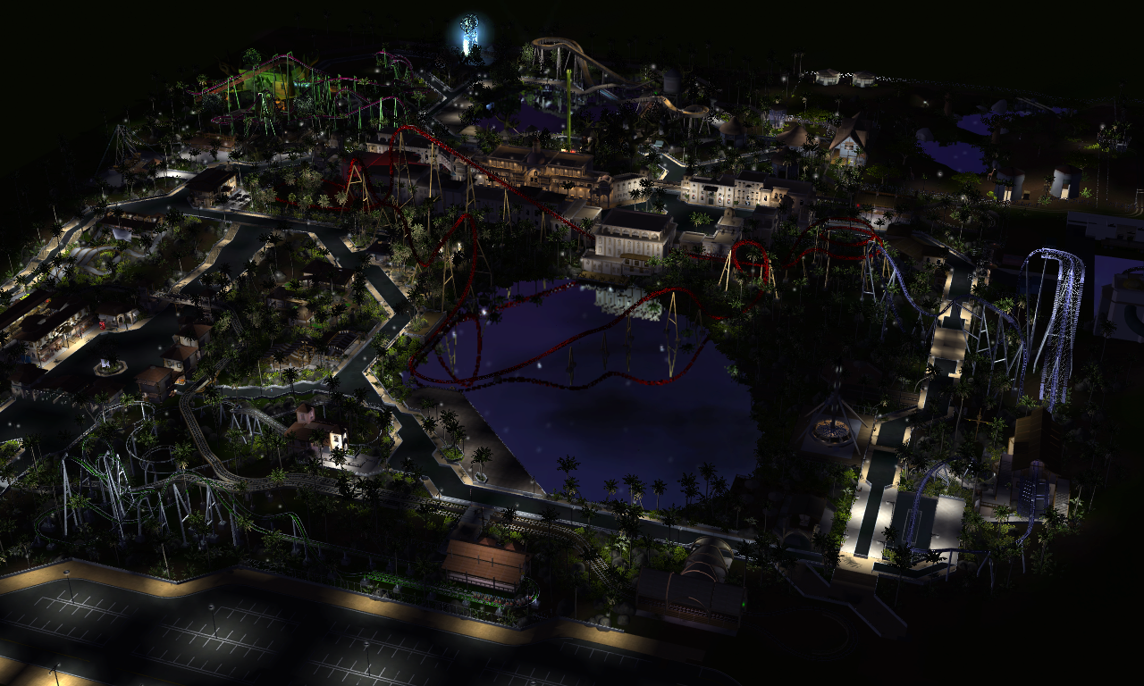
here are some new night shots and some random pics.. not much progress tho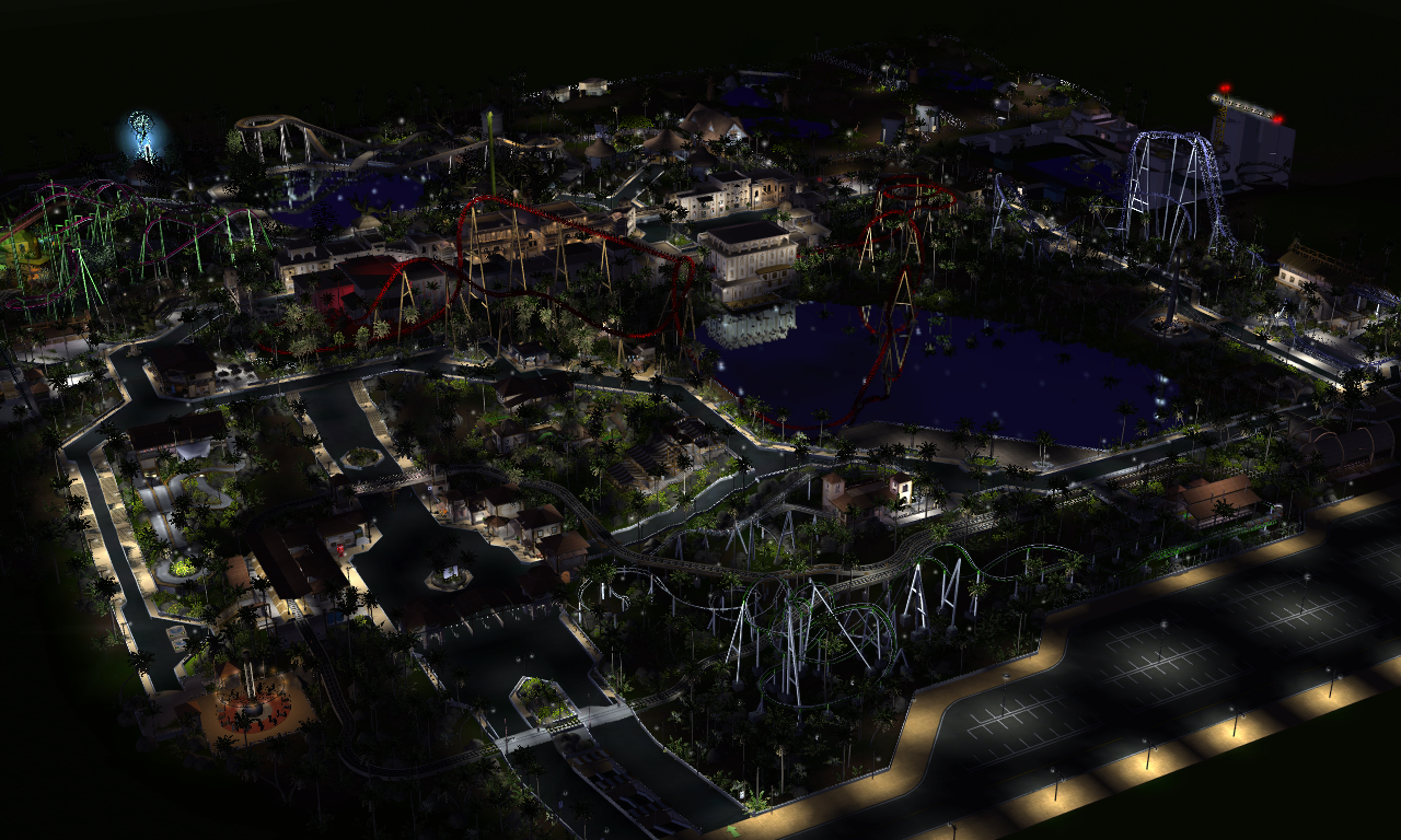
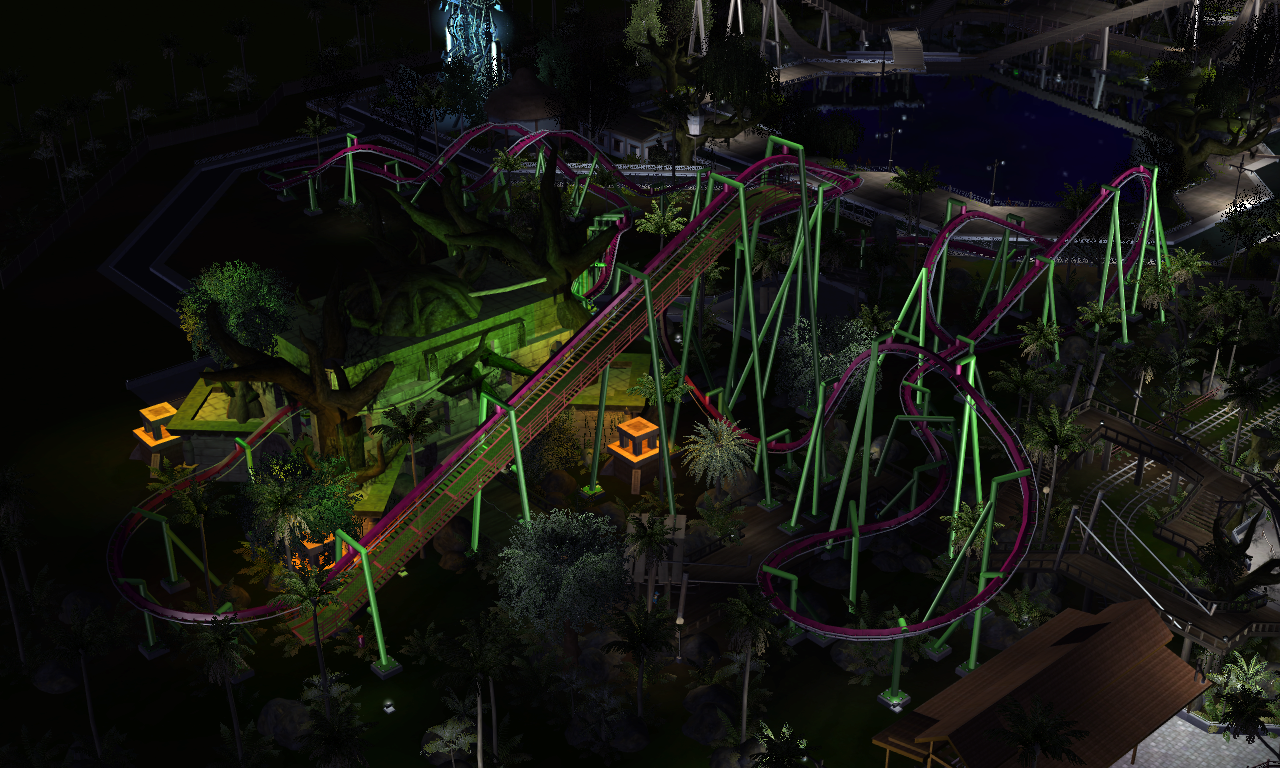
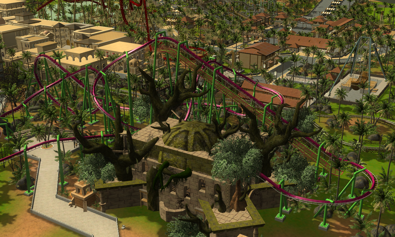
-
 Coaster Cow
Offline
I almost cried when I saw these. Too bad Atari couldn't have foreseen the ability to make things like this.
@RRP: I think the foliage problem is just the limits of RCT3, but I'm not positive. -

 Cocoa
Offline
pretty awesome work. I love that a game that can be looked at any way in 3d is requested to look isometric over at ne
 I do agree about the ground coverage though, it sort of shows some of the ugly textures that rct3 can have.
-

 leonidas
Offline
^ Don't think you know anything about it by seeing the three RCT3 projects posted here. Vegetation and landscaping can look absolutely photographic in rct3, to be honest, the vegetation, landscaping and paths are just not up to recent standards in this park. I get it if you're not gonna change that though.
The night-screens are absolutely beautiful, gorgeous theming and awesome coasters.
You know how I adore this project. Great work, I hate that Isometric view though haha.
Can't wait to see what's next! -

 TMH
Offline
Looks great! As leon said, the foliage here isn't a fault of the game. I think that's just the way NGT decided to do it for his park.
I kind of like the look of the Isometric view, although it doesn't look nearly as nice as the normal camera modes simply because you didn't build the park with the Isometric angles in mind. I really like the first shot. The park just seems so isolated with all the barren surroundings. -

 nin
Offline
Oh wow, interlocking corks on a flyer. You don't see that every day.
This park's pretty cool NGT; I've been wanting to give RCT3 another shot lately.
 Tags
Tags
- No Tags
