General Chat / The Art Department
-
 02-January 10
-

 rK_
Offline
flix from around 99-01 Boston area, dont know if any of this is still riding, i havnt been back in a few years =/
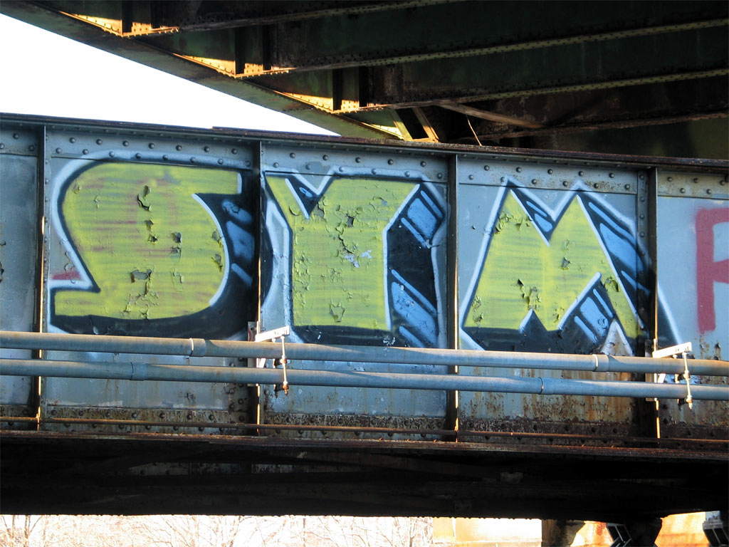
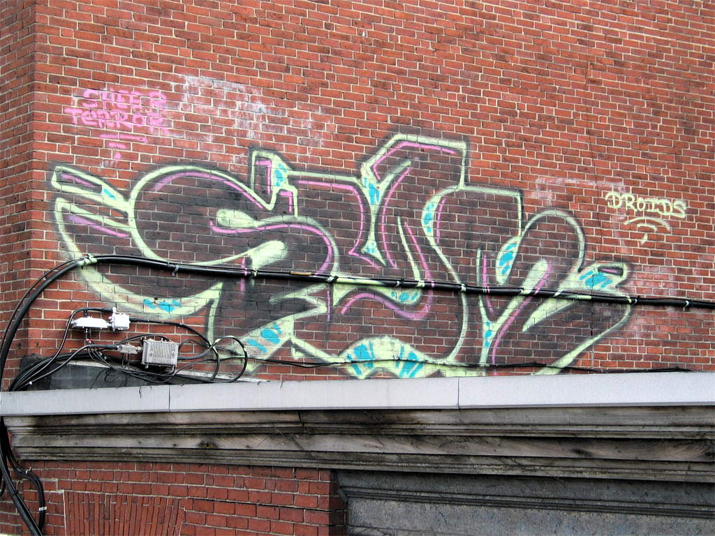
got put one up for the homie! FREE SPEK ITD!!!
-

 rK_
Offline
if i gave you a picture of my daughter would do a painting for me and my wife?
your bursh skills are amazing verti, please keep posting your work! -

 In:Cities
Offline
here's a layout i just finished a few days ago for some good friends of mine.
http://www.myspace.com/pointswestfl
dont be too critical, as they were the ones who specifically requested that art.
i didnt spend as much time on it as i should have, but it works i guess.
their music is incredible though.
i'm sure quite a few of you will dig these guys! -
 JoeZia
Offline
“The Grey Rose; Good and Evil”
In the beginning there was light. The light was alone. The light grew lonely, and roses grew upon the light's forehead. The light could not see the roses, and yet he knew it was there. The light longed for twilight. The light created the darkness to get his wish. The darkness gave the light his eyes. And the light gave the darkness his eyes. What the light could see was beautiful, a true masterpiece. What the darkness could see was miserable, a false master. The darkness had left the light and roses grew upon the dark's forehead. He knew the roses were there and yet he could not see them without the light. A portion of the light was tempted, and it departed from itself into the darkness. And a portion of the darkness had repented, and it had departed from itself into the light. The light grew hatred for the darkness. And the darkness grew hatred for the light. The contrast between the light and the darkness had created twilight. The light was not alone. In the end there was twilight. -
 RRP
Offline
serious wall of type on therehere's a layout i just finished a few days ago for some good friends of mine.
http://www.myspace.com/pointswestfl
dont be too critical, as they were the ones who specifically requested that art.
i didnt spend as much time on it as i should have, but it works i guess.
their music is incredible though.
i'm sure quite a few of you will dig these guys! -

 In:Cities
Offline
aha you're telling me man.
but its what they wanted i guess.
i really feel bad about this layout, as i know that i could have done so much more with the concept.
but i guess thats what i get for working with bands. i'm constantly rushed. -

 RRP
Offline
It's the same with most people, they expect you to be able to the a complete re brand or a big job like a brochure in a day or 2. Just make sure you outline a sensible time to them since it does as much harm to you as it does them when things are badly designedaha you're telling me man.
but its what they wanted i guess.
i really feel bad about this layout, as i know that i could have done so much more with the concept.
but i guess thats what i get for working with bands. i'm constantly rushed. -

 In:Cities
Offline
i dont usually charge much at all, since i realize that working with bands means working with dudes who have very little money.
just let me know exactly what you want, and i'm sure i can help you out with what you need. -

 BelgianGuy
Offline
Well I'd first need a full line-up then since bassplayers are hard to find...
But yeah we could talk;)
Also before thinking of stuff like this I want to make sure the artwork provided is of decent quality and such, wel thought out and most of all decently original for what we want to show. Since I mostly design all the stuff I want to put in myself and I'm not easyly pleased with something I'm a very annoying guy in these matters cuz I have an idea of something and don't really want to go outside of what I have in mind.
And indeed all us musicians are way too passionate about our instruments that all our money goes to that haha. -

 In:Cities
Offline
haha i hear you man.
so its a myspace layout you're looking for?
PM me with details dude, and i'll show you my other work -
 Andrew
Offline
http://andrewcm.deviantart.com/
This is my Deviantart page. It's brand spankin' new so I don't have a lot of quality stuff up yet but any thoughts would certainly be appreciated. -

 RRP
Offline
http://andrewcm.deviantart.com/
This is my Deviantart page. It's brand spankin' new so I don't have a lot of quality stuff up yet but any thoughts would certainly be appreciated.
The self portrait is nice,the rest feels like ive seen it all before -
 Andrew
Offline
The self portrait is nice,the rest feels like ive seen it all before
A number of those are sketches of Venture Bros. characters that I didn't come up with, just playing with the program.
 Tags
Tags
- No Tags
