General Chat / The Art Department
-
 02-January 10
-

 Casimir
Offline
The one on the impromptu table is obviously a papercraft model ;P
http://browse.devian... cubee#/d274h60 -

 SSSammy
Offline
i love it, bro.
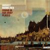
i love album covers to be super simple and a little abstract, but this toes that line perfectly and manages to be detailed yet tactful at the same time. -

 In:Cities
Offline
Thank you:] I typically tend to lean more toward the minimalistic approach with album art as well, but I decided to add a bit more detail than normal on this one.
I'm also doing artwork for each individual song as well, which is killing me haha. Seems like this is taking longer to do than the album was to write. -

tdub96 Offline
I thought the album was to be called Dialogues? or did I miss something? Either way, that looks fantastic dude. Im also very intrigued by the song titles, it seems like a very conceptual, deep record just by reading off a few of the titles. You've got me interested bro, cant wait to hear it! Good luck
-

 In:Cities
Offline
We changed the name a while ago because if flowed with the concept better.
This album is the first of a three part series: Rebirth - Rebuild - Release.
But thanks man:] We've put a lot of time and effort into this. Can't wait to let you hear it! -

 Hex
Offline
This is a drawing I made a year ago, I think it took like 5-8 minutes but I don't remember. It's a marine from Star Craft II. I'm not the best drawer so go easy.
-

 5dave
Offline
Yeah it does really look nice. Reminds me a bit of Mastodon's cover style, which is good.
Only thing I don't really like are the details at the roots, they look too cutted out, maybe you could make them turn thinner at the end?
"MFG" -

 K0NG
Offline
Working on the album artwork for my band's upcoming full-length. Any thoughts?:]

Looks like one of my RCT projects
-

 ScOtLaNdS_FiNeSt
Offline
I like it, Its simple but it stands out & thats what you want
 What type of band is it. Rock ?
-

 In:Cities
Offline
Its... rock of sorts lol
Here's an example:
http://www.youtube.c...h?v=P8aF7NwyoZ0
http://www.facebook.com/astheskyawaits
Dave- I agree. I drew them by hand with the polygonal lasso tool, so they're a little rough lol. I'll clean them up a bit though. Thanks!
Hahah thanks KONG<3 -

 ScOtLaNdS_FiNeSt
Offline
I like it
 I dont listen to rock usually but it made the hairs on the back of my neck stand up seriously, Which is always a good thing fucking well done
 Tags
Tags
- No Tags


