General Chat / The Art Department
-
 02-January 10
-

 SSSammy
Offline
is there a program that makes the line picture for you, imi? i liked the one in b&w of the bus station better personally. the one that's sideways.
 -

 Imi
Offline
erm.. no, i had to go round the edges on adobe illustrator. and yeah i like the bus station one better as well, but i don't have that one to hand
 -

 In:Cities
Offline
Just a few more recent designs i'm working on for clients.
This is one of my favorite things i've ever designed. Its album cover art for some of my good friends in the band History of Monsters.
This is a flier I designed for one of our upcoming shows.
This is an unfinished album cover art for my friends in These Arms of Faith.
And this is one of my favorites, a shirt design I'm finishing for These Arms of Faith.
-

 scarywaffles
Offline
i was going to post my coaster design of my stallion then i realized it was missing!
 -

 chorkiel
Offline
about the 'as the sky awaits' poster,
did you search for the fonts while you were making it.
or did you just have them ? -

 In:Cities
Offline
Well the ATSA logo was one that we've had for a long time. A friend of ours drew it by hand and vectored it.
The Convalesce and Grenade Face logos were ones that the bands supplied me. I simply traced over them all with the polygonal lasso tool and filled in the color and texture by hand.
The other bands didnt have logos, so i just simply used fonts and traced over them with the lasso tool to give them more of a custom look. Its really sloppy haha.
But I literally made every singly thing on this flier by hand with the polygonal lasso tool and brushes. Its a fun style to try! -

 chorkiel
Offline
I never used the polygonal lasso xd but it sounds fun
but for the other bands I have the same question did you just search for some fonts for them or did you already have them and just sort out what font you'd want for it ? -
 JoeZia
Offline
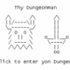
Making a game about the end of the world. This one if gonna be for commercial use. Here's an animation I exported out of my game's project:
I improoved the amination used in my last post. This is the Anti-Christ sinking into an equal mixture of blood, lava, and a high concentrated acid.
This game is being made with Adventure Maker (freeware version also available, however I purchased the commercial use.)
http://www.adventuremaker.com -

 JoeZia
Offline
^Thanks! I may post some more updates on this game and a demo download once finnished if you guys are interested. I may go back to playing some Rct, I've been kinda missing that little old game of mine.
-
 RRP
Offline
Major coincidence that one of the characters is also called WilliamHahaha nor affiliated with prince william?

-

 Liampie
Offline

This is a logo I just made... Rushed, but it could've been worse. It doesn't really matter though, it's just a logo for a proposed plan for reviving an old factory district. Graphic designing and logo stuff is not a part of my study, but it does cheer up the presentation I guess. At least its a better title/logo than Comic Sans 150 bold.
What do you think? Criticism is always useful. -

 Cocoa
Offline
did this clay torso today at my school's art camp.
the boobs look a little funny in this picture though. needless to say, the entire class (mostly girls) did women because nobody wanted to sculpt a dick . the body is a little long and thin on purpose cause I was originally going for a little more abstract design, but eventually settled on a more realistic approach.
for scale, this thing is probably higher than 60 cm (or 2 feet-ish)
I'll see if I can get more of my stuff up here eventually.
don't know why imageshack is uploading everything sideways?
 Tags
Tags
- No Tags
