(Archive) Advertising District / Going out with a BANG!
-
 31-December 09
-

RMM Offline
evil, i've always wanted to build a park in that style. every time i try, i either end up making it look too cluttered or too clean. too clean to the point where it isn't that style. i was wondering, was there a lot of planning when you built that? or was it sort of just build... and as you go, lightweight plan the next coaster. it looks too hectic, in a good way, to be all planned out. i love that park and that style.Edited by RMM, 06 January 2010 - 03:04 PM.
-

 Evil WME
Offline
To call it all planned out would be a mistake.
Lightweight plan the next coaster is definitely some nice terminology. And you make mistakes sometimes, and something just doesn't work.. you delete it, or change it so that it does. It was an ever on-going process of trying to make everything 'fit' to a certain extent (not the extent as to make it clean, but to the extent that it works; looks pretty).
So, in a sense, there was some planning involved. I took the park as it was, each time, and tried to add something cool to it, without ruining the rest. As you go along it becomes harder to fit something in that will add to the what in general would be called a mess, that will not detract from the rest. Coasters like the Bandit and the Monster were added in as the last coasters, and I really like both! Bandit uses only very little space, and it was hard not to cross it with sights of the Statue. The Monster was hard all over the place, it blocks some view of its surroundings but it leaves enough intact.
In short, I think you're on the right track. Would be really cool to see someone trying this style of building! You can still find some construction photos of it, too. You can see quite clearly, there, what was built and changed and deleted over time.
I'm glad that you still remember (and like) the park :).
If you ever do try to make a similar park, I'd be happy to give you some advice on where to go next. Don't hesitate to ask!
Although I really like my work, I think there is a lot of room for improvement! In coasters, theming, everything basically. Easy is different, though, and there isn't a lot of work to guide you. -

 RCTNW
Offline
I've been thinking about this and this would have to be my favorite SS of the past year from Project Aries. It really helped that I had a great coaster to work with from CP6!
-

 sixflagsfreak56
Offline
I like the screen RCTNW, but I don't like how the entrance and exit to the inline twist is the same. I think it would work better if you had a upwards banked turn in to the maneuver instead, and leave the exit.
 -

 Liampie
Offline
I think it's supposed to be a corkscrew, in that case this is as accurate as it can get.
 -

 Cocoa
Offline
Hooray for reviving old threads! Its a bit early, but hey, its christmas, and thats close enough! BANG!
I definitely have better stuff, I just haven't shown it. Oh yeessss, better stuff indeed.
-
 Timothy Cross
Offline
Great work Cocoa. Digg'n' the coaster Giga.
Mine's certainly not the best compared to other members here, and very unfinished. However, it's pretty much all I got this year...
-

 GigaG
Offline
You just love Old Glory, don't ya. As for the new Random Member Definition, it should say-
GigaG
Offline
You just love Old Glory, don't ya. As for the new Random Member Definition, it should say-K0NG hates apple computers but settled for a PC 'cause there was no 'banana' and OS X can't run RCT.
-

 Austin55
Offline
I could have gone with something from my more recent solo's, but I'll post something I dont think anyone really remembers.
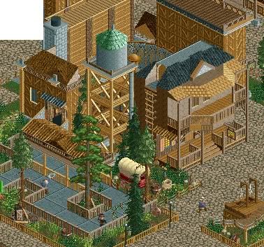
From Thrill Point Worlds of Adventure with me and Belgianguy.
And ofcourse I love this one
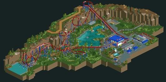
Hopefully next year I can get some releases and show people I can finish some stuff.
Happy New Years Everybody! Merry Christmas!
 Tags
Tags
- No Tags
