(Archive) Advertising District / Disneyland Park
-
 12-December 09
-

 coster
Offline
hey
this is coster
it´s been a long time, since i´d showed something here on NE.
but some remember me...maybe
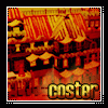
Here is my own disneyland park.
Today I only show a picture of a part of the mainstreet USA
Here can you see Walt´s an American Restaurant,The Cinema, An Book shop
and a Gift shop.
have fun with it.
see you next time
coster -

 SSSammy
Offline
wow, looking really great.
the only thing im going to attack you for is those stupid awnings which lacck in texture.
they ruin the great atmosphere you have going in my oppinion.
i cant wait to see more.
the shapes and forms are all really nice. -

 Splitvision
Offline
I like that alot! Sammys right about the awnings, though I think you could keep some of them the way they are. There could be more detail, though I like it at the level it is now. I'm especially a fan of the bright yellow building, it's bright and fresh. My only suggestion is that you should use different fences around the trees.
 -

 MF72
Offline
Greetings, coster.
It's looking good so far, and like SSSammy and Splitvision have pointed out, the awnings could use some work. Other than that, I don't really see anything too bad. Great work on the cinema building, too. Really cool looking. Looking forward to see more. -

 Casimir
Offline
I do like it alot!
the only thing that bothers me is the rose path right behind the rose awning. just seems to blend into each other. -

 Dark_Horse
Offline
Looks great, coster. I can definitely see some Highball inspiration, but on a more peep friendly scale. The pink roof on the right kind of blends with the pink path on the left. Might wanna change the color of that roof. Otherwise, awesome start and good luck.
 -

 Liampie
Offline
The red bricks and the custom trees hurt the screen badly. Very badly... Pretty cool otherwise.
The building at the top right is great, the yellow building at the corner can be too with a few tweaks I think... Change the roof to black and the awnings to deep red. -

 trav
Offline
I remember you! You were the guy who always made the big roofs and made them looks good.
I think the pinky sidewalk should be a different colour, but apart from that, that's fantastic.
 Tags
Tags
- No Tags


