(Archive) Advertising District / MANTA INTERPRETATION
-
 17-November 09
-
 BelgianGuy
Offline
Hi here's a topic of its own for my Manta design
BelgianGuy
Offline
Hi here's a topic of its own for my Manta design
First off again this is not a total rec, only the layout, the surroundings are total fiction
I'll post all the screens I have posted here and on TPR so you guys aren't left in the cold,
Hope you like what I have so far
Project status is 40%
Overturn near the entrance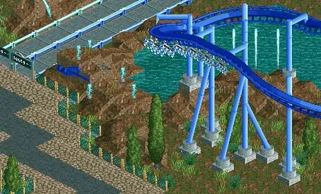
Station pic from the dump(note this has been modified to the advice given in the dump thread)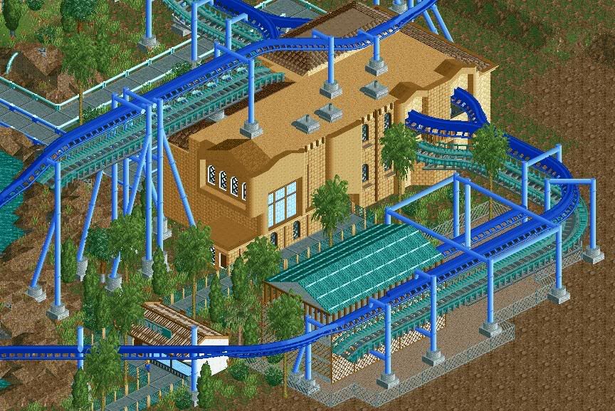
Layout finale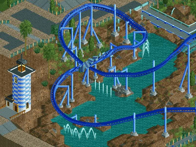
shop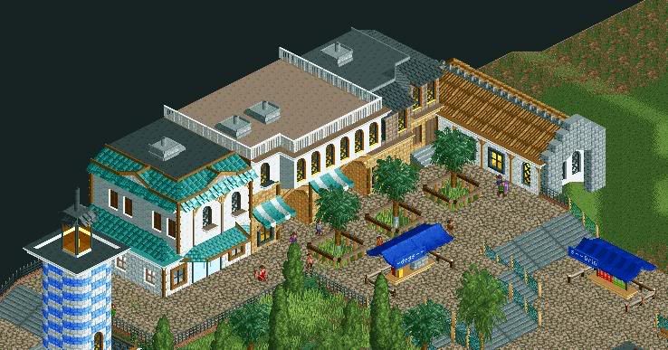
Queue with shade^^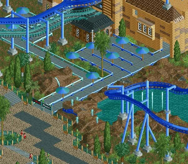
Pretzel loop(far from finished, except supports and minor stuff nothing was done here)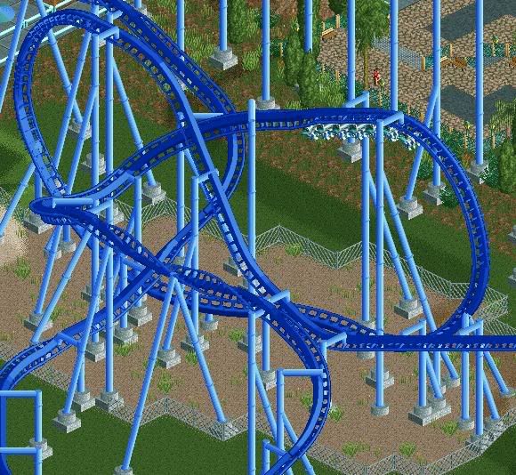
Plz tell me how to improve because I want that front page and what better advice than from the elite^^Edited by BelgianGuy, 17 November 2009 - 02:17 PM.
-
 posix
Offline
supports on the roof, i dunno. the rest is lovely. looks like you've improved drastically.
posix
Offline
supports on the roof, i dunno. the rest is lovely. looks like you've improved drastically. -
 Louis!
Offline
This is excelent. I love the custom logo in the first screen.
Louis!
Offline
This is excelent. I love the custom logo in the first screen.
The station in the second isn't as great as the other architecture but it's still quite nice. I think what would help would be to have the flat roof a different colour to the actual building. Also the supports on the roof is a bit funny. I think it would be ok if the supports were to go through to the building underneath, but you have footers on top which would surely cause the station roof to collapse from the weight.
The tarmac and crazy pathing combination isn't that great either, they don't compliment each other.
The whole layout is looking brilliant. As is the architecture in the 3rd screen.
Really nice work, looking forward to more of this. -
 SSSammy
Offline
i totally call parkmaker of the future.
SSSammy
Offline
i totally call parkmaker of the future.
the only bit which isnt fantastic is the lighthouse.
the lighthouse sucks. -
BelgianGuy
Offline
Those supports are being taken care of and what type of path you think would work better?
Can I ask why the lighthouse sucks? I think it is located quite nicely and is decent in excecution -
 turbin3
Offline
^the top of the lighthouse is executed poorly.
turbin3
Offline
^the top of the lighthouse is executed poorly.
Rest looks really good, I love the houses.
Nice supports aswell. -
 Steve
Offline
I think all of the path choices need to be reconsidered. Just don't seem to fit to me.
Steve
Offline
I think all of the path choices need to be reconsidered. Just don't seem to fit to me.
Landscaping around the water is excellent. I think some minor foliage or something else is needed to spruce it up in places.
I agree the footers on the roof are odd, but there doesn't seem like a way around it, now. I also feel like some of the supports are a little strange, maybe even a bit unrealistic at times. Not sure. They do look really nice though.
Everything else looks great, though and I look forward to what's coming next. -
BelgianGuy
Offline
Well good news Hulk it is getting done I'm at 75% currently so that always good news
I'll reply first
@Posix: thanks and I hope it shows I've been trying some new stuff.
@Goliath123: thanks and its just the real deal I copied and the pretzel was a pain in the ass to hack its about 5-6coasters to get it to look right.
@Louis: Thanks and the logo is something thats also copied from the real coaster, as far as the station goes I changed the roof colour to black and got rid of the footers, not it looks as if the supports go right through the building. As far as the path choices go, I tried some stuff and I'll keep the crazy pavement but I'm not sure what I'll take to spice it up a bit, maybe the same concrete that I use for the stairs.
@SSSammy: I certainly hope I'll achieve that one day and thanks, I also did some retouches t the lighthouse roof,
@Turbin3: Thanks
@Steve: I added some minor foliage near the water and it looks much better IMO thnaks for the advice
@Alpengeistfan1: thanks it took me long enough so it schould look good.
@Cocoa: Thanks and I've added some colour to the rest of the buildings
@Hulkpower25: Thanks and I'm the type of person who starts to finish something so you'll see it finished as a design or as an honorary mention
Now onto the new screen,
Its the plaza in front of the coaster near the overturn towards the people walking on that plaza
Note: Foliage isn't 100% finished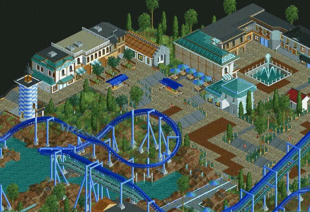
Thanks and I hope you guys like it
BelgianGuy -
SSSammy
Offline
id really like to talk to you on msn or aim.
some little tiny tiny little things to make this even more perfect.
check my page if you have either or them. -
 tdub96
Offline
Really like it great atmosphere, great architecture, and most importantly, great coaster
tdub96
Offline
Really like it great atmosphere, great architecture, and most importantly, great coaster -
 JDP
Offline
I feel like you're missing great opportunities to have that coaster interact with the path around it.
JDP
Offline
I feel like you're missing great opportunities to have that coaster interact with the path around it.
-JDP -
 CedarPoint6
Offline
^ I can agree with that. Manta is like the king of path interaction-- it's fantastic. I think you could bring some stuff in here like that. It looks like you certainly have the space. Your layout seems pretty good, at least. Not entirely accurate, but its pretty good for what you're doing. Looks very nice.
CedarPoint6
Offline
^ I can agree with that. Manta is like the king of path interaction-- it's fantastic. I think you could bring some stuff in here like that. It looks like you certainly have the space. Your layout seems pretty good, at least. Not entirely accurate, but its pretty good for what you're doing. Looks very nice. -
BelgianGuy
Offline
I have a problem concerning that because the pretzel is on the other side and its really hard to get the paths over there because everything is already build around this plaza
-
Louis!
Offline
That lanscaping is really really nice. You need to work on your structures but apart from that this is totally awesome.


Tags
- No Tags