(Archive) Advertising District / My most ambitious project to date
-
 08-October 09
-

 Phatage
Offline
I was heavily considering circling around the turnaround, as I think it would have been a cool and realistic thing to do, but I felt that the ride ended in the right place where I ended it. The track length is a tad short for a GCI of that height (it's a little more than 2700ft at 99ft tall) but my station is also taller than most GCI coasters so I needed to used that speed to get to a high brake run that is also slightly sloped down, enough to overcome friction without a need for tires. The station is higher like that because there's an extended pre-lift section; I'll go more into it when I do the writeup but the prelift was more inspired by Dorney's Hercules than any real GCI, but I feel like GCI is expanding in so many subtle ways with their coasters that it wouldn't be out of the question to throw in something a little different.
The triple down element after crossing over the lift hill (after the first drop) is partially inspired by a combination of the middle section of Joris and Draak and a ski slalom. Again, this is building off of the expansion of GCI's style in recent years and I personally feel it would be really fun and not out of the question. Thanks for giving an analysis though, care to share any pics of your 'rec'? -

 JDP
Offline
dude i had a feeling those high airtimes were inspired from the newest gci twin. thats one thing i do like about this design, the elements are odd, but are fitting with the newer gci models.
And yeah i took a screen shot but i didnt wanna post it without your permission.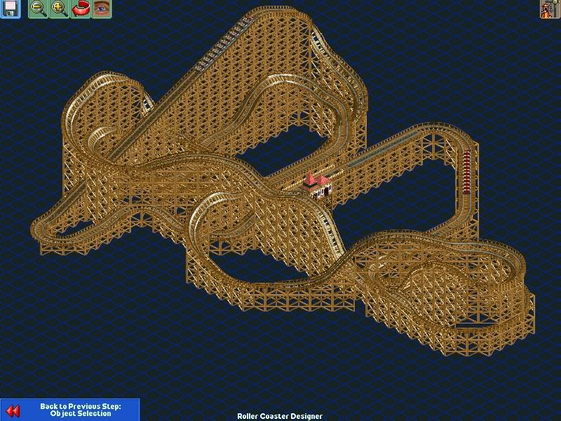
This was my out look on it
-JDP -

 Phatage
Offline
Not bad at all! what's your speed at the end? Mine (spreadsheet) is at about 20mph right before the brakes.
 -

 JDP
Offline
you are correct sir. it hits the brake run at 22mph and has pretty solid pacing over all. i think once the layout is perfected it will be a nice design
-JDP -

 Phatage
Offline
Ok, so I know this has been taking me a while but I think I'm finally at the point where I'm almost done with the actual text of the writeup and what's left is the layout (of the writeup). I'm not the best with these things so I was wondering if any of you would be ready/willing/able to help me. I was thinking something along the lines of this (except for the weird blank part at the beginning):
http://www.coastersa...nonen_eng.shtml
Anyway I know layout is very time consuming and whatnot, I'm willing to discuss rewards/compensation if you can show me a sample of what you're planning on first. I've essentially split the ride up into sections to discuss each part and have many images for each section; below are some of the images for the first drop and triple down:


So please let me know if you're interested. -

 Phatage
Offline
You understand it's the writeup layout, right? I would definitely hear out any ideas for improvement but this may or may not require additional content (what I would consider a 'guest spot').
 -

 Phatage
Offline
To clarify, I mean layout in the sense of a newsletter or something like that; I have a good 9 pages of text and a ton of pictures and need them put together to be one cohesive report that's also attractive to the eye. I went into much, much more detail than the last design but I also devoted specific parts of the text for people not so technically inclined. The result so far is that there's a lot of stuff to be organized and I was wondering if anybody wanted to give it a go.
 -

 RRP
Offline
To clarify, I mean layout in the sense of a newsletter or something like that; I have a good 9 pages of text and a ton of pictures and need them put together to be one cohesive report that's also attractive to the eye. I went into much, much more detail than the last design but I also devoted specific parts of the text for people not so technically inclined. The result so far is that there's a lot of stuff to be organized and I was wondering if anybody wanted to give it a go.
You mean a document for a pitch? -

 Phatage
Offline
Yeah that's pretty much it. I do want to send it over to GCII but also release it for public viewing on different coaster forums.
 -

 RRP
Offline
If you can wait a couple of weeks i could offer some helpYeah that's pretty much it. I do want to send it over to GCII but also release it for public viewing on different coaster forums.
-

 Phatage
Offline
Sure, I think what I'll do is basically give it a stab myself but like I said, I'm not really hopeful, but when I finally give up I can let you know and hopefully the timing works out.
 -

 GameWorldLeader
Offline
looking at all the work you put into this and the image that JDP replecated I hope you try to pitch this to a park or something. this ride looks sweet.
 -

 Cole
Offline
looking at all the work you put into this and the image that JDP replecated I hope to try to pitch this to a park or something. this ride looks sweet.
How about you make your own design instead of using his?
-

 Comet
Offline
I don't really have any criticism or help to offer I just wanted to say this is very cool and keep us updated please
 -

 Phatage
Offline
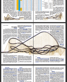
Sorry this is going slowly but I just found out my school has Indesign on the library computers (I'm pretty sure they aren't supposed to outside this one computer lab that's really inconvenient/crowded) so hopefully things will move more quickly now. Here's an update of me messing around with the program, seeing what things fit and determining where I want to be on the scale between simple and flashy.
 -
 ScOtLaNdS_FiNeSt
Offline
Hey man that screen above looks so professional, Seriously you should with out doubt send this to the right people, I would have this in my local park in a second
 What ever you do with this good luck Phatage
 Tags
Tags
- No Tags
